Figures & data
Figure 1 Flow of patients through this retrospective study. Ultimately, 363 patients were enrolled who underwent TG for GC.
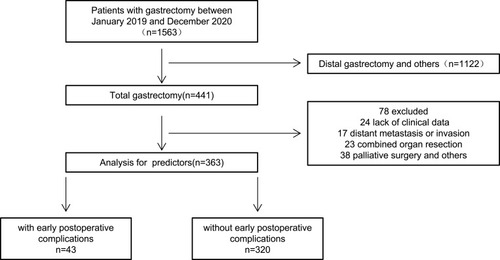
Table 1 Comparison of Clinical and Pathological Data of the Patients
Figure 2 Distribution Figure: After matching between the two groups, the score distribution is consistent, and the matching effect is good.
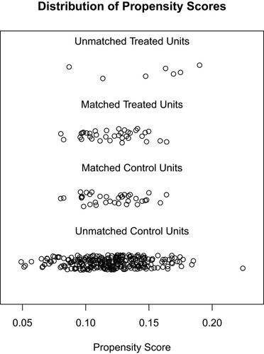
Figure 3 Histogram Figure: After matching between the two groups, the score distribution is consistent, and the matching effect is good.
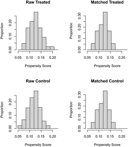
Table 2 Surgical and Pathological Outcome of the Patients
Table 3 Demographic or Characteristic Date of the Patient in Primary Cohort and Validation Cohort
Table 4 Univariate and Multivariable Analysis of Factors Influencing Early Postoperative Complications of Total Gastrectomy for Gastric Cancer
Figure 4 The nomogram for predicting the risk of early postoperative complications of total gastrectomy for gastric cancer. Cost, one-time consumables for surgery. LymphNodes, number of total lymph nodes. PositivelymphNodes, number of positive lymph nodes.
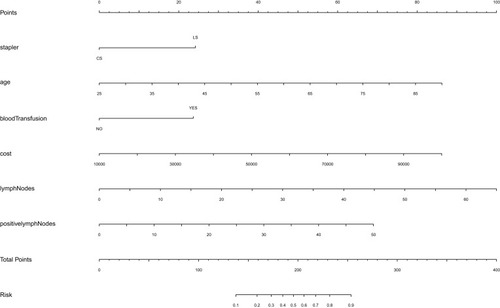
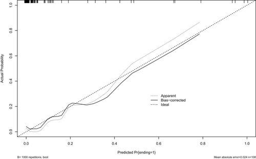
Figure 5 Calibration plots of primary cohort.
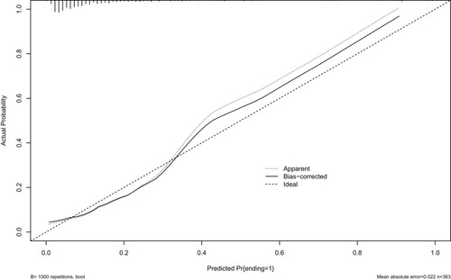
Figure 6 Calibration plots of modeling cohort.
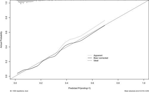
Figure 7 Calibration plots of validation cohort.