Figures & data
Figure 1 The Markov model simulated three health states: PFS, PD and death.
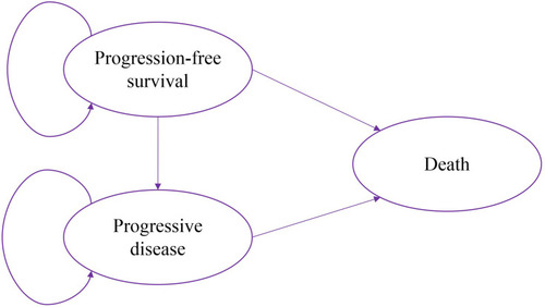
Table 1 Weibull Parameters of Model Estimated for Progression-Free and Overall Survival Curves
Figure 2 (A) Kaplan–Meier curve of the progression-free survival from the NEJ009 study. (B) Simulate progression-free survival curve for the GCP group and the gefitinib group. (C) Kaplan–Meier curve of overall survival from the NEJ009 study. (D) Simulate overall survival curve for the GCP group and the gefitinib group.
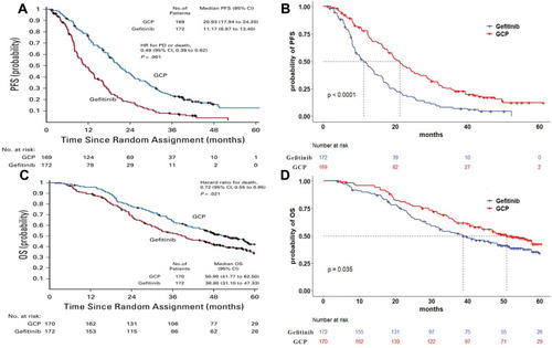
Table 2 The Incidence and Expenditures of SAEs
Table 3 Costs, Utilities, and Discount Rates in the Model
Table 4 The Cost and Outcome Results of the Cost-Effectiveness Analysis
Figure 3 Tornado diagram of one-way sensitivity analysis. It summarized the results of one-way sensitivity analysis, which listed influential parameters in descending order according to their effect on the ICER over the variation of each parameter value.
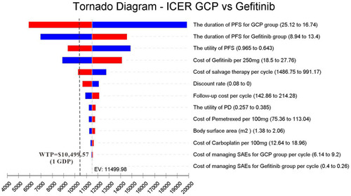
Figure 4 A probabilistic scatter plot of the ICER between the GCP and gefitinib group. Each dot represents the ICER for 1 simulation. An ellipse means 95% confidence interval. Dots that are located below the ICER threshold represent cost-effective simulations. (A) A probabilistic scatter plot of under WTP=$10,499.57 (1 GDP). (B) A probabilistic scatter plot of under WTP=$31,498.70 (3 GDP).
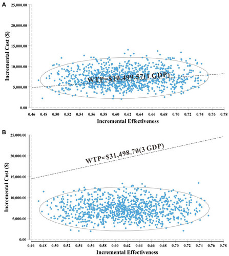
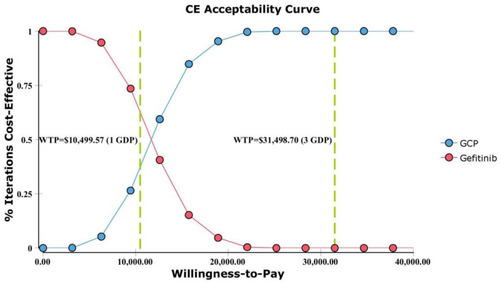
Figure 5 Cost–effectiveness acceptability curve.