Figures & data
Table 1 Case 1
Table 2 Case 2
Table 3 Case 3
Table 4 Case 4
Table 5 Therapy Protocols
Figure 1 FK866 selectively inhibits the proliferation of A549. (A) The protein–protein interaction (PPI) of differentially expressed genes (DEGs) between H1975 and A549. The protein in the pink circle was less expressed in A549 than in H1975, and protein in the blue circle was more expressed in A549. (B) The top is the metabolic pathway of NAD+. The text in the box represents metabolite, and the text around the arrow represents metabolic enzyme. The middle part is expression level of NAMPT in H1975 and A549, the corresponding quantitative result is in the bar plot at the bottom (p-value=0.001, ***p < 0.005). (C) The efficacy of FK866 in vitro. H1975 and A549 were cultured in different concentrations of FK866 for 72h. The cell viability comparison of H1975 and A549 in the same dose group was calculated by t-test. The significant difference started from 10 nM (p < 0.0001: ****ns: not significant). (D) The efficacy of FK866 in vivo. Mice inoculated with A549 were given FK866 (20 mg/kg/day) or vehicle for eight days. The tumor volume at the same time point was compared by t-test in these two groups, and the significant difference started from the fourth day (p < 0.005: ***p < 0.0001: ****ns: not significant).
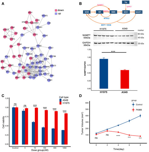
Table 6 Parameter List
Figure 2 Graphical diagnostics of the model. Observations versus individual predictions for A549 in single with FK866 from day 0 to day 8 (top, n=5), the total volume of the mixed tumor with FK866 from day 3 to day 11 (middle, n=5), A549 in mixed tumor (bottom, n=5). Each row includes lines of identity (left), individual-weighted residuals (IWRES) versus time (middle), and the predicted volume versus time (right). In the subplots of predicted volume versus time, the blue shaded area represents the 90% confidence interval of the simulation of the median value of the experimental samples. The line represents the median of the observations.
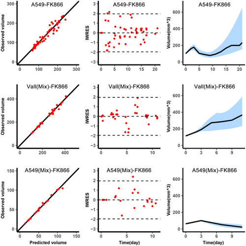
Figure 3 Fixed periodic treatment plan implemented in animal experiment. (A) Tumor volume versus therapy time in the experiment. The first row was the three representative samples from the DT1 group, which adopted the O-W-F-W plan. The second row was the three representative samples from the DT2 group which adopted the O-F-W plan. The black dots were the observations of total volume, and the black triangle was the observations of A549 volume. The experiment has been performed for 60 days, so the observations were collected to the 60th day. The yellow curves were the simulation results of total volume, and the green curves were the simulation results of A549 volume. The blue, red and green color bands below the curves represent the withdrawal, administration of osimertinib and FK866, respectively. (B) Distribution of individual parameters of experiment samples. Boxplot of biological parameters of experiment samples obtained from individual empirical Bayes estimates.
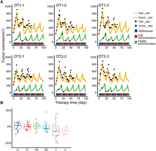
Figure 4 The distribution of the outcome of the filtered fixed periodic plans. Boxplot of the outcome of the O-W-F-W plans and O-F-W plans in four competitive cases. The black horizontal line was the outcome of the standard of care in the corresponding competitive case.
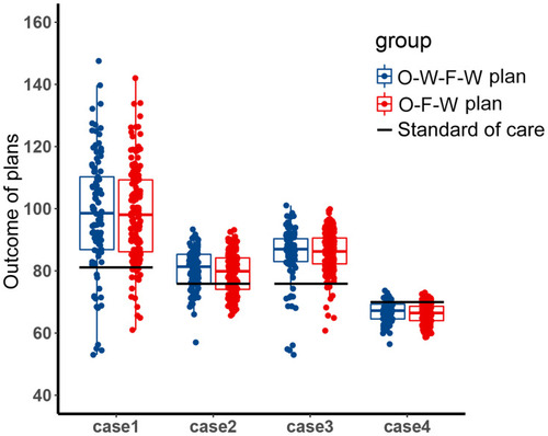
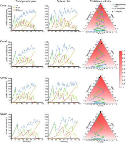
Figure 5 The performance of fixed periodic plan and optimal plan. The four rows in the figure represent the four competition cases described in the methods. Each row includes the tumor subpopulation content varies with time of fixed periodic plan from start to the endpoint (left), the tumor subpopulation content varies with time of optimal plan from start to the end point (middle), the tumor composition of these two plans and the relative evolutionary velocity of resistant subpopulation (right).