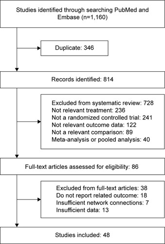
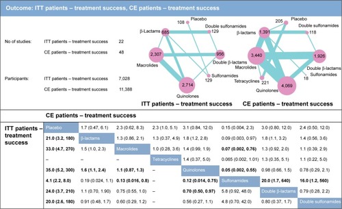
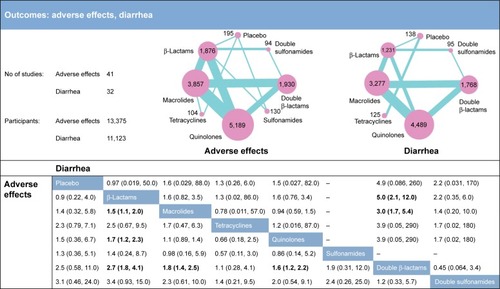
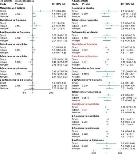
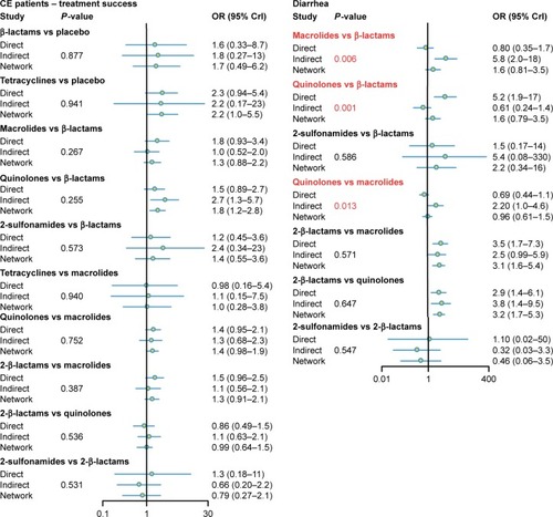
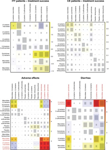
64
Views
3
CrossRef citations to date
0
Altmetric
Original Research

Network meta-analysis of success rate and safety in antibiotic treatments of bronchitis

, , &
Pages 2391-2405 | Published online: 09 Aug 2017

Figures & data

Table 1 Study and patient characteristics

Figure 1 Flow diagram of literature search.

Figure 1 Flow diagram of literature search.

Figure 2 Network meta-analysis results for the endpoints of ITT patient treatment success and CE patient treatment success rates. The network plots show direct comparison of different therapies, with node size corresponding to sample size. The number of included studies for specific direct comparison governs the thickness of solid lines. ORs with 95% CrIs are applied to evaluate the efficacy outcomes. Note that in the upper half of the table, column treatments are compared against row treatments, whereas in the lower half of the table, row treatments are compared against column treatments. Bold data represents significant results.

Abbreviations: ITT, intention-to-treat; CE, clinically evaluable; OR, odds ratio; CrI, credible interval.

Figure 2 Network meta-analysis results for the endpoints of ITT patient treatment success and CE patient treatment success rates. The network plots show direct comparison of different therapies, with node size corresponding to sample size. The number of included studies for specific direct comparison governs the thickness of solid lines. ORs with 95% CrIs are applied to evaluate the efficacy outcomes. Note that in the upper half of the table, column treatments are compared against row treatments, whereas in the lower half of the table, row treatments are compared against column treatments. Bold data represents significant results.Abbreviations: ITT, intention-to-treat; CE, clinically evaluable; OR, odds ratio; CrI, credible interval.

Figure 3 Network meta-analysis results for the endpoints of adverse effects and diarrhea. The network plots show direct comparison of different therapies, with node size corresponding to sample size. The number of included studies for specific direct comparison governs the thickness of solid lines. ORs with 95% CrIs are applied to evaluate the efficacy outcomes. Note that in the upper half of the table, column treatments are compared against row treatments, whereas in the lower half of the table, row treatments are compared against column treatments. Bold data represents significant results.

Abbreviations: OR, odds ratio; CrI, credible interval.
Figure 3 Network meta-analysis results for the endpoints of adverse effects and diarrhea. The network plots show direct comparison of different therapies, with node size corresponding to sample size. The number of included studies for specific direct comparison governs the thickness of solid lines. ORs with 95% CrIs are applied to evaluate the efficacy outcomes. Note that in the upper half of the table, column treatments are compared against row treatments, whereas in the lower half of the table, row treatments are compared against column treatments. Bold data represents significant results.

Figure 4 Node-splitting results for ITT patient treatment success, CE patient treatment success, adverse effects, and diarrhea.

Abbreviations: ITT, intention-to-treat; CE, clinically evaluable; OR, odds ratio; CrI, credible interval.

Figure 4 Node-splitting results for ITT patient treatment success, CE patient treatment success, adverse effects, and diarrhea.Abbreviations: ITT, intention-to-treat; CE, clinically evaluable; OR, odds ratio; CrI, credible interval.

Figure 5 Net heat plot. The size of the gray squares indicates the contribution of direct evidence (shown in the column) to the network evidence (shown in the row). The colors are associated with the change in inconsistency between direct and indirect evidence (shown in the row). Blue colors indicate an increase of inconsistency and warm colors indicate a decrease.

Abbreviations: ITT, intention-to-treat; CE, clinically evaluable.
Figure 5 Net heat plot. The size of the gray squares indicates the contribution of direct evidence (shown in the column) to the network evidence (shown in the row). The colors are associated with the change in inconsistency between direct and indirect evidence (shown in the row). Blue colors indicate an increase of inconsistency and warm colors indicate a decrease.

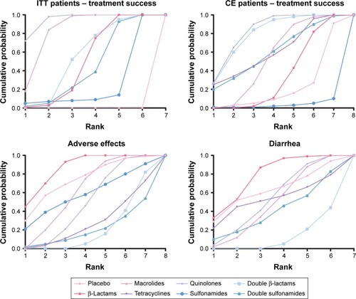
Table 2 Surface under the cumulative ranking curve (SUCRA) results

Figure 6 SUCRA results.

Abbreviations: ITT, intention-to-treat; CE, clinically evaluable; SUCRA, surface under the cumulative ranking curve.

Figure 6 SUCRA results.Abbreviations: ITT, intention-to-treat; CE, clinically evaluable; SUCRA, surface under the cumulative ranking curve.

Figure 7 Clustered ranking plot of the network. The plot is based on cluster analysis of SUCRA values. Each plot shows SUCRA values for two outcomes: ITT patient treatment success, CE patient treatment success, adverse effects, and diarhoea. Each color represents a group of treatments which belongs to the same cluster. Treatments lying in the upper right corner are more effective and safer than the other treatments.

Abbreviations: ITT, intention-to-treat; CE, clinically evaluable; SUCRA, surface under the cumulative ranking curve.
Figure 7 Clustered ranking plot of the network. The plot is based on cluster analysis of SUCRA values. Each plot shows SUCRA values for two outcomes: ITT patient treatment success, CE patient treatment success, adverse effects, and diarhoea. Each color represents a group of treatments which belongs to the same cluster. Treatments lying in the upper right corner are more effective and safer than the other treatments.