Figures & data
Table 1 Comparison Between COPD Subjects with and without Severe Hypoxemia
Figure 1 Distribution of PaO2 (A) and relationships between PaO2 and PaCO2 (B). 887 COPD subjects were included. Values are in mmHg.
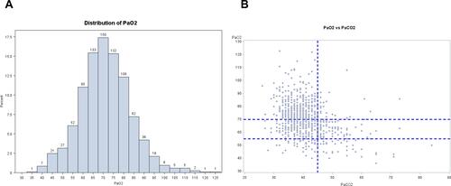
Figure 2 Relationships between PaO2 and FEV1, and distribution of COPD subjects for severe hypoxemia and severe airflow limitation. 887 COPD subjects were included. High PaO2/high FEV1 are in the right and upper part of the graph. High PaO2/low FEV1 are in the left and upper part of the graph. Low paO2/high FEV1 are in the right and lower part of the graph. Low PaO2/high FEV1 are in the left and lower part of the graph. Values are in mmHg or %.
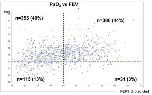
Table 2 Comparison Between COPD Subjects with and without Severe Hypoxemia, with or without Severe Airflow Obstruction
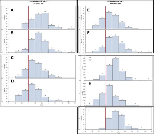
Figure 3 Repartition of PaO2 according to GOLD stage 2007 1 to 4 (A–D, respectively) or according to CART classification 1 to 5 (E–I, respectively) (with a cut-off at 60 mmHg, (8)). 887 COPD subjects were included.