Figures & data
Table 1 The Differentially Expressed FRGs in COPD Group Compared with Normal Group
Figure 1 Flow chart.
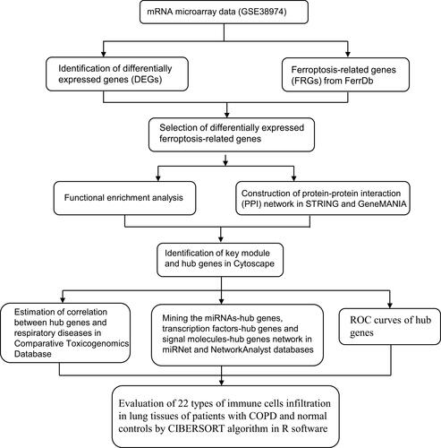
Figure 2 Identification of differentially expressed ferroptosis-related genes (FRGs). (A) The principal component analysis (PCA) plot of samples in GSE38974. (B) Venn diagram of GEO2R result and FRGs. (C) Volcano plot of differential genes between COPD and normal groups. The top five genes were labelled (upregulated-IL6, ATM and TNFAIP3, downregulated-IL33 and TNFBR1). (D) Heatmap of 15 differentially expressed FRGs.
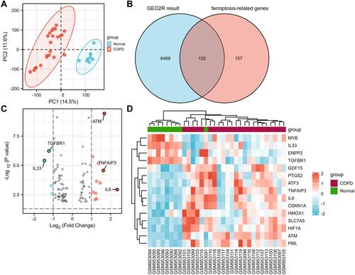
Figure 3 Expression and correlation of differentially expressed FRGs. (A) Box plot of 15 differentially expressed FRGs in COPD group compared with normal group. The significance markers are shown as: *, P<0.05; **, P<0.01; ***, P<0.001. (B) Heatmap of correlation of 15 differentially expressed FRGs.
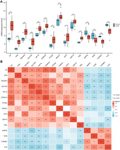
Table 2 The Most Significant Terms of GO and KEGG Enrichment Analyses
Figure 4 GO and KEGG enrichment analyses of differentially expressed FRGs. (A) Lollipop plot of significant terms. (B) Circular network of significant terms and genes. Blue nodes represent terms, red nodes represent genes, and connecting lines represent the relationship between terms and genes. (C) Bubble plot of significant terms combined with logFC. A Z-score greater than zero indicates positive regulation, a Z-score less than zero indicates negative regulation, and absolute value of Z-score represents the probability of regulation. (D) Donut plot of significant terms combined with logFC. Each column of the inner circle corresponds to one term, the height of column represents adjusted P value, and the filled color represents Z-score of each term.
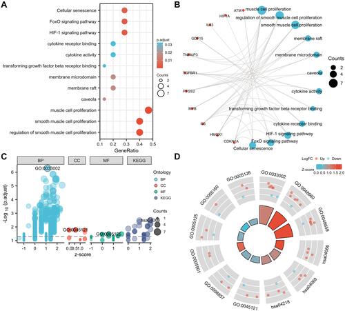
Figure 5 PPI network, key module and hub genes of differentially expressed FRGs. (A) The PPI among 15 differentially expressed FRGs. (B) The interaction number of each differentially expressed FRG. (C) Key module of the PPI network screened by MCODE plugin. (D) Hub genes screened by cytoHubba plugin. (E) The overlap of predicted hub genes.
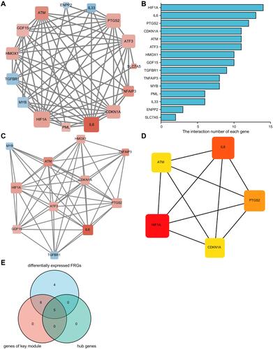
Figure 6 The correlations between hub genes and respiratory tract diseases in comparative toxicomics database.
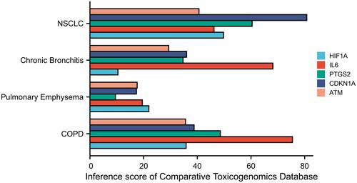
Figure 7 The interaction network of hub genes in miRNet and network Analyst. (A) The network of hub genes with miRNAs. (B) The network of hub genes with transcription factors. The fuchsia nodes represent hub genes and the green nodes represent transcription factors. The five transcription factors that connect with at least four hub genes are labelled. (C) The network of hub genes with signal molecules. The signal molecules that connect with at least two hub genes are labelled. (D) The predicted lncRNA-miRNA-hub gene regulatory network. Yellow diamonds represent lncRNAs, green ellipses represent miRNAs, and blue rectangles represent hub genes.
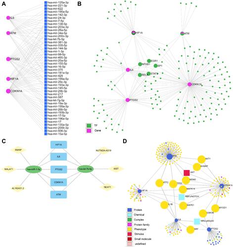
Figure 8 The receiver operating characteristic (ROC) curves of hub genes. (A) ROC curve of HIF1A. (B) ROC curve of IL6. (C) ROC curve of PTGS2. (D) ROC curve of CDKN1A. (E) ROC curve of ATM. (F) ROC curve of five genes combination.
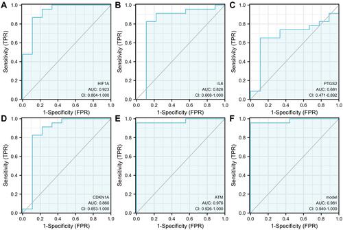
Figure 9 Immune infiltration of COPD lung tissues compared with normal tissues. (A) Stack bar chart of proportions of the immune cells infiltration. (B) Box plot of proportions of the immune cells infiltration. The significance markers are shown as: ns, P>0.05; *, P<0.05; **, P<0.01; ***, P<0.001.
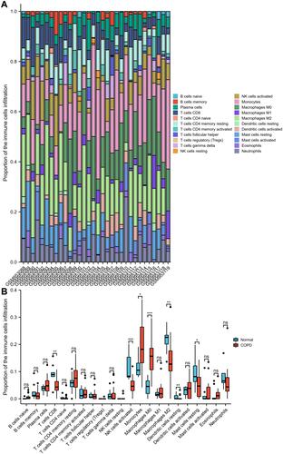
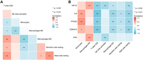
Figure 10 Differentially infiltrated immune cells and hub genes. (A) Heatmap of correlations of differentially infiltrated immune cells. (B) Heatmap of correlations of hub genes with differentially infiltrated immune cells. The significance markers are shown as: *, P<0.05; **, P<0.01.