Figures & data
Figure 1 PRISMA 2009 Flow Diagram.
Notes: PRISMA figure adapted from Moher D, Liberati A, Tetzlaff J, Altman DG, The PRISMA Group (2009). Preferred Reporting Items for Systematic Reviews and Meta-Analyses: The PRISMA Statement. PLoS Med 6(7): e1000097. 72.
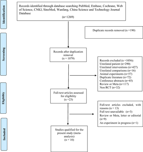
Table 1 Characteristics of Included Studies
Table 2 GRADE Evaluation Results
Figure 2 (A) Summary of risk of bias for each included study. (B) bar graph of the risk of bias showing the percentage of risk level for each characterized risk. Each color represents a different level of bias: red for high risk, green for low risk, and yellow for unclear risk of bias.
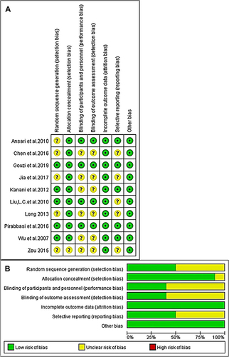
Figure 3 FEV1% in lung function.
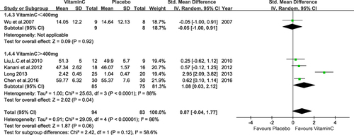
Figure 4 Sensitivity Analysis FEV1%.
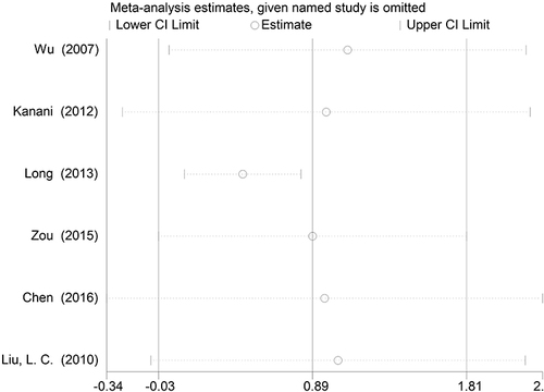
Figure 5 FEV1/FVC in lung function.
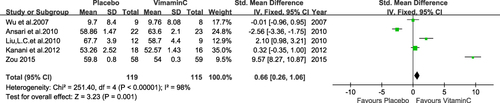
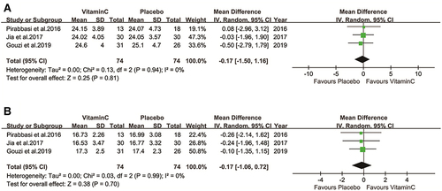
Figure 6 Vitamin C level in serum.
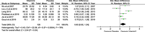
Figure 7 Serum vitamin E level.
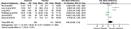
Figure 8 GSH level in serum in COPD patients.
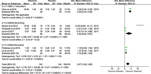
Figure 9 Enzymatic antioxidants of lungs.
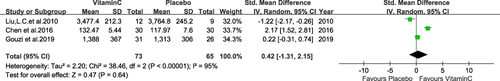
Figure 10 Nutrition levels (A, B).