
Figures & data
Figure 1 Flow-chart describing the flow of included patients through the randomized design and data collection procedure. The flow-chart shows the patient-flow through the randomized design. It illustrates, on a day-to-day timeline, the inclusion of patients within first 48 hours of hospitalization and the randomization allocating patients to either the intervention or control group. In the intervention group, patients receive oxygen treatment by the device designed for Automated Oxygen Administration. In the control group, patients receive manual nurse-administered oxygen treatment. The intervention lasted a minimum of 4 hours and a maximum of three days and 21 hours or until patients were back on LTOT flow or without a need of oxygen supplementation. The procedures for data collection are shown at the bottom of the illustration. Patient Reported Outcome Measures (PROMs) are collected at inclusion (baseline) and by the end of intervention.
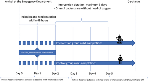
Figure 2 The construct, dimensions, and domains of the Multidimensional Dyspnea Profile. *Additional descriptors (ie items) for SQ or A2 can be added if needed, using the same numerical rating scale and anchor statements for responses. The SQ descriptor Choices and the additional descriptors or emotions are also part of the MDP but are not incorporated in the domain scoring.
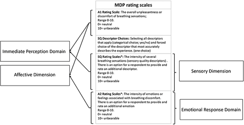
Figure 3 Consort flow-chart of inclusion. Consort flow-chart of inclusion showing number of patients (n) assessed for eligibility, randomization, allocation, and completion for analysis of the primary outcome on the MDP.
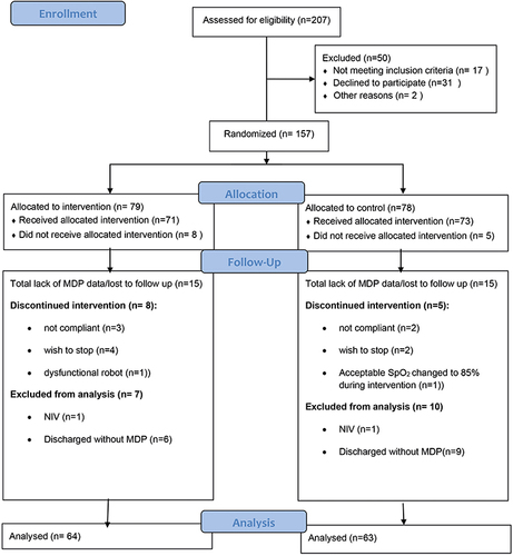
Table 1 Characteristics of the Included Patients, n=157
Table 2 Baseline Symptom Scores are Given in Medians and Inter Quartile Ranges (IQR) and Fixed Daily Dose of Drugs in mg are Given in Mean (SD)
Figure 4 Fraction of time with different saturation levels. The figure shows the fraction of time spent with severe hypoxemia, hypoxemia, normoxemia, and hyperoxemia for the intervention group (O2matic, blue color) and the control group (manual oxygen administration, red color) respectively, with p-values for the difference between the groups.
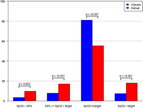
Figure 5 Spaghetti plots. The figures illustrate the within group difference in overall unpleasantness on the A1 scale for the intervention group (black spaghetti plot) and the control group (red spaghetti plot). Dashed lines represent patterns of change, that may include more than one patient ID, and bolded/fat lines illustrates the median within group difference between baseline and follow up.
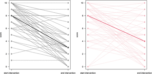
Table 3 Data are shown as medians with Inter Quartile Ranges [IQR].
Table 4 Reflection of Patients' Answers to the SQ Descriptor Choice Shown in : The Construct, Dimensions, and Domains of the Multidimensional Dyspnea Profile