Figures & data
Figure 1 Flowchart of the screening process.
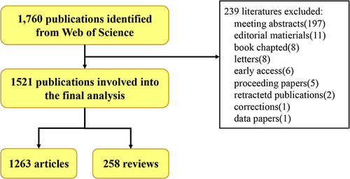
Figure 2 Annual Trend of Research Publication Quantity. (A) Curve fitting of the of the total annual growth trend of publications (R2 = 0.8453). (B) The number of publications by year over the past 10 years.
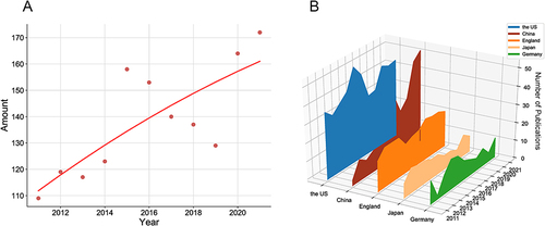
Table 1 Publications in the 10 Most Productive Countries/Regions
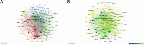
Figure 3 The mapping on co-authorship counties/regions networks. (A) Counties/regions co-authorship network visualization map. Clusters are grouped by the frequency of shared co-occurrence terms that represent each country. Closely related terms are grouped into the same cluster with the same color. The size of each circle represents the number of publications a country has produced, with more publications generating a larger circle. The line between the two points in the figure represents those two countries/regions had established a similar relationship. The thicker the line, the closer the link between the two countries/regions. (B) Countries/regions co-authorship overlay visualization map. The color of each node is based on its average publication year. Counties/regions in yellow appeared later than those in blue.
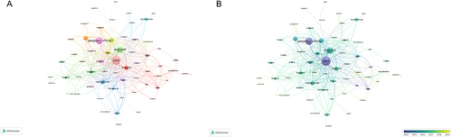
Table 2 Publications in the Top 10 Most Productive Institutions
Table 3 The Top 10 Authors with the Most Publication
Table 4 The Top 10 Co-Citation Authors
Figure 4 The mapping on co-cited authors networks. The relevance of authors is determined by the number of times that their articles are referenced by the same article. The same color represents authors who are within the same topic of interest. The size of each circle represents the number of citations of the author, with more citations generating a larger circle. The thickness of the connecting line indicates the strength of the link.
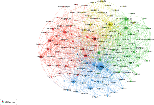
Table 5 The Top 10 Journals with the Most Publications
Table 6 The Top 10 Cited Articles
Table 7 The Top 10 Cited Reviews
Figure 5 The yearly number of local citations of papers with high local citations (LCS). The size and colors of the circle represent the LCS of papers.
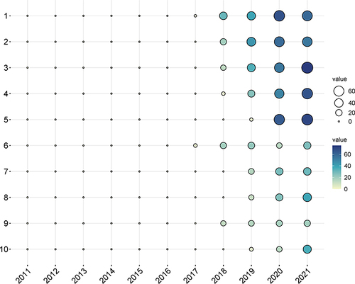
Figure 6 The mapping on keywords of research of macrophages associated with chronic obstructive pulmonary disease over the past 11 years. (A) The 132 keywords, which occurred more than 19 times among 5666 keywords, were divided into five clusters by different colors: cluster 1: red, cluster 2: green, cluster 3: blue, cluster 4: yellow, and cluster 5: purple. The size of the nodes represents the frequency of occurrences. The color of an item is determined by the cluster to which the item belongs. The thickness of the connecting line indicates the strength of the link. (B) Visualization of keywords according to the average publication year. Keywords in yellow appeared later than those in blue.