Figures & data
Figure 1 (A and B) Volcano plot of differentially expressed genes (DEGs) from dataset GSE5058 and GSE38974. The abscissa is log2(fold change) and the ordinate is -log10(p-value). Red dots represent up-regulated genes in this group, blue dots represent down-regulated genes in this group, and black dots represent non-significant DEGs. (C) Venn diagram of DEGs. The sum of the numbers in each circle represents the total number of differential genes in the comparison group, and the overlapping part of the circle represents the common differential genes between the two comparison groups.
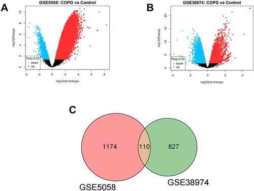
Figure 2 Functional enrichment analysis of differentially expression genes. (A) Histogram of Gene Ontology (GO) analysis. (B) Bubble plot of GO analysis. The color depth of the node represents the corrected p-value, and the size of the node refers to the number of genes involved. (C) Histogram of Kyoto Encyclopedia of Genes and Genomes (KEGG) analysis. (D). Bubble plot of KEGG analysis.
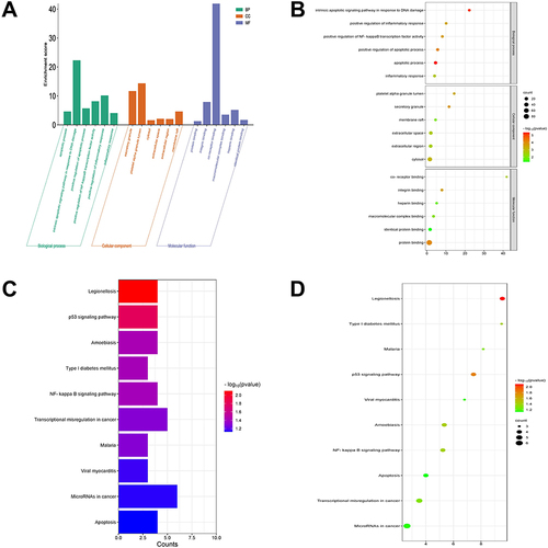
Figure 3 (A) Ridgeline plot of hub genes. The x-axis represents gene expression levels, and the shape of the peak represents the dispersion of data in a group, with the height representing the number of samples corresponding to the gene expression level. (B) Principal component analysis (PCA) plot of hub genes. The coordinate axes PC1 and PC2 represent the first and second principal components (ie, the explanation rates of latent variables for differences); points represent samples, with different colors indicating different groups. (C) Matrix correlation analysis of hub genes. Matrix analysis is used to perfectly display the correlation of genes between matrices and visualize them. Asterisk indicators (*, **, ***, ****) indicate a gradually increasing correlation. The red circles represent the greatest correlation.
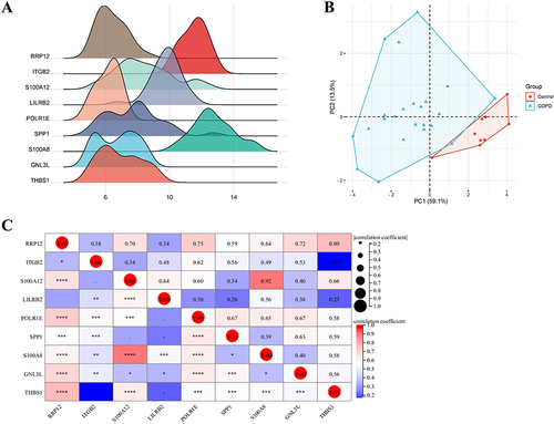
Figure 4 Receiver operating characteristic (ROC) analysis curves for GNL3L, ITGB2, LILRB2, POLR1E, RRP12, S100A8, S100A12, SPP1 and THBS1. The x-axis represents the false positive rate and the y-axis represents the true positive rate, while the expression values of the genes in the sample data are shown.
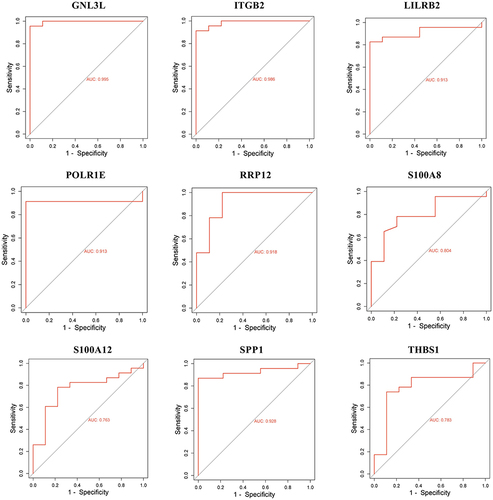
Figure 5 RT-qPCR was performed to detect the mRNA expression levels of GNL3L, ITGB2, LILRB2, POLR1E, RRP12, S100A8, S100A12, SPP1 and THBS1 in mouse tissues. ***p < 0.001 compared with the Control group.
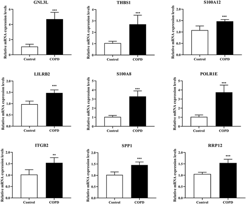
Figure 6 (A) RT-qPCR detection of GNL3L expression. (B) Lung injury score. (C) Lung Wet/Dry weight ratio. (D) Representative images of lung tissue with Hematoxylin-eosin staining in each group (magnification: 200×; scale bar: 100 μm). (E) Mean linear intercept (MLI) of alveolar in lung tissues. Compared with the Control group, **p<0.01, ***p<0.001; compared with the LV-NC group, #p<0.05, ##p<0.01, ###p<0.001.
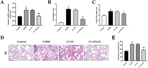
Figure 7 ELISA was executed to detect the expression of inflammatory factors (A) and oxidative stress-related factors (B). (C) Western blot was performed to detect the expression of ATM/p53 pathway-related proteins in the tissues. Compared with the Control group, **p<0.01; compared with the LV-NC group, #p<0.05, ##p<0.01.
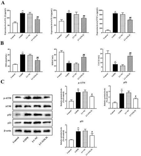
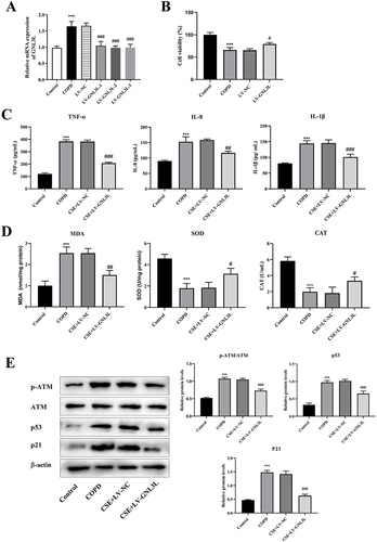
Figure 8 (A) RT-qPCR detection of LV-GNL3L transfection efficiency. (B) CCK8 was used to detect cell viability. (C) ELISA was used to detect the contents of inflammatory factors (IL-1β, IL-8 and TNF-α). (D) ELISA was performed to detect oxidative stress indicators (MDA, SOD, CAT). (E) Western blot was applied to detect the protein expression of ATM/p53 pathway-related proteins. Compared with Control group, ***p<0.001, compared with LV-NC group, #p<0.05, ##p<0.01, ###p<0.001.