Figures & data
Table 1 Patient Baseline Characteristics Table
Figure 1 Patients inclusion flowchart.
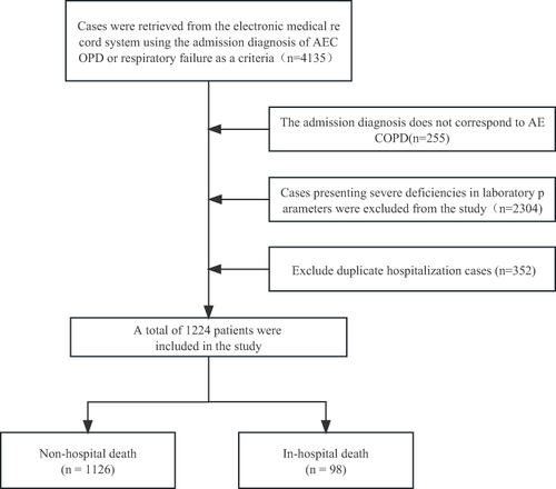
Table 2 Model A
Figure 2 The vertical axis in the figure represents the values of the coefficients, the top horizontal axis represents the number of non-zero coefficients in the model, and each line represents a variable (A). The vertical axis represents the cross-validationerror, and the top horizontal axis corresponds to the number of variables for different λ values. The dashed line on the left corresponds to the number of variables corresponding to the minimum standard error, while the dashed line on the right corresponds to the number of variables corresponding to 1 times the standard error (B).
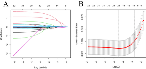
Figure 3 ROC of model A (A) and model B (B).
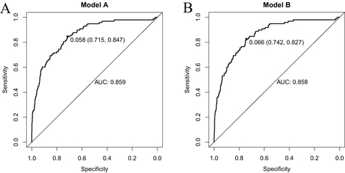
Figure 4 The gray line in the middle of the chart (45-degree diagonal line) represents the ideal curve, the solid black line represents the curve of the current model, and the dashed line represents the calibration curve. It can be seen from the figure that the fitting line of the calibration curve of Model B is very close to the ideal line, indicating good model fit (A and B).
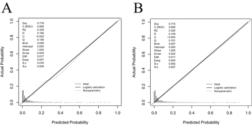
Figure 5 The x-axis represents the threshold probability, and the y-axis represents the net benefit. The red solid line represents the column chart model. The decision curve indicates that both result in a similar peak net benefit for patients, with a threshold probability of 2–92% for Model A, and 2–72% for Model B.
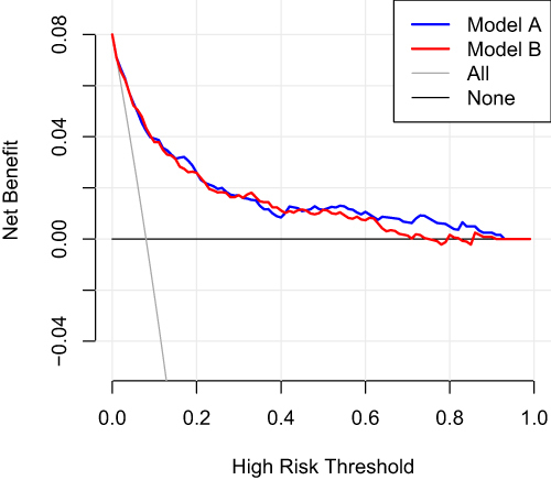
Table 3 Model B
Figure 6 Figure 6 shows the internal validation of Model B using the bootstrap method, with the blue shaded area indicating the estimated 95% confidence interval.
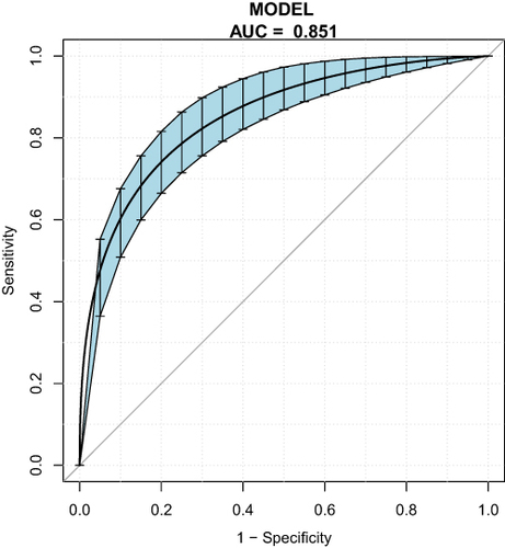
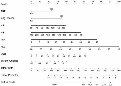
Figure 7 This figure shows the nomogram model established in this study for predicting in-hospital mortality risk of AECOPD patients. The top section corresponds to the predicted scores for different variable values, while the middle section represents the predictive factors. By assigning values based on the patient’s clinical data, the total assigned score corresponds to the predicted probability of in-hospital mortality at the bottom. The larger the total score, the higher the in-hospital mortality risk for AECOPD patients.