Figures & data
Figure 1 Comparison of body weight of mice in group C and group T. Data were presented as the mean±standard deviation, *p<0.05 vs group C.
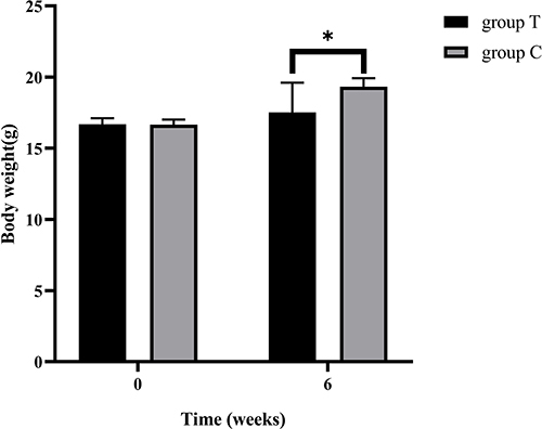
Figure 2 The score plots from OPLS-DA mode. (A) Plasma OPLS-DA score plots in positive and negative modes of the group C and group T. (B) Skin OPLS-DA score plots in positive and negative mode of the group C and group T.
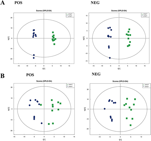
Figure 3 The proportion of identified plasma metabolites in each chemical classification.
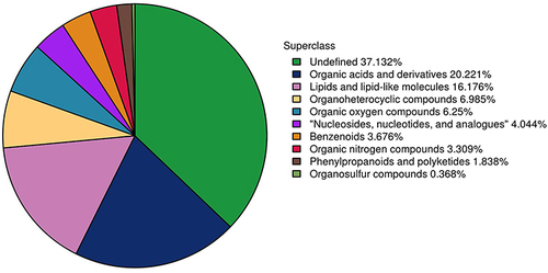
Figure 4 Correlation heatmap and hierarchical clustering heatmap. (A) correlation heatmap analysis of differential metabolites in plasma in positive mode. (B) correlation heatmap analysis of differential metabolites in plasma in negative mode. (C) Hierarchical clustering heatmap of 38 differential plasma metabolites between group C and group T.
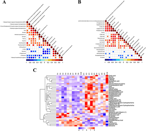
Figure 5 ROC curves for potential plasma biomarkers with VIP values in the top 10.
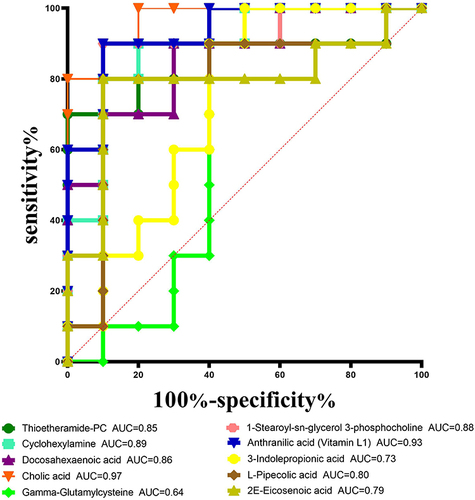
Figure 6 Statistics of KEGG enrichment in plasma. The x axis indicates the rich factor(number of significantly differentiated metabolites/total metabolites in this pathway), and the y axis indicates name of the KEGG metabolic pathway. The size and color of bubbles represent the number of metabolites and the p-value, respectively.
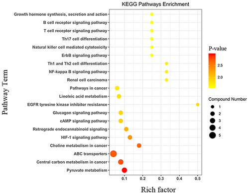
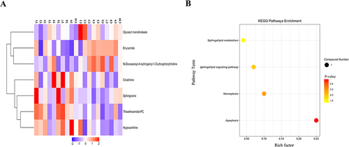
Figure 7 Hierarchical clustering heatmap and KEGG enrichment analysis chart in skin. (A) Hierarchical clustering heatmap of 7 differential metabolites in skin. (B) Statistics of KEGG enrichment in skin. The x axis indicates the rich factor corresponding to each pathway, and the y axis indicates name of the KEGG metabolic pathway. The size and color of bubbles represent the number of metabolites and the p-value, respectively.