Figures & data
Figure 1 The levels of MOTS-c and experimental behavioral results of mice in different groups (n=7).
Notes: (A) Determination of levels of MOTS-c by ELISA in different groups. (B–G) Experimental behavioral results in different groups. (B) Time spent by mice on the beam in the balance beam test (BBT). (C) scores of mice in the BBT test. (D) Representative trajectory plot of the mice in the Morris water maze (MWM). (E) Time spent by mice in the target quadrant in the MWM test. (F) Representative trajectory plot of the mice in the open field test (OFT). (G) Total distances traveled by mice in the OFT test (All data were expressed as mean ± SD. *p<0.05; **p<0.01).
Abbreviations: CON, control; MOTS-c, mitochondrial open reading frame of the 12S rRNA-c; TBI, traumatic brain injury.
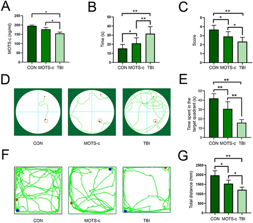
Figure 2 Transcriptomics analysis of MOTS-c VS TBI groups (n=3).
Notes: (A) PCA of transcriptome profiles separated the MOTS-c and TBI groups. (B) Hierarchical clustering based on the DEGs. Red and green represent up-regulation and down-regulation, respectively. (C) Volcano plot of the DEGs. The red and blue points represent the up-regulated and down-regulated genes, respectively (DEGs: |log2FC|≥1 and q<0.05).
Abbreviations: MOTS-c, mitochondrial open reading frame of the 12S rRNA-c; TBI, traumatic brain injury.
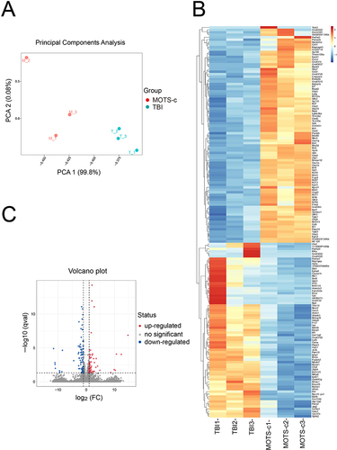
Figure 3 GO terms and KEGG pathway analyses of the DEGs (n=3).
Notes: (A) The enriched GO terms of the DEGs in cellular component, biological process and molecular function. (B) KEGG pathway enrichment analysis of the DEGs. Color represents q value and bubble size represents the number of genes enriched.
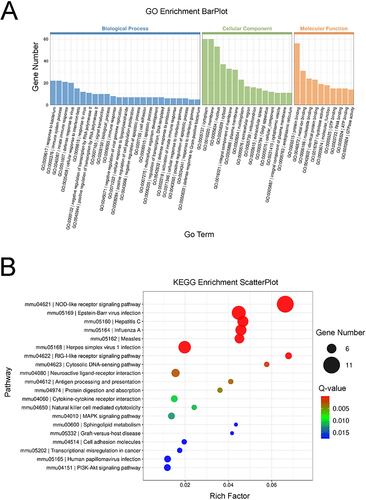
Figure 4 Metabolomics analysis of MOTS-c VS TBI groups (n=7).
Notes: (A) Score scatter plot of the OPLS-DA model. (B) Volcano plot. The red and blue points represent the up-regulated and down-regulated metabolites, respectively. The bubble size represents the VIP value. (C) Heatmap of hierarchical clustering analysis for the MOTS-c and TBI groups. Red and blue represent up-regulation and down-regulation, respectively (DEMs: VIP>1.0 and p<0.05).
Abbreviations: MOTS-c, mitochondrial open reading frame of the 12S rRNA-c; TBI, traumatic brain injury.
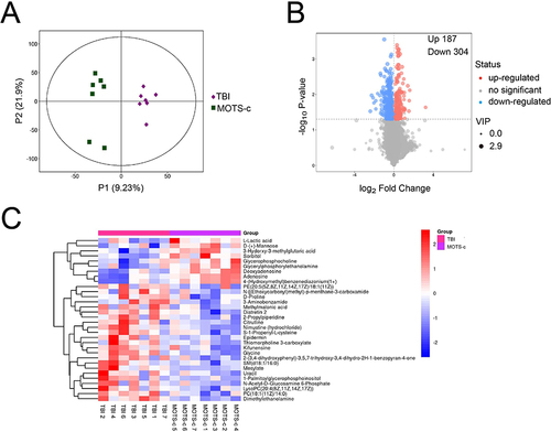
Figure 5 Pathway analysis of the DEMs (n=7).
Notes: (A) KEGG Classification of the TBI and MOTS-c groups. (B) Bubble plot of the MOTS-c and TBI groups. Color represents p value and bubble size represents the pathway impact.
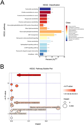
Figure 6 Integrated analysis of metabolomics and transcriptomics data.
Notes: (A) Venn plot of metabolomics and transcriptomics. The red and blue circles represent the enriched pathways of metabolomics and transcriptomics, respectively. The purple represents the enriched pathways involving both the transcriptome and metabolome. (B) The correlations of DEGs and DEMs by Spearman algorithm. Red and green represent the positive and negative correlation, respectively. The color labels represent Spearman correlation coefficient values. (C) KEGG pathway enrichment of differential genes and metabolites. The red and blue bars represent the metabolites and genes, respectively. Numbers represent the number of DEMs and DEGs involved in this pathway, respectively.
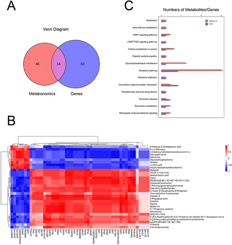
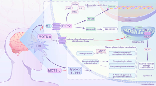
Figure 7 The possible neuroprotective mechanism by MOTS-c in the TBI mice.
Notes: down-regulation: MIF, RIPK1, TNF-α, IL-1, IL-6, IFN-γ, Ndufs7, ROS, Chat, Glycerophospholipid metabolism; up-regulation: retrograde endocannabinoid signaling pathway.