
Figures & data
Table 1 Demographic and baseline characteristics for the 21 children
Figure 1 Distribution of Attention Deficit/Hyperactivity Disorder Rating Scale (ADHD RS-IV) scores of the 21 patients before (screening and baseline), at the end (visit 3), and after stopping the treatment (visit 4).
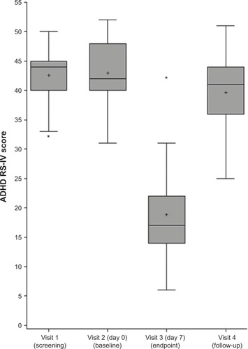
Figure 2 Distribution of Conners’ Parent Rating Scale – Revised: Long (CPRS-R:L) of the 21 patients before (screening and baseline), at the end (visit 3), and after stopping the treatment (visit 4).
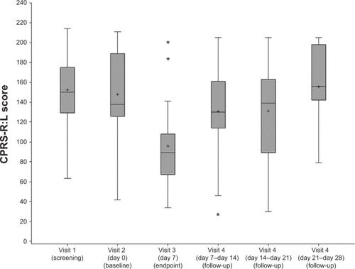
Figure 3 Distribution of Clinical Global Impression – Severity (CGI-S) score of the 21 patients before (screening and baseline), at the end (visit 3), and after stopping the treatment (visit 4).
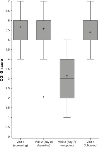
Table 2 Clinical Global Impression – Improvement scores after 1 week of mazindol (1 mg/day) in the 21 patients
Figure 4 Individual observed plasma concentrations of mazindol (ng/mL) versus time.
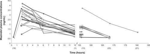
Figure 5 Diagnostic goodness-of-fit plots for the pharmacokinetic model of mazindol.
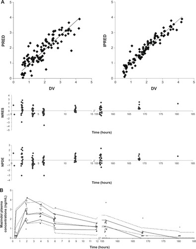
Table 3 Population pharmacokinetic parameters of mazindol estimated in 21 children: basic model with no covariates, final model, and associated bootstrap results