Figures & data
Figure 1 Shows the flow chart of inclusion and exclusion of records.
Note: The flow chart is adapted from Page MJ, McKenzie JE, Bossuyt PM, et al. The PRISMA 2020 statement: an updated guideline for reporting systematic reviews. BMJ. 2021:n71. Creative Commons.Citation21
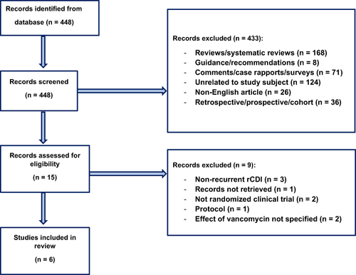
Table 1 Shows the results for All Included Studies
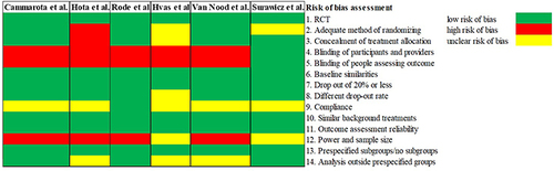
Figure 2 Shows the risk of bias assessment on criteria 1–14 (refer to Supplementary Document 2). For each study, criteria with low risk of bias are colored green, high risk of bias are colored red, and unclear risk of bias are colored yellow.