Figures & data
Table 1 Demographic and Clinical Characteristics of Study Population in the Derivation and Validation Cohorts
Figure 1 Flow diagram of study design.
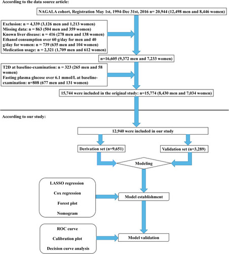
Table 2 Risk Factors of Type 2 Diabetes According to the LASSO Regression Model in Non-Obese Adults
Figure 2 Demographic and clinical feature selection using the LASSO regression model. (A) 10-fold cross-validation via minimum criteria was applied for optimal parameter (lambda) selection through LASSO model. Partial likelihood deviance (binomial deviance) curve was schemed versus log (lambda). Dotted vertical lines were drawn at the optimal values by using the minimum criteria and 1 SE of the minimum criteria (the 1-SE criteria). (B) LASSO coefficient profiles of the 19 features. A coefficient profile plot was produced against the log (lambda) sequence. Vertical line was generated at the value selected by 10-fold cross-validation, where optimal lambda resulted in six features with nonzero coefficients.
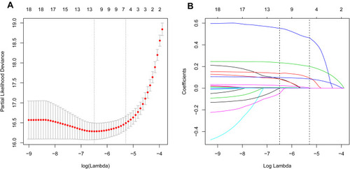
Figure 3 Forest plot of the HR of the selected feature. Use forest plot to visualize multivariate Cox regression analysis.
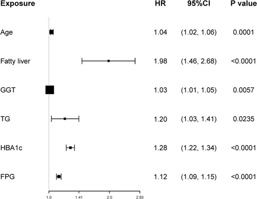
Figure 4 Nomogram for predicting the 5-year risk of T2D in non-obese adults. To use the nomogram, find the position of each variable on the corresponding axis. A vertical line was drawn from that value to the top points scale to determine the number of points that were assigned by that variable value. Then, the points from each variable value were added. Finally, draw a line from the total point axis to estimate the 5-year risk of T2D at the lower line of the nomogram.
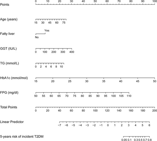
Table 3 C-Index in the Nomogram on Derivation Cohort and Validation Cohorts
Figure 5 Time-dependent receiver-operating characteristic (ROC) curves of the model in the derivation and validation cohort. (A) Time-dependent ROC curve of the model in the derivation cohort. (B) Time-dependent ROC curve of the model in the validation cohort. The solid and dashed lines depict the AUC and random chance, respectively. *Using bootstrap resampling (times = 1000).
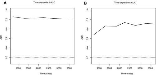
Figure 6 Calibration curves for the derivation and validation cohort models. (A) Calibration curve of the model in the derivation cohort. (B) Calibration curve of the model in the validation cohort. The red solid line represents an ideal predictive model, and the solid black line shows the actual performance of the predictive model. The yellow shadow represents 95% confidence interval. The calibration curves showed a good correlation between the predicted probability and actual probability. *Using bootstrap resampling (times = 1000).
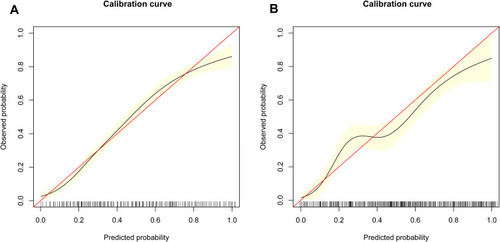
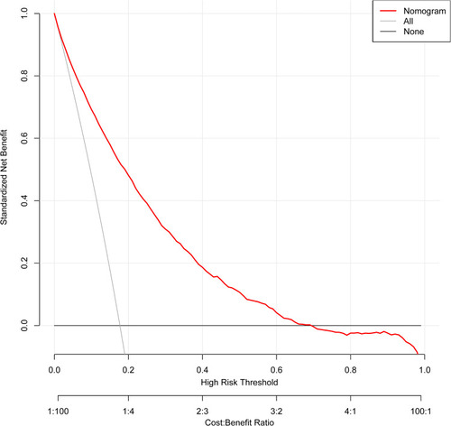
Figure 7 The Decision curve analysis of the nomogram in the whole cohort. Net benefit was produced against the high risk threshold. The black line represents the net benefit when none of the participants are considered to develop diabetes, while the light gray line represents the net benefit when all participants are considered to develop diabetes. The area between the “no treatment line” (black line) and “all treatment line” (light gray line) in the model curve indicates the clinical utility of the model. The farther the model curve is from the black and light gray lines, the better the clinical use of the nomogram. *Using bootstrap resampling (times = 1000).