Figures & data

Table 1 Baseline Clinical Characteristics of the Derivation Cohort
Table 2 Predictors Identified by Univariate Cox Regression Analysis
Figure 1 Forest plots of the predictors selected by multivariate Cox analysis in the derivation cohort. (A) Results of the multivariate Cox regression analysis of the derivation cohort; (B) the multivariate regression results after continuous variables transformed into categorical variables in the derivation cohort. aRepresented the level of ALB was between 25 and 35 g/L; brepresented the level ALB level was less than 25 g/L. Red squares and horizontal bars represent the overall estimates and 95% CIs.
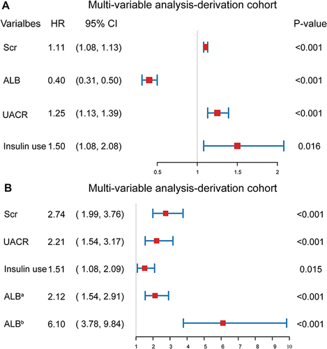
Figure 2 A nomogram of the final prediction model.
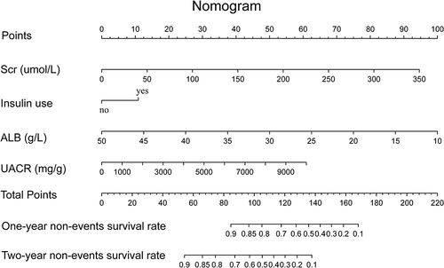
Table 3 A Simple Risk Table of the Final Prediction Model
Figure 3 Restricted cubic spline (RCS) curves of the continuous variables involved in the final model.
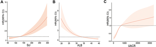
Figure 4 Receiver operating characteristic (ROC) curve for the nomogram and the risk table. The solid blue line represented the derivation cohort, and the solid red line represented the validation cohort. (A) ROC curve for the nomogram. The AUC and its 95% CI were 0.791 (0.762–0.820) in the derivation cohort and 0.793 (0.746–0.840) in the validation cohort; (B) ROC curve for the risk table. The AUC and its 95% CI were 0.764 (0.731–0.797) in the derivation cohort and 0.763 (0.714–0.812) in the validation cohort.
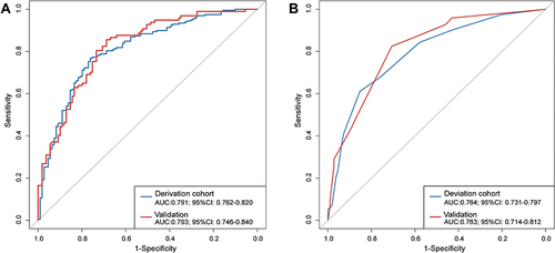
Figure 5 The calibration curves for the nomogram and the risk table in the derivation and validation cohort. (A) The calibration curves for the nomogram in the derivation cohort; (B) the calibration curves for the nomogram in the validation cohort; (C) the calibration curves for the risk table in the derivation cohort; (D) the calibration curves for the risk table in the validation cohort. The calibration plot showed the agreement between the predicted probability (x-axis) and the actual probability (y-axis) of the 24-month risk of the study outcomes. A perfect prediction would correspond to the 45° grey dotted line. Spike histograms on the top of each picture reflected the number of T2DKD patients with a predicted probability corresponding to the x-axis value.
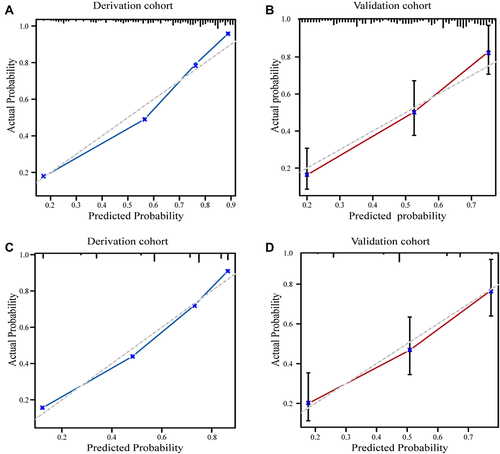
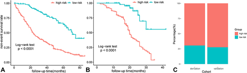
Figure 6 Risk stratification and Kaplan–Meier curve of each risk group in the derivation and validation cohort. (A) Kaplan–Meier curve in the derivation cohort; (B) Kaplan–Meier curve in the validation cohort; (C) risk stratification based on the risk table in the derivation and the validation cohort.