Figures & data
Figure 1 Flow diagram of the data screening.
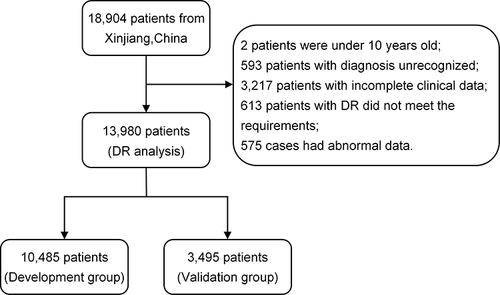
Table 1 Clinical Characteristics of the Study Population (N=13,980)
Table 2 Baseline Characteristics Were Analyzed by Multivariate Logistic Regression in the Training Group. (N= 10,485)
Figure 2 Demographic and clinical feature selection using the LASSO binary logistic regression model (figure was created by R software, “glmnet” package, version 2.0–18, https://CRAN.R-project.org/package=glmnet).
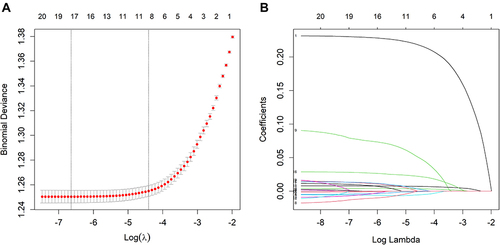
Figure 3 Nomogram to predict the risk of DR.
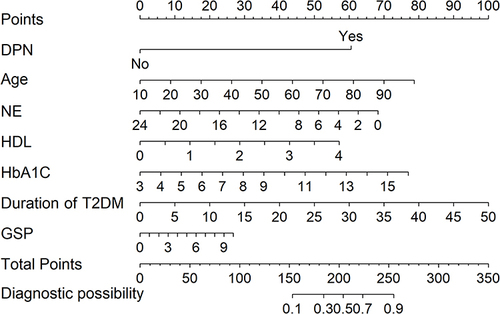
Figure 4 According to Nomogram’s estimate, the probability of DR risk in patient no.1020 (A) and no.2089 (B) was 0.12 and 0.816, respectively, P < 0.001.
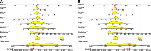
Figure 5 The ROC curves of the nomogram for DR risk (left, development group, right, validation group. including ROC curves of single risk factor model).
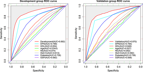
Figure 6 Calibration curves for the validation and development group models (left, development group, right, validation group).
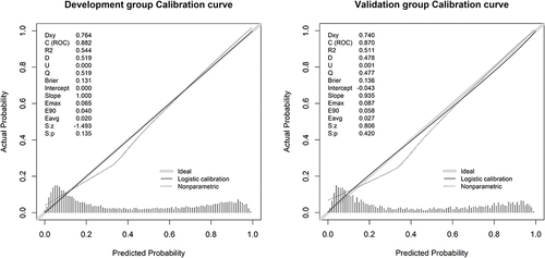
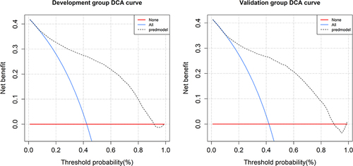
Figure 7 The decision curve analysis of the nomogram for DR risk (left, development group, right, validation group).