Figures & data
Table 1 Comparison of Clinical Characteristics Between the Two Groups
Table 2 Results of DN Univariate Logistic Regression Analysis
Table 3 Results of Multivariate Logistic Regression Analysis of DN
Figure 1 Nomogram model for predicting DN.
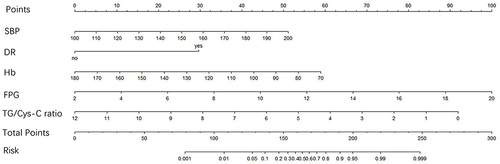
Figure 2 ROC curve of DN risk prediction efficiency. The abscissa represents the false positive rate, which is also (1-specificity), the ordinate represents the true positive rate, which is also the sensitivity, and the area under the red curve represents the area under the ROC curve.
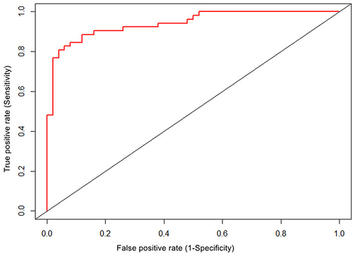
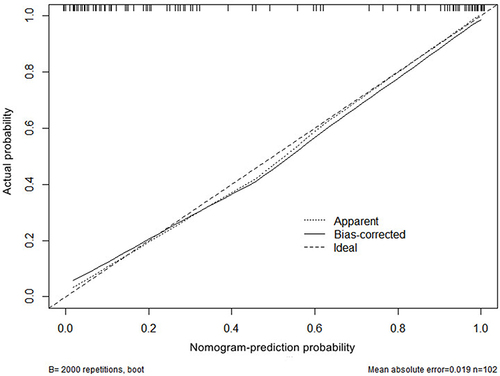
Figure 3 Calibration curve of nomogram model for predicting DN. New sample data set was obtained by using R4.1 software through Bootstraps method of independent sampling 2000 times, and calibration curve of DN occurrence risk line prediction was drawn. X-axis represents the probability of DN predicted by the nomogram model, and Y-axis represents the probability of DN actually diagnosed.