
Figures & data
Figure 1 Different types of drug treatments alter the levels of diabetes-related parameters. (A) Blood glucose curve of mice (***P < 0.001, other group vs MD group based on one-way ANOVA). (B) Body weight curve of mice (**P < 0.01, ****P < 0.0001, other group vs MD group based on one-way ANOVA). (C) Histogram of mouse insulin levels (*P < 0.05, other group vs MD group based on one-way ANOVA). (D) Histogram of mouse C-peptide levels. (E) The pathological picture of the liver of mice in the 4 groups (HE x200). Black arrows: Hepatocytes were degenerated, swollen, loose and lightly stained in the cytoplasm; red arrows: necrotic foci were common, and a large number of hepatocyte nuclei were fragmented and dissolved or fused with surrounding tissues to form unstructured eosinophils; blue arrow: with abundant granulocyte infiltration. (F) Kidney pathological pictures of mice in the 4 groups (HE x200). Red arrows: with extensive necrosis of renal tubules and collecting ducts, necrosis and shedding of renal tubular epithelial cells, and necrotic cell debris and granulocytes in the lumen; black arrows: tubular epithelial cells were degenerated and swollen, with loose and lightly stained cytoplasm; purple arrows: the presence of vacuoles in the cytoplasm was common; Orange arrows: granulocytes rarely infiltrated the glomerulus. (G) Pancreatic pathological pictures of mice in the 4 groups (HE x200). Black arrow: massive acinar cell invasion.
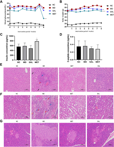
Figure 2 Drug treatment of diabetic mice significantly altered gut microbiota diversity and microbiota function. The V4 region of the 16S amplicon was sequenced for bioinformatic analysis to assess gut microbial makeup. (A) Box plots of α-diversity index (observed OTUs, Shannon, Simpson, and invsimpson). (B) PCA 3D plot. (C) Heatmap shows the abundance of the top 50 genera for each cluster. (D) Taxa with differences in abundance across groups identified using the LEfSe method. The circles radiating from the inside to the outside represent the taxonomic levels from phylum to genus. Each small circle at a different taxonomic level represents a taxonomy at that level, and the diameter of the small circle is proportional to the relative abundance. (E) The bacterial genus with the most significant differences between the MD group and the NC group. The histogram shows the difference in the abundance of genus between the two groups. The dotted bar graph shows the percentage of all genera of this genus in the two groups of samples, respectively. (F) The bacterial genus with the most significant differences between the SAL group and the MD group. The histogram shows the difference in the abundance of genus between the two groups. The dotted bar graph shows the percentage of all genera of this genus in the two groups of samples, respectively. (G) Heatmap of the most important level 3 KO pathways identified by Tax4Fun analysis in four groups.
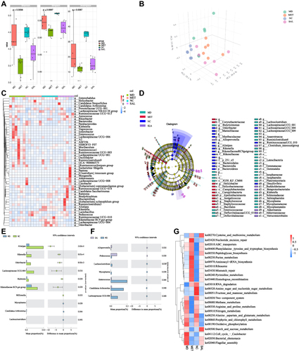
Figure 3 Redundancy analysis (RDA) of relative abundance of bacteria with environmental factors in each group. *Top 10 genera responding to environmental variables.
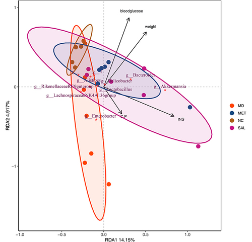
Figure 4 Identification of the signature gut microbiota, associated with diabetes, by random forest method. (A) The relative abundance of each bacterial genus was analyzed by random forest method in the 24 samples, ranked according to Mean decrease accuracy. (B) Pearson correlation analysis between the top 7 genera and environmental factors with the highest mean decrease accuracy value (*P < 0.05; **P < 0.01; ***P < 0.001). (C) ROC analysis of the top 7 genera with the highest mean decrease accuracy value.
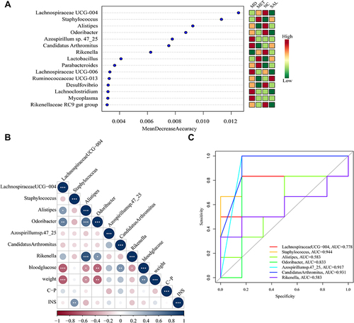
Table 1 Abundance and Disease Data of Candidatus arthromitus and Odoribacter Obtained Through gutMEGA Database
Table 2 Abundance and Disease Data of Odoribacter Obtained Through the Disbiome Database