Figures & data
Figure 1 Flow diagram of study design.
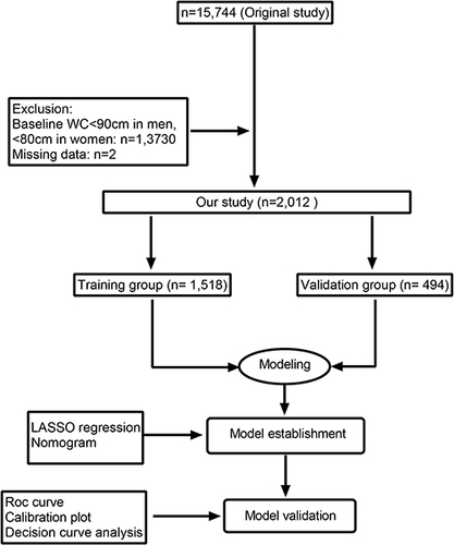
Table 1 Demographic and Clinical Characteristics of Study Population
Figure 2 Nomogram for predicting the 3-year and 6-years risk of T2D in adults with abdominal obesity. To use the nomogram, an individual patient’s value is located on each variable axis, and a line is drawn upward to determine the number of points received for each variable value. The scores for all variables are then added to obtain the total score, and a vertical line is drawn from the total-points row to estimate the 3-year and 6-years risk of T2D in adults with abdominal obesity at the lower line of the nomogram.
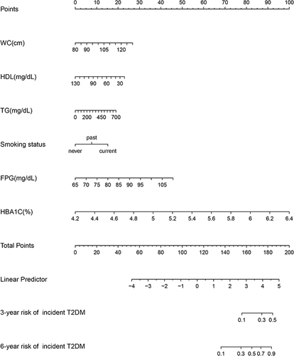
Figure 3 ROC curve of the nomogram in the training and validation cohort (bootstrap resampling times = 1000).
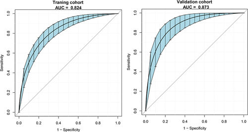
Figure 4 Decision curve analysis of the nomogram in the training and validation cohorts. The y-axis stands the net benefit. The x-axis indicates the threshold probability. The red line represents the nomogram. The black line displays the net benefit of the strategy of treating no patients. The gray line displays the net benefit of the strategy of treating all patients (bootstrap resampling times = 1000).
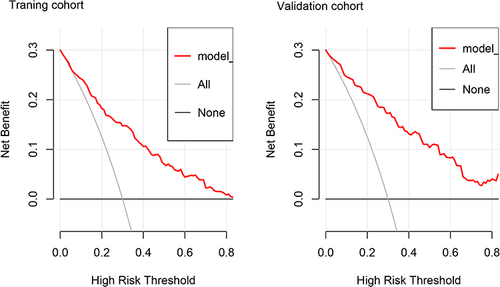
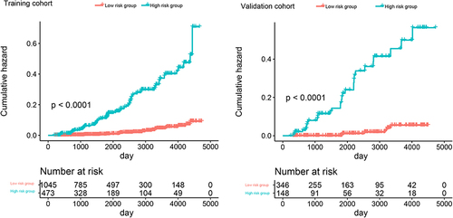
Figure 5 Cumulative hazard analysis of risk group stratification based on the predictor from nomogram prediction. Cumulative hazard analysis showed the T2DM incidence probability of high risk and low risk group between the training cohort and the validation cohort.