Figures & data
Table 1 Patient Demographics and Operation Characteristics
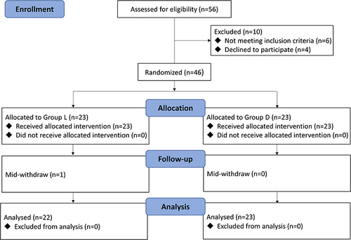
Figure 1 The CONSORT study diagram.
Figures 2 (A) The driving pressure of the two groups at each time point. (B) The respiratory compliance of the two groups at each time point. (C) The Pplat of the two groups at each time point. (D) The Ppeak of the two groups at each time point. Data are shown by mean ± SD. **P < 0.01, ***P < 0.001.
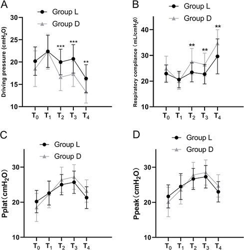
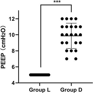
Figure 3 Distribution of intraoperative PEEP in the two groups. The solid line represents the median and whiskers’ interquartile range. Data is displayed by median (interquartile range). ***P < 0.001.
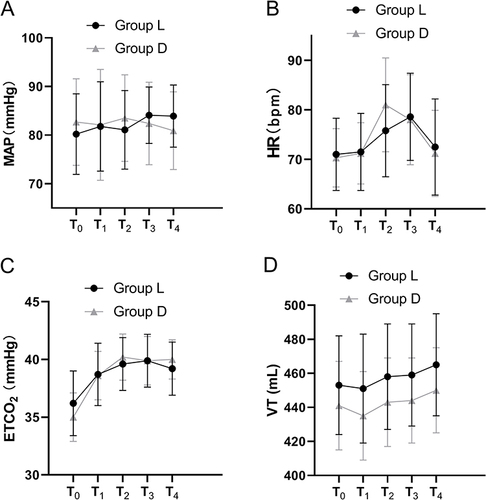
Figures 4 (A) The MAP of the two groups at each time point. (B) The HR of the two groups at each time point. (C) The ETCO2 of the two groups at each time point. (D) The VT of the two groups at each time point. Data is shown by mean ± SD.