Figures & data
Figure 1 Flow chart of participants.
Note: The flow chart shows the entire research process.
Abbreviations: T2DM, type 2 diabetes mellitus; DKD, diabetic kidney disease.
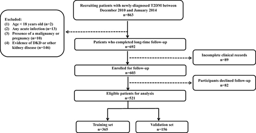
Table 1 Demographic and Medication of Newly Diagnosed T2DM Patients
Table 2 Laboratory Measurement Indicators of Newly Diagnosed T2DM Patients
Table 3 Logistic Regression Analysis of DKD-Related Risk Factor
Figure 2 ROC curve of TyG index and HOMA-IR.
Notes: ROC curve of TyG index and HOMA-IR drawn according to the training set. We calculated the AUC of the TyG index and HOMA-IR, which were 0.694 (95% CI 0.630 to 0.758) and 0.640 (95% CI 0.575 to 0.705), respectively.
Abbreviations: ROC, receiver operating characteristic; AUC, area under the curve; TyG index, triglyceride-glucose index; HOMA-IR, homeostasis model assessment for insulin resistance.
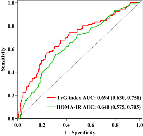
Table 4 LASSO Regression Analysis of DKD-Related Risk Factor
Figure 3 Clinical indicators correlation analysis.
Notes: *P value < 0.05, **P value < 0.001, significant correlation between variables.
Abbreviations: BMI, body mass index; SBP, systolic blood pressure; FBG, fasting blood glucose; PBG, postprandial blood glucose; HbA1c, haemoglobin A1c; FCP, fasting c-peptide; WBC, white blood cell; Hb, haemoglobin; NLR, neutrophil to lymphocyte ratio; FIB, fibrinogen; ALT, alanine aminotransferase; AST, aspartate aminotransferase; ALB, albumin; BA, bile acid; BUN, blood urea nitrogen; UA, uric acid; eGFR, estimated glomerular filtration rate; TC, total cholesterol; TG, triglyceride; HDL, high-density lipoprotein; LDL, low-density lipoprotein; Apoa1, apolipoprotein a1; Apob, apolipoprotein b; UACR, urinary albumin creatinine ratio; TyG index, triglyceride-glucose index; TSH, thyroid stimulating hormone; FT3, free triiodothyronine; FT4, free thyroxine; DR, diabetic retinopathy; DPN, diabetic peripheral neuropathy; CCB, calcium channel blocker; ACEI, angiotensin-converting enzyme inhibitor; ARB, angiotensin receptor blocker.
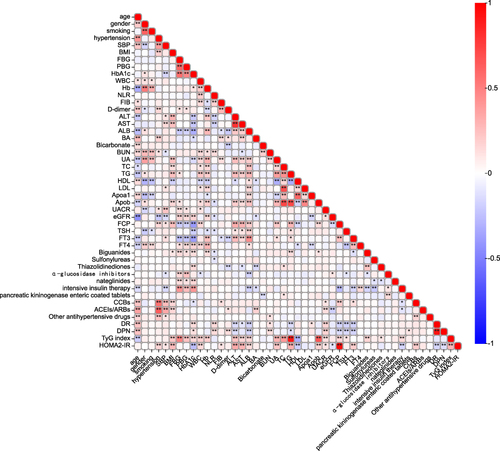
Figure 4 LASSO regression analysis.
Notes: (A) Cross-validation curve. (B) Coefficient distribution plot of 37 variables. The cross-validated error within one standard error of the minimum is shown on the right vertical line, while the minimum error is shown on the left vertical line.
Abbreviation: LASSO, less absolute shrinkage and selection operator.
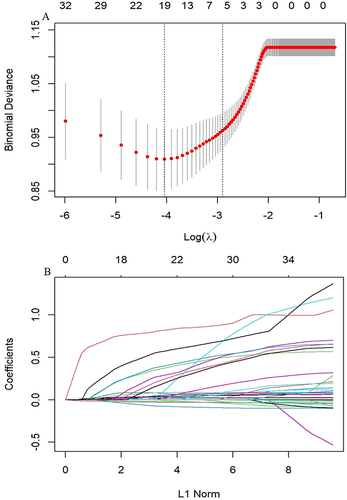
Figure 5 Dynamic nomogram developed for predicting DKD in patients with newly diagnosed T2DM.
Notes: Dynamic nomogram can reflect the score of each variable of patients in actual situation, so as to obtain the corresponding DKD risk probability. The risk probability of DKD calculated for the first patient in the cohort by each variable score is shown in the figure above.
Abbreviations: TG, triglyceride; eGFR, estimated glomerular filtration rate; UACR, urinary albumin creatinine ratio; TyG index, triglyceride-glucose index; DKD, diabetic kidney disease; T2DM, type 2 diabetes mellitus.
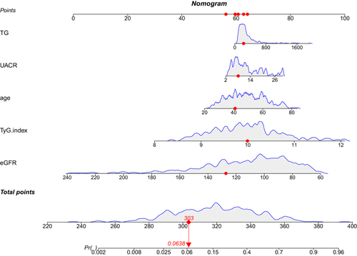
Figure 6 ROC curves of the predictive model.
Notes: For the training set, the predicted AUC of the nomogram was 0.826 (95% CI 0.775 to 0.876), meanwhile, the AUC of the validation set was 0.803 (95% CI 0.719 to 0.887).
Abbreviations: ROC, Receiver operating characteristic; AUC, area under the curve; V set, validation set; T set, training set.
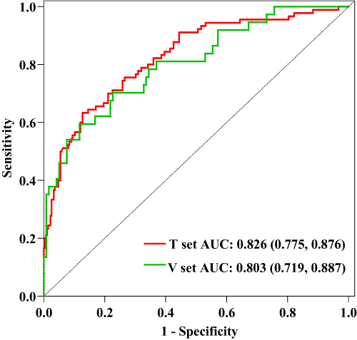
Figure 7 Calibration curves of the nomogram.
Notes: (A) Calibration curve of the model in the training group. (B) Calibration curve of the model in the validation group. The calibration curve reflects the consistency between the predicted probability and the actual probability. Y-axis = actual probability of DKD. X-axis = predicted probability of DKD. The shadow line represents a perfect prediction by an ideal model. The red line represents the performance of our model, which coincides well with the shadow line.
Abbreviation: DKD, diabetic kidney disease.
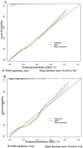
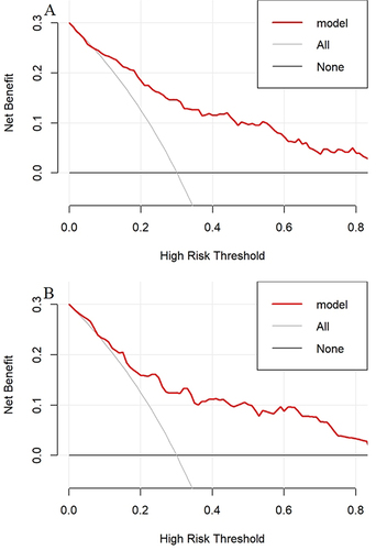
Figure 8 DCA for the nomogram.
Notes: (A) Decision curve of the model in the training group. (B) Decision curve of the model in the validation group. The y-axis measures the net benefit. The solid red line represents the nomogram. The solid gray line represents the assumption that all patients have DKD. The solid black line represents the assumption that no patients have DKD.
Abbreviations: DCA, decision curve analysis; DKD, diabetic kidney disease.