Figures & data
Table 1 Demographic and Clinical Characteristics by Group
Table 2 KEGG Pathway Themes
Figure 1 Panel A shows the heat map for the 10 transcripts that showed the highest magnitude fold-change between responders and non-responders. Individual participants are represented by columns; those indicated by purple boxes are the non-responders; those indicated by yellow boxes are the responders. Rows represent individual gene transcripts. Intensity of the colors blue or red indicates the magnitude of the z-score for fold-change. Panel B shows box and whisker plots for the distribution of gene counts for the 10 transcripts with the greatest magnitude differential expression between responders and non-responders. The center thick black bar shows the median, the upper and lower borders of the boxes represent the 75th and 25th percentiles, and individual dots are outliers. Non-responders are shown in purple; responders are shown in yellow.
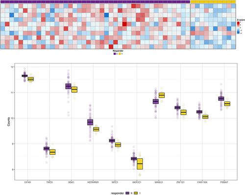
Figure 2 The top 10 pathways that contained over-representation of the differentially expressed transcripts related to responders versus non-responders to behavioral interventions are shown. The size of the dot represents the number of transcripts within the pathway that were over-represented relative to the total number of transcripts included in the analyses. The color of the dot shows the magnitude of the false discovery rate-adjusted p-value.
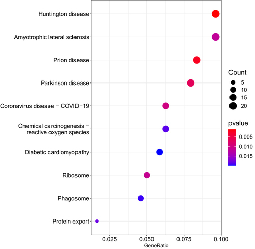
Figure 3 The top 10 pathways that contained over-representation of the differentially expressed transcripts contained within the module derived from weighted gene correlation network analysis for body mass index are shown. The size of the dot represents the number of transcripts within the pathway that were over-represented relative to the total number of transcripts included in the analyses. The color of the dot shows the magnitude of the false discovery rate-adjusted p-value.
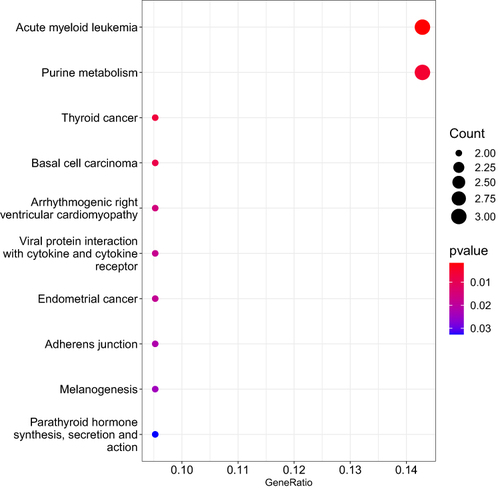
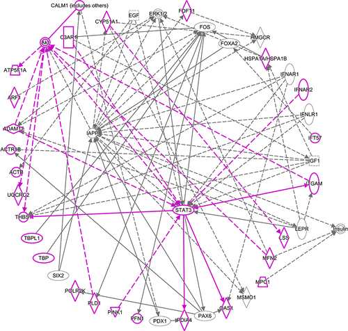
Figure 4 Solid lines show direct interactions. Dashed lines show indirect interactions. Arrows show activation. Blunted lines show inhibition. Vertical diamonds are enzymes. Horizontal diamonds are peptidases. Vertical ovals are transmembrane receptors. Horizontal ovals are transcription regulators. Circles are other. Double circles are complexes. Vertical rectangles are G-protein coupled receptors. Squares are cytokines. Trapezoids are transporters. Inverted triangles are kinases. Molecules outlined in purple are gene transcripts or their products that were located in the top 10 Kyoto Encyclopedia of Genes and Genomes (KEGG) pathways that contained overrepresented genes from differential expression analysis.