Figures & data
Table 1 HIV_VCT, HIV_PICT and ART Distribution with Sex and Age at Health Facilities in Gondar City
Figure 1 Number of HIV_VCT, HIV_PICT and ART attendants against Time in Months. In the figure the green colored line represents number of ART attendants, the yellow-colored line represents HIV_PICT and the bright Orange colored line represents HIV_VCT.
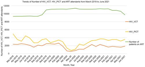
Table 2 Mean and Mean Difference of HIV_VCT, HIV_PICT and ART Attendants
Figure 2 Number of HIV_VCT and HIV_PICT Attendants within Twenty-eight months. In the figure the blue colored bar represents HIV_VCT and the bright Orange colored bar represents HIV_PICT.
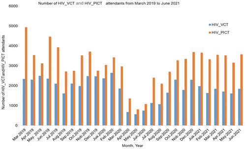
Figure 3 Newly initiation of ART and lost PLWHA of participants’ pre COVID-19, during and post COVID-19 lockdown periods in 28 Months. In the figure the green colored line represents number of peoples lost HIV follow up, the yellow-colored line represents number of individuals started ART.
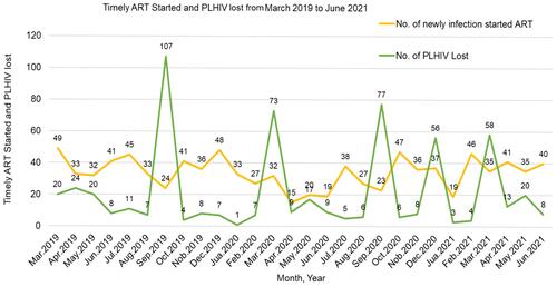
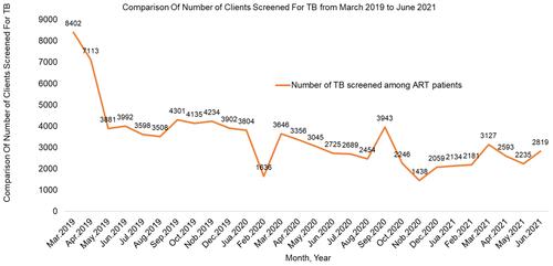
Figure 4 Comparison of number of clients screened for TB of participants’ before COVID-19, during and post lockdown periods in 28 Months. In the figure the bright Orange colored line represents number of ART patients screened for tuberculosis.