
Figures & data
Table 1 Socio-Demographic Characteristics of HIV Infected Adults with 1st Line Virological Failure at High Load Public Health Facilities in Northwest Ethiopia, from 2016 to 2020 (n=427)
Table 2 Baseline Clinical, Laboratory, and ART Information of HIV Infected Adults with Virological Failure at High Load Public Health Facilities in Northwest Ethiopia, from 2016 to 2020 (n=427)
Table 3 ART Adherence Barriers of HIV Infected Adults with the First-Line Virological Failure at High Load Public Health Facilities in Northwest Ethiopia from 2016 to 2020 (n=427)
Table 4 ART Follow-Up, Laboratory and Clinical Information of Adult HIV Infected Patients with Virological Failure at High Load Public Health Facilities in Northwest Ethiopia, from 2016 to 2020 (n=427)
Figure 1 The Kaplan–Meier survival curve of time to switch to 2nd line anti-retroviral therapy (ART) and its predictors among HIV-infected adults at high load public health facilities in Northwest Ethiopia, from 2016 to 2020 (n=427).
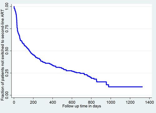
Figure 2 The Kaplan–Meier survival curve by regimen change for time to switch to 2nd line Anti-Retroviral Therapy (ART) and its predictors among HIV-infected adults at high load public health facilities Northwest Ethiopia, from 2016 to 2020 (n=427). (Blue line=survival curve of patients with 1st line regimen change, Black line = survival curve of patients with 1st line regimen change).
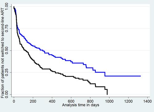
Figure 3 The bar graph of the proportion of switching by time to switch to the 2nd line Anti-Retroviral Therapy (ART) among HIV-infected adults at high load public health facilities in Northwest Ethiopia, from 2016 to 2020 (n=427).
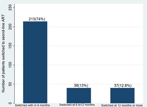
Figure 4 The pie chart of the proportion of patients by final status among HIV-infected adults at high load public health facilities in Northwest Ethiopia, from 2016 to 2020 (n=427), (Blue=active, Orange=transferred out to other facility, Red=Lost to follow up, Green=dead).
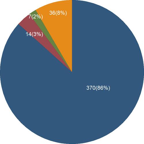
Table 5 Bi-Variable and Multivariable Analysis of Predictors of Time to Switch to 2nd Line ART Among HIV-Infected Adults at High Load Public Health Facilities in Northwest Ethiopia, from 2016 to 2020 (n=427)