Figures & data
Figure 1 The monthly number of measles cases in Hong Kong from January 2009 to December 2019. The orange area highlighted the period from March to April 2019 when the outbreak in the airport occurred.
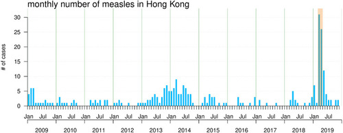
Figure 2 The epidemiological features of the measles outbreak in HKIA from March to April 2019. Panel (A) shows the daily number of infected staff sorted by the rash onset date. Panel (B) shows the cumulative number of staff vaccinated (purple dotted line) since March 01, 2019, and the approximated susceptibility (S(t), green line) of all staff. The measles vaccination program for airport staff was launched on March 23, 2019, and it was indicated by the vertical dashed line. Panel (C) shows the estimated effective reproduction number, Reff(t). The horizontal dashed line marks the level of Reff = 1. Panel (D) shows the basic reproduction number, R0(t) = Reff(t)/S(t). In panel (D), the dot and bar at the right-hand side summarized the mean and 95% percentile of R0(t) respectively. In panels (C) and (D), the solid line represents the estimated mean, and the shaded area represents the 95% confidence interval (CI).
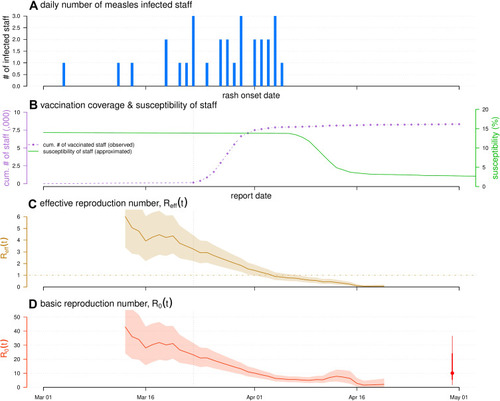
Table 1 Summary Table of the Notations
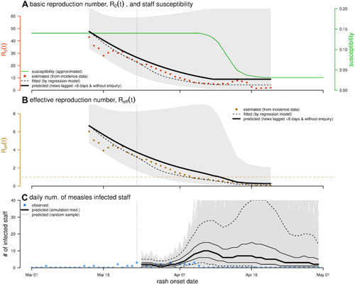
Figure 3 The prediction and simulation results of the reproduction numbers and number of infected staff. Panel (A) shows the estimated (brown dots, consisting with and fitted (dashed curve) R0(t), and predicted (bold curve) r0(t). The green curve is the approximated S(t), as the same as in . Panel (B) shows the estimated (brown dots, consisting with and fitted (dashed curve) Reff(t), and predicted (bold curve) reff(t). The shading area represents the 95% CI of the prediction. Panel (C) shows the observed (blue dots, consisting with Fig 2(a)) C(t), and predicted (black and grey curves) number of infected staff, c(t). The black bold curve is the simulation median, the black thin curves are the lower and upper bounds of the interquartile range (IQR), and the black dashed curves are the lower and upper bounds of the 95% CI. The grey curves show 10,000 simulation samples.