Figures & data
Table 1 Patients and Disease Characteristics
Figure 1 Study design. A total of 446 ICU patients with complete relevant data were enrolled in this study.
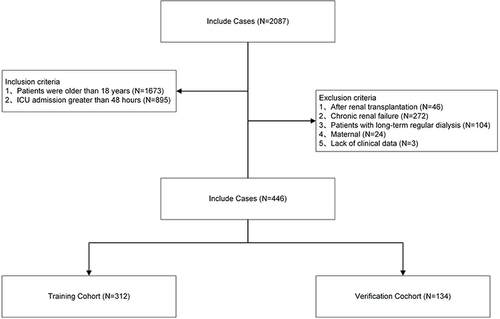
Table 2 Univariate and Multivariate Analyses of Predictors for AKI
Figure 2 Net reclassification index.
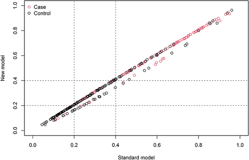
Figure 3 Nomogram to predict the outcomes of AKI.
Abbreviations: CHF, congestive heart failure; APACHE, Acute Physiology and Chronic Health Evaluation; BE, base excess.
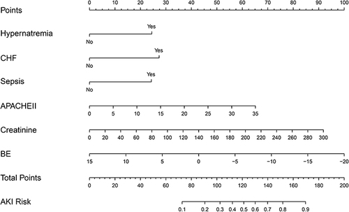
Figure 4 Calibration curves of the nomogram in the training dataset (A) and validation dataset (B).
Notes: The calibration curves show calibration of the nomogram in terms of agreement between the predicted risk of AKI.
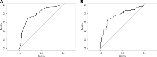
Figure 5 Calibration of the nomogram to predict the AKI in the training dataset (A) and validation dataset (B).
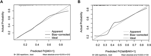
Figure 6 In the clinical impact curve in the training dataset (A) and validation dataset (B).
Notes: Concerning the clinical impact curve, we assumed applying 1000 patients to our model under simulated examination conditions. There are two sets of lines, those in red that fit through the model and those in blue that do, by looking at when the actual and the model fit. “Number high risk” represents the number of high-risk patients with a poor prognosis predicted by the model at different threshold probabilities. “Number high risk event” represents the actual number of high-risk patients with a poor prognosis.
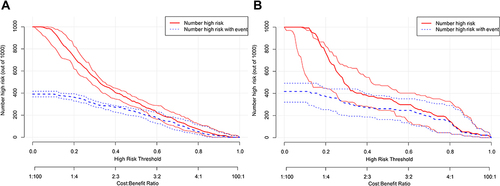
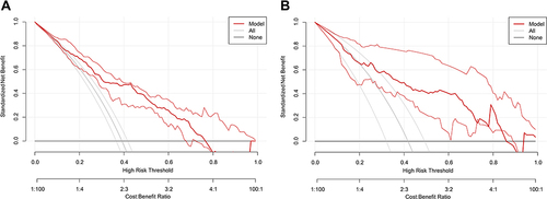
Figure 7 Decision curve analysis (DCA) for the nomogram in the training dataset (A) and validation dataset (B).
Notes: In the decision curve, the abscissa represents the threshold probability to predict AKI and the ordinate represents the net benefit after benefits and harms. Three models, represented by three different colored lines, were compared in the figures. The first is a black parallel horizontal line above the abscissa, which, as an ideal model, is to assume that all patients do not develop AKI and are therefore completely free of intervention, with a net benefit of 0. The second is the gray lines in the plot, the gray lines are the three lines in the plot that show their confidence intervals. The line set represents a pessimistic attitude that AKI occurs in all patients, all intervened. The third is the group of lines in red, the thicker line in the middle being the actual modeled line and flanked by its confidence interval.