Figures & data
Figure 1 Transmission electron microscopy (TEM) of intestinal epithelial cells. Tight junction (black arrow); mitochondria (red arrow); lipid-droplet (yellow arrow). Scale above, 5µm. The scale below, 2µm.
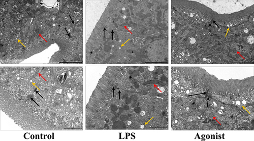
Figure 2 CaSR altered the fecal metabolites. (A) Scores plots of PLS-DA between the control and LPS groups (n =8 mice per group). (B) Scores plots of PLS-DA between the LPS and Agonist groups (n =8 mice per group). (C) Scores plots of OPLS-DA between the control and LPS groups. (D) Scores plots of OPLS-DA between the LPS and Agonist groups. 1 and 2 are in the positive and negative modes, respectively.
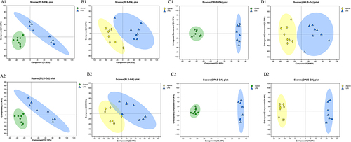
Figure 3 Metabolites in the LPS and Agonist groups. (A) A volcanic plot of metabolites.The horizontal coordinate is the multiple change value of the difference in metabolite expression between the two groups; the vertical coordinate is the statistical test value of the difference in metabolite expression. Both the horizontal and vertical values were logized. Each dot in the diagram represents a specific metabolite, and the size of the dot represents the Vip value. The more the point on the left and right and the point on the upper side, the more significant the expression difference is. (B) The top 50 significantly altered metabolites in the LPS and Agonist groups.Each column represents a sample, with the sample name below; The color represents the relative expression of the metabolite in the group of samples. The corresponding relationship between the color gradient and the numerical size is shown in the gradient color block. The right side is the metabolite VIP bar chart. The bar length indicates the contribution value of the metabolite to the difference between the two groups. The larger the value, the greater the difference between the two groups. * P < 0.05, **P < 0.01, ***P < 0.001, Control vs LPS.(C) KEGG pathways enriched by differential genes between Agonist group and LPS group.
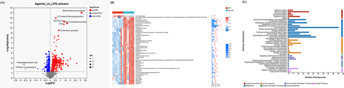
Figure 4 Pathway impact in topology analysis. The size and color of each circle were based on the pathway impact value and P-value, respectively.
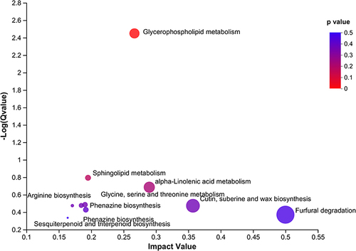
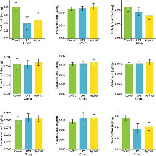
Figure 5 SCFAs contents in different groups. **P < 0.01, ***P < 0.001, Control vs LPS; #P < 0.05, Agonist vs LPS.