Figures & data
Figure 1 Relationship of serum albumin concentration to relative risk of mortality for 50- to 69-year-old male life insurance applicants.
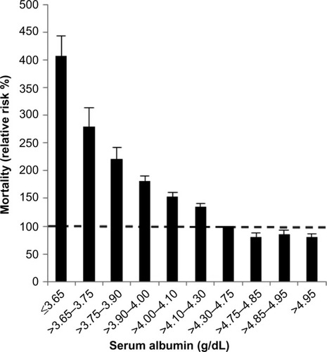
Table 1 Selected normal values for serum albumin, absolute and fractional plasma synthesis rates, and plasma and total body distribution of albumin
Table 2 Human pathological albumin fractional turnover, absolute synthesis rates, and albumin plasma and total body distribution
Table 3 Acute changes in albumin synthesis rates in normal human subjects
Figure 2 Plot of albumin synthesis versus serum albumin (both normalized to the normal values) for subjects with acute and chronic liver disease.
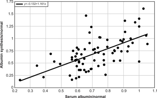
Figure 3 Plot of the clearance of antipyrine (black), indocyanine green (red), or aminopyrine (blue) versus serum albumin (normalized to the normal value).
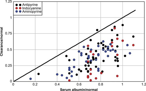
Figure 4 Plot of either the total albumin synthesis rate relative to normal (red) or the urinary albumin excretion relative to total synthesis (black) versus the urinary albumin excretion in a series of nephrotic syndrome patients with varied diagnoses and no obvious liver disease.
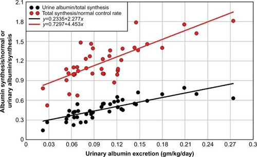
Figure 5 Plot of either the total albumin synthesis rate relative to normal (red) or the urinary albumin excretion relative to total synthesis (black) versus the serum albumin relative to normal.
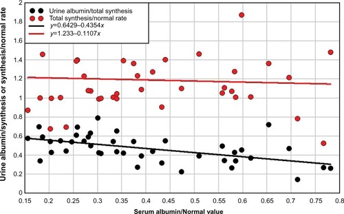
Figure 6 Plot of serum albumin versus the percent of an intravenous dose of 51Cr-labelled albumin collected over 4 days of stool sampling in 50 control subjects and 130 patients with hypoalbuminemia and no obvious liver or renal disease.
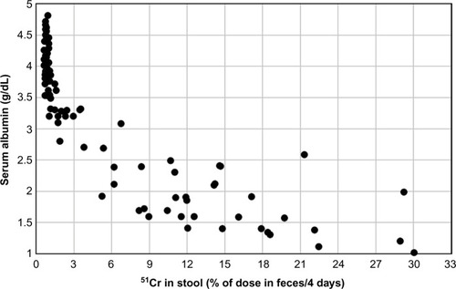
Figure 7 Plot of the percent of plasma albumin that is synthesized/day versus the percent of plasma albumin that is excreted into the GI tract/day in subjects with increased GI albumin clearance and hypoalbuminemia.
Abbreviation: GI, gastrointestinal.
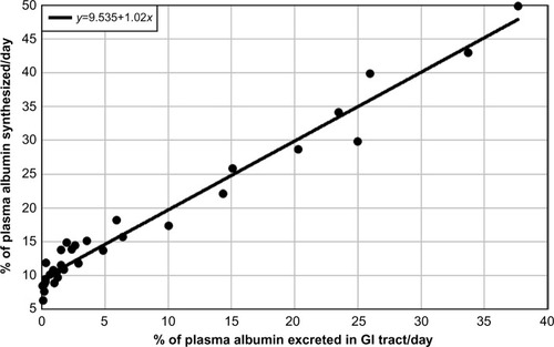
Figure 8 Distribution of all serum albumin concentrations measured in a single day at the Minneapolis Veterans Administration Hospital for outpatients and inpatients.
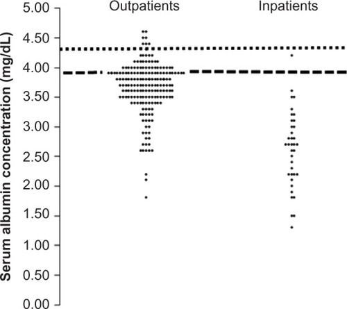
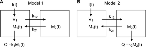
Figure S1 Schematic diagram of the two different compartmental models.
Notes: I(t): input to system as function of time t; Mi(t): amount of solute in compartment i; ki: rate constant for excretion from compartment i; kij: rate constant for exchange from compartment i to compartment j; Q: amount of excretion.