Figures & data
Figure 1 Workflow of the inclusion and exclusion of the study subjects.
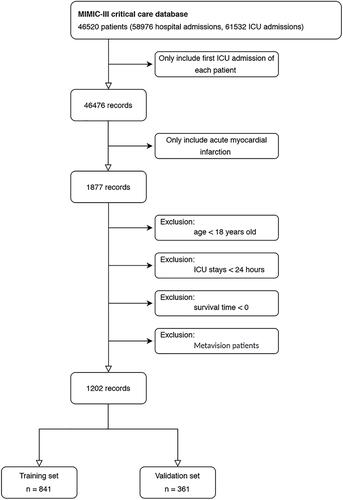
Table 1 Characteristics of Critically Ill Patients with AMI in the Training and Validation Sets
Table 2 Univariate Cox Regression Analysis of 4-Year Overall Survival in the Training Set
Table 3 Multivariate Cox Regression Analysis of 4-Year Overall Survival in the Training Set
Figure 2 The nomogram for predicting the 4-year overall survival rate of patients with AMI. The nomogram included eight variables, including age, respiratory rate, blood urea nitrogen, cardiogenic shock, hemoglobin, pneumonia, and the use of dialysis and mechanical ventilation. In using the nomogram, a vertical line should be drawn upward from each variable to the “Points” line to obtain the score, and then the values are added to get the total score. Finally, a vertical line is drawn downward from the “Total Points” to obtain the 4-year overall survival of the patients with AMI.
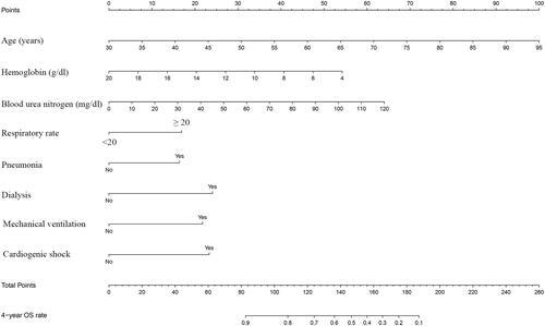
Figure 3 The calibration curve of the nomogram for predicting the 4-year overall survival in the training (A) and the validation (B) sets. The dotted line represents the ideal curve where the predicted value is the same as the observed value. X-axis: survival as predicted by the nomogram; Y-axis: actual survival in the cohort.
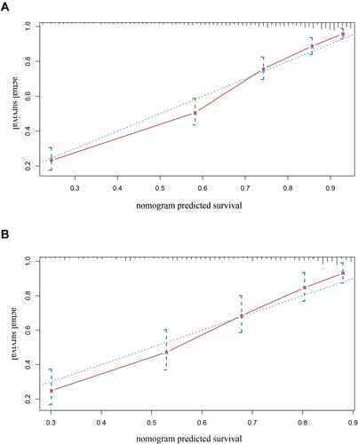
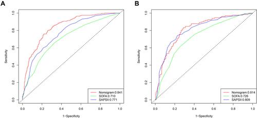
Figure 4 The ROC curve of the nomogram, SOFA and SAPS II scores for predicting the 4-year overall survival in the training (A) and validation (B) vs X-axis: 1-specificity; Y-axis: sensitivity.