Figures & data
Figure 1 Flow chart of inclusion and exclusion.
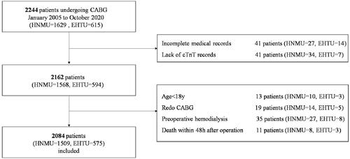
Table 1 Baseline Clinical Characteristics of Total Cohort and Subsets
Figure 2 Median values of (A) cTnT in cTnT group and (B) hs-cTnT in hs-cTnT group at different time points. Red lines: the fitted curves of the median value at each time point.
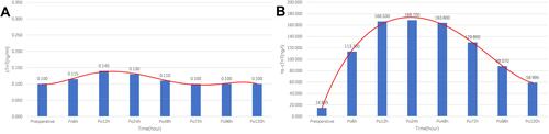
Table 2 Baseline Clinical Characteristics of Non-PMI Group and PMI Group
Figure 3 Median values of (A) cTnT in cTnT group with preoperative cTnT in the normal range, (B) cTnT in cTnT group with preoperative cTnT in the abnormal range, (C) hs-cTnT in hs-cTnT group with preoperative hs-cTnT in the normal range, (D) hs-cTnT in hs-cTnT group with preoperative hs-cTnT in the abnormal range at different time points. Red lines: the fitted curves of the mean value at each time point.
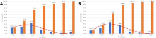
Figure 4 Peak value distributions at different time points in (A) cTnT group and (B) hs-cTnT group. Blue bars: percentage of total number of peak occurrences at the time points. Orange bars: cumulative percentage. Red lines: fitted curves of percentage at each time point.
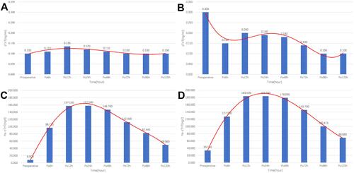
Table 3 Risk Factors of PMI by Univariate Logistic Regression Analysis
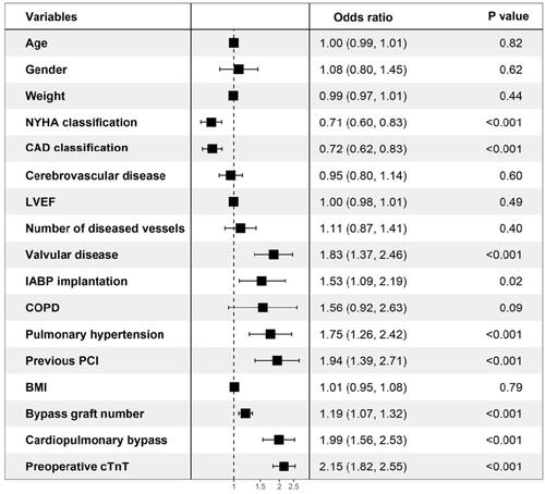
Figure 5 The forest map of the multivariate logistic regression analysis.