Figures & data
Figure 1 Workflow of the study.
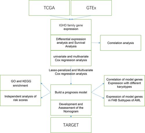
Figure 2 Heatmap of differential IGHDs. The blue, white, and red colors of the subject correspond to low, medium, and high expression. ***pValue <0.001; *pValue <0.05.
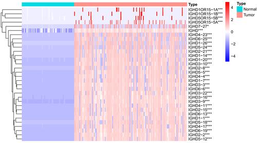
Figure 3 Single-gene survival analysis of IGHD family members in AML patients.
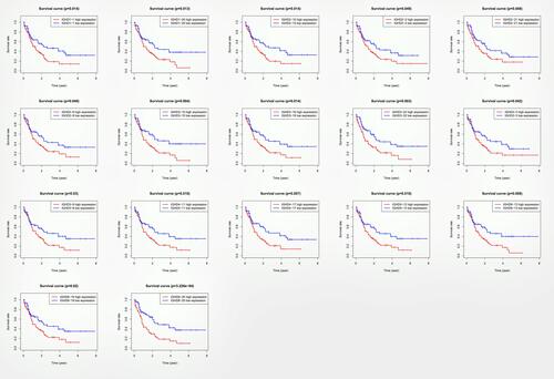
Table 1 Univariate and Multivariate Cox Regression Analysis Results of IGHDs
Table 2 Multiple Cox Regression Analysis of the Model Genes
Figure 4 (A, B) Creation of the prognostic model based on LASSO algorithm; (C) the survival curve of patients in high and low risk groups; (D–F) the Area Under Curve (AUC) value of the ROC curve corresponding to 1 year, 3 years, and 5 years of IGHDs model; (G) risk heatmaps; (H) Risk score curves; (I) survival status figures.
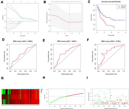
Figure 5 (A) Univariate prognostic analysis of TCGA-AML clinical indicators and risk scores (B) Multivariate prognostic analysis of TCGA-AML clinical indicators and risk scores. (C) Normogram for predicting 1-year, 3-year, and 5-year OS (D–F) Calibration curves of 1-year, 3-year and 5-year OS Black broken lines symbolizes the perfect predicted model, and the blue full line symbolizes the noticed model. (G–I) The expressions of model genes according to FAB classification in AML. (J–L) The expressions of IGHD1-1, IGHD1-20, IGHD3-16 between AML karyotype.
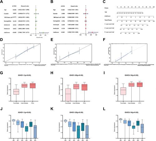
Figure 6 (A) The correlations of IGHDs with each other in AML. blue suggests positive correlation, Red suggests negative correlation, and the depth of color suggests the degree of correlation. Gene functional enrichment of differentially expressed in patients with high-risk scores. (B) Gene ontology analysis; (C) The top 15 most enriched KEGG pathways. (D–F) Boxplots for the difference confirmation of model genes. (G) Kaplan-Meier survival curve of IGHD1-20 in validation cohort using TARGET database.
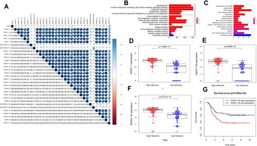
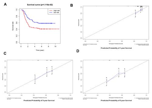
Figure 7 Validation of the prediction model. (A) the survival curve of patients in high and low risk groups. (B–D) Calibration curve for the risk score model using TARGET database.