
Figures & data
Table 1 Comparisons of Baseline Characteristics Between the Original Cohort, Matched Cohort and Weighted Cohort
Figure 1 The flow chart of the included population.
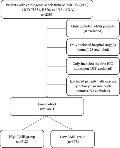
Figure 2 Overall survival of high-LMR and low-LMR groups. Kaplan–Meier curve (A) before and (B) after PSM.
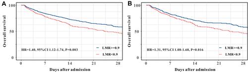
Table 2 Summary of Results of Primary Outcome and Sensitivity Analysis
Table 3 NRI and IDI Analyses for Risk Reclassification of in Hospital Mortality in Original Cohort and Matched Cohort
Table 4 Compared the Predictive Effect of LMR with SII Inin Hospital Mortality in Original Cohort and Matched Cohort