Figures & data
Table 1 Baseline Demographic and Laboratory Characteristics of Patients
Figure 1 Flow chart outlining patient selection and grouping process. (A) training cohort selection; (B) validated cohort selection.
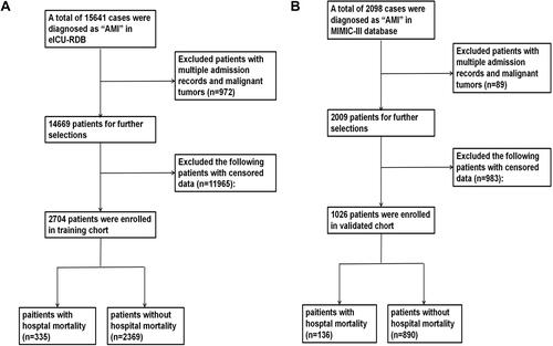
Table 2 Univariate and Multivariate Analysis of Risk Factors for Hospital Mortality in Training Cohort
Figure 2 Nomogram for predicting the risk of hospital mortality in AMI patients admitted in ICU. To use this nomogram, first, locate the patient’s age, then draw a vertical line straight up to the points axis on the top to get the score associated with age. Repeat the process for the other variables. Add the score of each variable together and locate the total score on the total points axis. Finally, draw a line straight down to the “risk of hospital mortality” axis at the bottom to obtain the probability of hospital mortality. Urine: 1: <100mL; 2: ≥100mL and <400mL; 3: ≥400mL and <2500mL; 4: >2500mL.
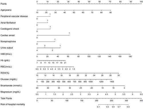
Figure 3 Receiver operating characteristic (ROC) curve of the training and validated cohorts. (A) ROC curve to assess discrimination performance in the training cohort; area under the curve (AUC) was 0.810. (B) ROC curve for assessing discrimination performance in the validated cohort; AUC was 0.885.
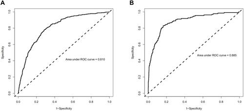
Figure 4 Calibration curves of the training cohort and validated cohort. The x-axis represents the nomogram-predicted hospital mortality. The y-axis represents the actually diagnosed hospital mortality. The diagonal dotted line represents a perfect prediction by an ideal model. The solid line represents the performance of the nomogram, of which a closer fit to the diagonal dotted line represents a better prediction. (A) calibration curve of training cohort; (B) calibration curve of the validated cohort.
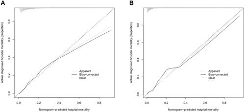
Figure 5 Decision curve analysis (DCA) of the training cohort and validated cohort. The y-axis measures the net benefit. The dotted line represents the hospital mortality nomogram. The thin solid line represents the assumption that all patients die in the hospital. The thick solid line represents the assumption that all patients survive in the hospital. (A) DCA of training cohort; (B) DCA of the validated cohort.
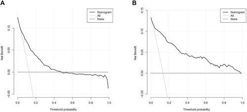
Figure 6 (A) ROC curve of SAPS II to assess discrimination performance in the validated cohort; AUC was 0.860. (B) ROC curve of OASIS to assess discrimination performance in the validated cohort; AUC was 0.837. (C) ROC curve of SOFA to assess discrimination performance in the validated cohort; AUC was 0.811.
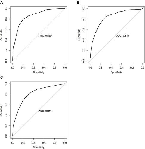
Figure 7 (A) calibration curve of SAPS II of the validated cohort; (B) calibration curve of OASIS of the validated cohort; (C) calibration curve of SOFA of the validated cohort.
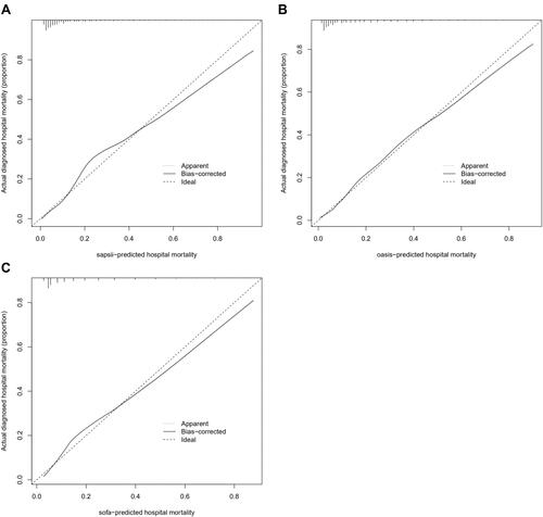
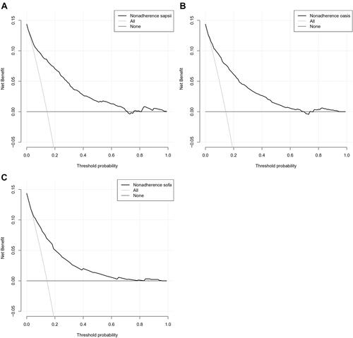
Figure 8 (A) DCA of SAPS II of the validated cohort; (B) DCA of OASIS of the validated cohort; (C) DCA of SOFA of the validated cohort.