Figures & data
Figure 1 The identification of differentially expressed genes in GSE75010 dataset. (A) The distribution of gene expression value in each sample after data standardization. The horizontal axis is the sample and the vertical axis is the gene expression value. (B) The PCA analysis. The points with different colors represent samples from different groups, and the closer the distance between two points, the more similar the expression of mRNA in the two samples. (C) The volcano plot of differentially expressed genes between case group and control group. The horizontal axis is Log2 FC, and the vertical axis is -log10 (FDR). The blue points represent upregulated genes, the red points represent downregulated genes. (D) The heatmap of differentially expressed genes between case group and control group. The horizontal axis represents samples, the vertical axis represents genes, the red color indicates high expression, and the blue color indicates low expression.
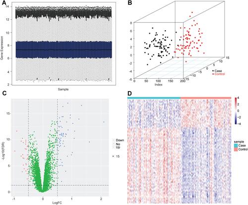
Figure 2 The functional enrichment and immune infiltration analyses in GSE75010 dataset. (A) The histogram of the top 20 most significantly enriched GO terms (the horizontal axis is the number of genes and the vertical axis is the name of GO terms), and the chord chart of genes enriched in the top 10 GO terms (the right semicircle represents the top 10 GO terms, and the left semicircle represents the genes enriched in the 10 GO terms). (B) The histogram of the top 7 most significantly enriched KEGG pathways. The horizontal axis is the number of genes and the vertical axis is the name of KEGG pathways. (C) The FGSEA results of DEGs in samples with hypertension in pregnancy. (D) The relative proportion of infiltrating immune cells in all samples with hypertension in pregnancy. (E) The violin plot of immune cells with significantly different infiltration proportions in samples with hypertension in pregnancy compared with healthy subjects. The horizontal axis is different groups, and the vertical axis is the relative infiltration proportion of immune cells. P value is determined by Wilcoxon test. (F) The PCA analysis of samples based on eight types of immune cells. The dots with different colors represent different types of samples.
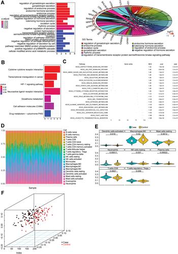
Figure 3 The construction of PPI network. (A) The PPI network was constructed based on the differentially expressed genes. Each dot represents a node. The more lines connected with the dot, the greater the degree of the node, the more important the gene in the network. (B) The top 20 genes with higher degree in PPI network were screened based on MCC algorithm. The darker the red, the higher the degree.
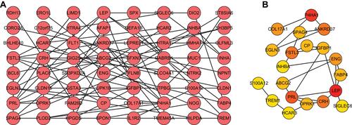
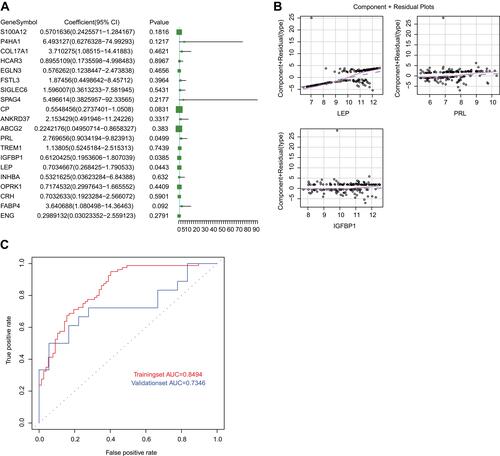
Figure 4 The construction of logistic regression model. (A) The volcano plot of 20 genes screened from PPI network in the model. P < 0.05 indicated that the gene contributed more to the model. (B) The component plus residual plot of LEP, PRL and IGFBP1 in the model. The obvious linear relationship between the horizontal axis and the vertical axis indicated that the independent variables were suitable to be included in the model. (C) The ROC curves of logistic regression model in GSE75010 and GSE48424 datasets. The horizontal axis indicates false positive rate (FPR), and the vertical axis indicates true positive rate (TPR). The AUC value is the area under the curve and can intuitively evaluate the quality of the model, the larger the AUC value, the better the model.