Figures & data
Figure 1 The flowchart of the predictive model of DGF.
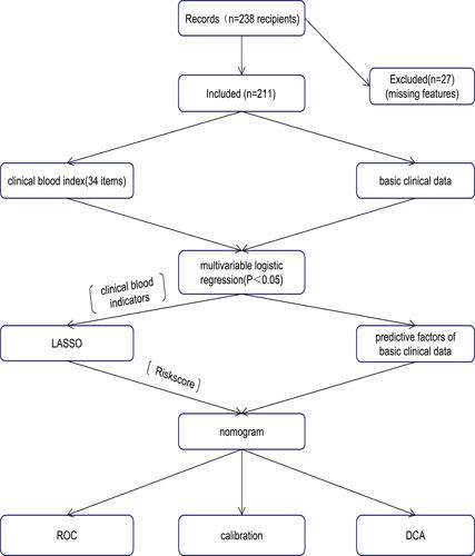
Table 1 Demographics and Clinical Characteristics of the DGF and Non-DGF Groups
Table 2 Morbidity of DGF Prediction Factors After Renal Transplantation from DD Donors
Table 3 Evaluation Results for the Proposed Model Among 10 Randomly Selected Independent Subgroups
Figure 2 Demographics and clinical features selection using the LASSO binary regression model.
Notes: (A) In the LASSO model, the best lambda parameter is selected using 5-fold cross-validation and minimal criteria. The curve of the partial likelihood deviance (binomial deviance) was plotted versus the logarithm of the lambda parameter. Dotted vertical lines were drawn at the optimal values using the minimum criteria and the I SE of the minimum criteria (I-SE criteria). (B) For 13 characteristics, LASSO coefficient profiles were created. Each coefficient profile was displayed against the lambda parameter’s logarithm. The vertical line was generated using 5-fold cross-validation at the selected value, where the best lambda value was generated in 12 features with nonzero coefficients.
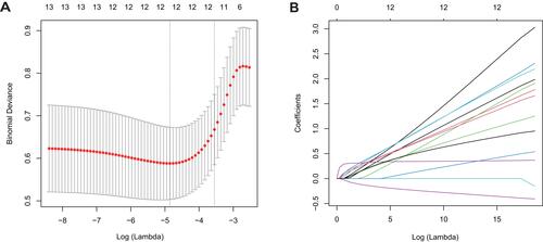
Figure 3 Developed nomogram of DGF.
Notes: The nomogram of DGF was developed in the cohort using WIT, R-age, R-BMI, and Riskscore. The Riskscore includes 12 CBIs, namely R-K+, R-Na+, R-HCO3−, R-LYMP, R-EO, R-FIB, R-TT, D-GFR, D-creatinine, D-urea, D-albumin, and D-Na+.
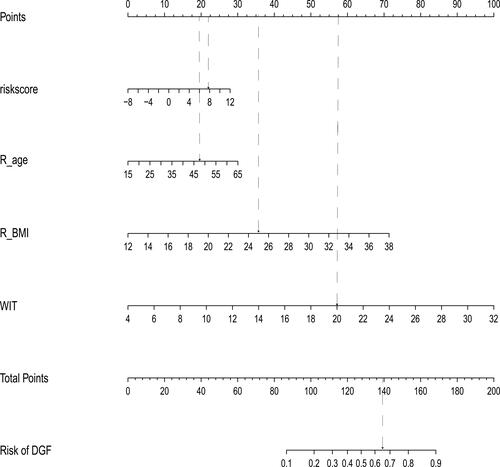
Figure 4 Assessment of the clinical effectiveness of the proposed model.
Notes: (A) The post-KT morbidity risk prediction nomogram’s receiver operating characteristic (ROC) curves. The x-axis and y-axis reflect the post-KT morbidity prediction’s false-positive and true-positive rates, respectively. The AUC (area under the receiver operating characteristic curve) is 0.725. (B) The research cohort’s calibration curves for the nomogram of post-KT morbidity risk prediction. The post-KT DGF forecasts are on the x-axis, while the actual DGF is on the y-axis. An ideal model’s flawless prediction results match the diagonal dotted line. The nomogram performance is represented by the solid line, with a closer match to the diagonal dotted line indicating better prediction. (C) For post-KT DGF, decision curve analysis (DCA) was used. The net benefit is represented on the y-axis. The post-KT DGF risk nomogram is represented by the red line. The thin solid line denotes the assumption that all kidney receivers would survive following transplantation, whereas the thick solid line denotes the assumption that all kidney recipients will suffer DGF after transplantation. The decision curve shows that the threshold probabilities of a patient and a doctor are (>0.1) and (<0.9), respectively. The current study found that using the morbidity risk nomogram for post-KT morbidity risk prediction is more helpful than using the intervention-for-all-recipients or no-intervention schemes.
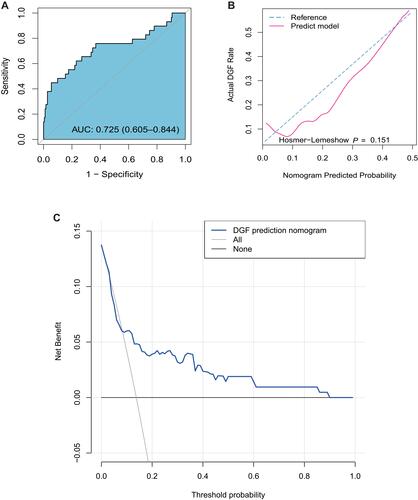
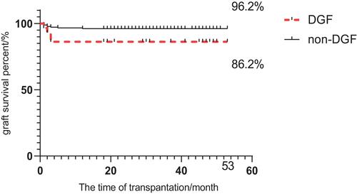
Figure 5 Kaplan-Meier plot of graft survival for DGF.