Figures & data
Figure 1 GTs-related genes in ovarian cancer. (A) Principal component analysis of tumor and normal tissues samples of TCGA and GTEx databases. (B) Volcano plots of DEGs from TCGA and GTEx databases. (C) Heatmap of DEGs. (D) Boxplot of expressions of top 10 DEGs. (E) Venn diagram of intersection of glycosyltransferase gene and DEGs. In (D), asterisk indicator in each grid represents the significance p value of the correlation of the corresponding genes, ****Means P <0.0001.
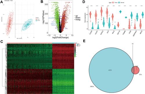
Figure 2 GTs-related genes associated with prognosis in ovarian cancer. (A) Forest plot with P-value <0.2 in univariate Cox analysis. (B) A model was constructed after LASSO cox regression analysis. (C) LASSO deviance diagram. (D) protein–protein interaction of 15 candidate genes. (E) Person correlation analysis between 15 candidate genes. (F) P-value of Pearson correlation analysis. In E and F, the color of each square indicates the correlation between genes on the corresponding X and Y axes. Blue represents positive correlation, red represents negative correlation, and the darker the color, the stronger the correlation. In E, the number in each grid represents the Pearson correlation coefficient between the corresponding genes. In F, asterisk indicator in each grid represents the significance p value of the correlation of the corresponding genes, *Represents P < 0.05, **Represents P < 0.01, and***Means P < 0.001.
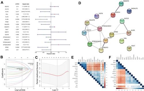
Figure 3 Prognostic value of these candidate factors. (A) Survival state diagram of ovarian cancer patients. The abscissa of the survival state diagram expressed the patient, the ordinate meant the survival time (year). The red represented the dead patient, and the blue represented the living patient. (B) Survival curve of high and low risk patients. The abscissa meant the survival time, and the unit was day. The ordinate represented the survival rate. Red expressed high-risk and blue indicated low-risk in patients. (C) Roc curve for the risk score of OS. The abscissa represented the false-positive rate, and the ordinate meant the true positive rate. (D and E) Nomogram of survival rate in 3,5,7,10-year. (F) Forest plot with clinical factors in univariate Cox analysis. (G) Forest plot with ages of patients in multivariate Cox analysis. (H) Heatmap of 15 candidate factors and clinicopathological features.
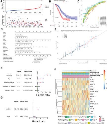
Figure 4 External validation of the prognostic gene signature. (A) Relationship between the survival status/risk score rank and survival time (days)/risk score rank (up). The heatmap of mRNA expression of the fifteen-gene signature in the ICGC cohort. (B) Kaplan–Meier curves of OS of the low- and high-risk groups. (C) Time‐dependent ROC curve analysis of survival prediction by the prognostic model.
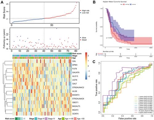
Figure 5 Functional analysis of 15 prognostic genes. (A) The dotplot of top 10 BP and all CC and MF terms by GO analysis. (B) The dotplot of KEGG pathway. (C) The network diagram between glycosylation-related BP terms and prognostic genes. (D) The network diagram between KEGG pathways and prognostic genes. The larger the circle, the more genes it contained; conversely, the smaller the circle, the fewer genes it contained. The color of the circle is correlated with the FDR-value. The smaller the FDR-value is, the closer it is to the red value. The larger the FDR-value is, the closer it is to the blue green.
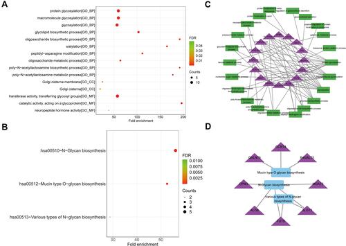
Figure 6 Functional analyses of DEGs between high- and low-risk groups by GSEA. (A) The DEGs between high- and low-risk groups from TCGA database. The red and green dots represent significantly upregulated and downregulated DEGs, respectively. The black dots represent genes that are not differentially expressed high- and low-risk groups samples. (B) Heatmap of the expression levels of the top 25 up- and down-regulated DEGs in high- and low-risk groups. Red upregulation; Green downregulation. The value of expression intensity is based on the gene expression level analysis by R software. (C) Enrichment plot: immune effector process. (D) Enrichment plot: positive regulation of immune system process. (E) Enrichment plot: regulation of immune response. (F) Enrichment plot: immune system development. (G) Enrichment plot: innate immune response. (H) Enrichment plot: leukocyte activation involved in immune response.
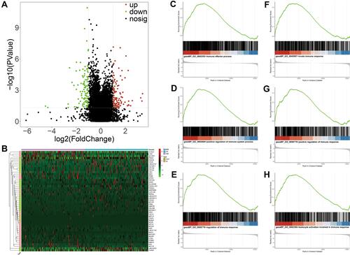
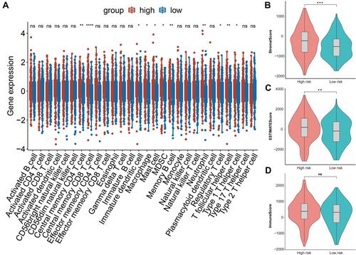
Figure 7 The relationship between risk score and immune infiltration. (A) Boxplot of the difference of infiltration of immune cells in high and low risk groups. (B) Violin plot of difference of stromal scores in two risk patients. (C) Violin plot of difference of ESTINATE scores in two risk groups. (D) Violin plot of difference of immune scores in two risk groups. In , asterisk indicator in each grid represents the significance p value of the correlation of the corresponding genes, *Represents P < 0.05, **Represents P < 0.01, * * *Means P < 0.001, and****Means P <0.0001.