Figures & data
Figure 1 The flow diagram of this study.
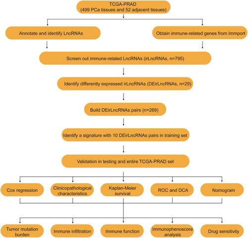
Figure 2 Construction of a prognostic signature for prostate cancer. The heatmap (A) and volcano (B) showed the DEirlncRNAs in TCGA database. (C) Process of variable selection in LASSO regression with 10-fold cross-validation. (D) Confidence interval in every lambda of LASSO regression.
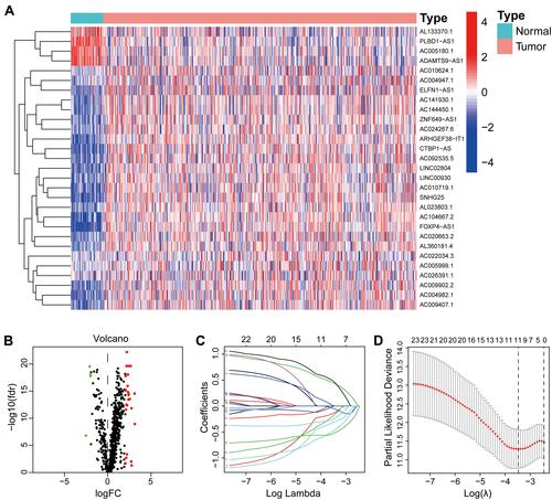
Table 1 Clinical Characteristics of Prostate Cancer Patients in Each Set
Figure 3 Evaluation of a risk model for prostate cancer in the training set. (A) The risk curve of each sample reordered by risk score. (B) The scatter plot of the samples of BCR. (C) Heatmap showed the expression profiles of the signature in the low-risk group and high-risk group. (D) Biochemical recurrence analysis for the signature. (E) Time-dependent ROC analysis curve for the signature. (F) Forest plot for univariate Cox regression analysis. (G) Forest plot for multivariate Cox regression analysis.
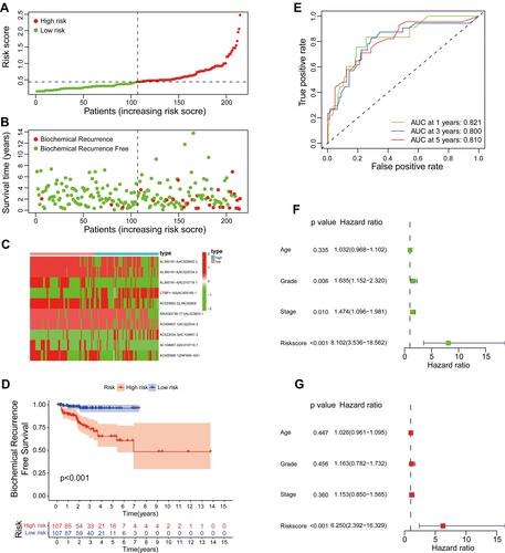
Figure 4 Evaluation of a risk model for prostate cancer in the testing set. (A) The risk curve of each sample reordered by risk score. (B) The scatter plot of the samples of BCR. (C) Heatmap showed the expression profiles of the signature in the low-risk group and high-risk group. (D) Biochemical recurrence analysis for the signature. (E) Time-dependent ROC analysis curve for the signature. (F) Forest plot for univariate Cox regression analysis. (G) Forest plot for multivariate Cox regression analysis.
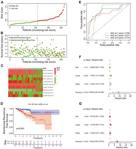
Figure 5 The relationship between the signature and different clinical features. A strip chart (A) along with the scatter diagram showed the relationship among (B) age, (C) tumor grade, (D) stage, (E) BCR, (F) T stage, (G) N stage, (H) M stage and the risk score. . *P< 0.05, **P< 0.01, and ***P< 0.001.
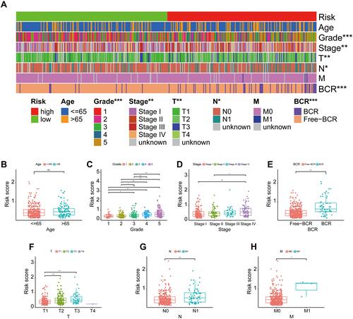
Figure 6 Stratification survival analyses. (A–H) Kaplan–Meier curve analyses of BCR-free time in subgroups stratified by different clinical features.
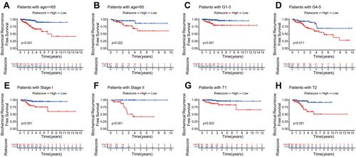
Figure 7 Construction and validation of nomogram. (A) Time-dependent ROC analysis curve for the signature and clinical factors in the entire set. (B) Decision curve analysis of the signature and different clinical factors. (C) The nomogram predicted the probability of the 1-, 2-, and 3-year BCR-free time. (D–F) Calibration plot for the validation of the nomogram.
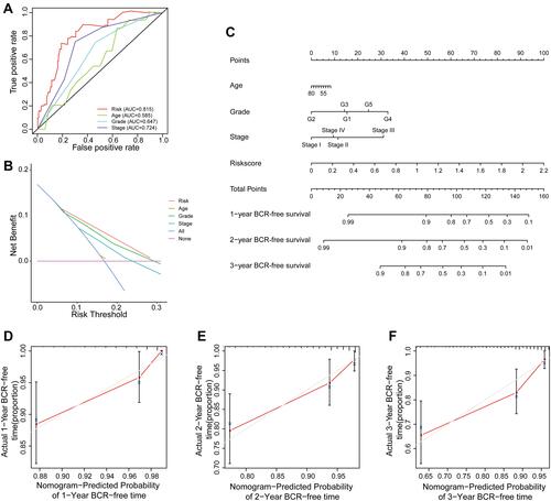
Figure 8 Landscape of mutation profiles between low- and high-risk groups. (A and B) Mutation information of the genes with high mutation frequencies in the low- and high-risk groups. (C and D) Variant classification, variant type, SNV classification, variants in per sample, and summary of variant classification in the two groups. (E and F) Co-expression analysis of Top 20 mutant genes in the two groups. *P< 0.05 and **P< 0.01.
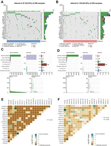
Figure 9 The relationship between TMB and the signature. (A) The level of TMB in the low- and high-risk groups. (B) Pearson correlation analysis between TMB and risk score. (C) Kaplan–Meier curve analysis of BCR-free time for patients with TP53 wild or TP53 mutation. (D) Kaplan–Meier curve analyses of BCR-free time for patients with different TP53 status and risk groups. **P< 0.01.
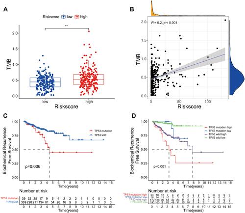
Figure 10 Tumor immune microenvironment between low- and high-risk groups. (A) The relationship between the signature and tumor-infiltrating immune cells. (B) Heatmap of abundance of immune cells in the low- and high-risk groups. (C–J) Correlation between the signature and the infiltration of immune cell subtypes: (C) CD4+ T cells, (D) CD8+ T cells, (E) neutrophils, (F) macrophage, (G) myeloid dendritic cells, (H) B naive cells, (I) B cells, and (J) B memory cells. **P< 0.01.
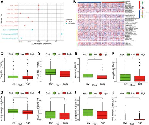
Figure 11 Immune cell infiltration and immune function by ssGSEA algorithm. (A) The differences in the immune cells in the low- and high-risk groups. (B) Immune function in the two groups. (C) The expression of HLA family in the two groups. (D) The expression of immune checkpoint in the two groups. (E) The difference analysis of IPS between the two groups. *P< 0.05, **P< 0.01, and ***P< 0.001.
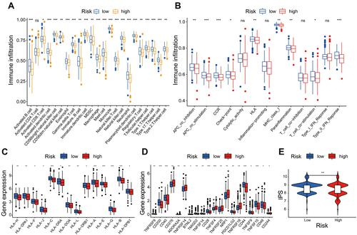
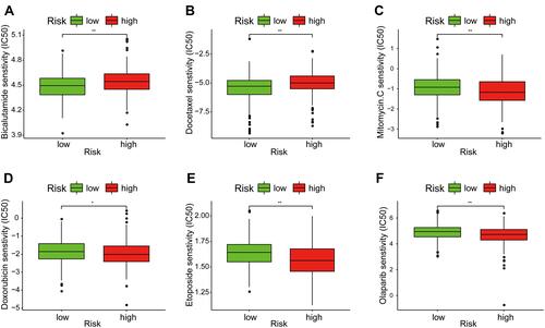
Figure 12 Assessment of medical treatment in low- and high-risk groups. (A–F) Correlation between the signature and the IC50 of the drugs: (A) Bicalutamide, (B) Docetaxel, (C) Mitomycin C, (D) Doxorubicin, (E) Etoposide, and (F) Olaparib. *P< 0.05 and **P< 0.01.