Figures & data
Table 1 Simple and Multiple Binary Logistic Regression Between Predictor Variables and Discharge Status for Derivation and Validation of a Risk Score of Early Neonatal Death Among Early Neonates in Neonatal Intensive Care Unit, 2021
Figure 1 The receiver operating curves with the area under the curve of the derivation datasets of the final multiple logistic regression model. (The solid green color shows the area under the curve with surrounding 95% CI. While the dotted line at the middle (a ROC curve close to the y = x or 45-degree line) is an reference line for poor model with no predictive).
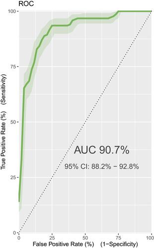
Figure 2 The density plots of the derivation datasets of the final multivariate model. (The red one represents early neonates who are at low risk of death and the blue one those who are at high risk of death).
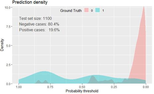
Table 2 Baseline Characteristics of Study Participants for Derivation and Validation of a Risk Score of Early Neonatal Death Among Early Neonates in Neonatal Intensive Care Unit 2021 (N= 1100)
Figure 3 Decision curve for a model to predict early neonatal death in early neonates admitted to neonatal intensive care unit. (The apparent curve model (red broken line in the middle) show a curve with variables in the final model; red small broken line in two sides show 95% CI of the apparent curve; Blue line show the cross validated model. Black horizontal line at the bottom is null model without independent variables. While three black line falling from left to right show all model).
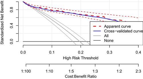
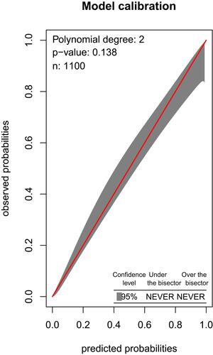
Figure 4 Calibration plots of derivation datasets. Calibration plots demonstrating observed versus predicted probability of early neonatal intensive care unit mortality in the derivation dataset from the multiple regression models. (Red line show the calibration of predicted versus the observed probabilities; black area around the red show the 95% CI of the calibration).