Figures & data
Figure 1 Expressions of the 29 pyroptosis-related genes and the interactions among them. (A) Heatmap of the pyroptosis-related genes between the normal and the tumor tissues. (B) PPI network showing the interactions of the pyroptosis-related genes (interaction score = 0.4). (C) The correlation network of the pyroptosis-related genes. P values were showed as: **P < 0.01; ***P < 0.001.
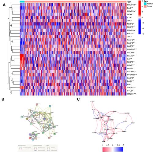
Figure 2 Tumor classification based on the pyroptosis-related DEGs. (A) 414BC patients were divided into two clusters by the consensus clustering matrix (k = 2). (B) Heatmap and the clinicopathologic characters of the two clusters classified by these DEGs. (C) Kaplan–Meier curves for the OS of these two clusters.
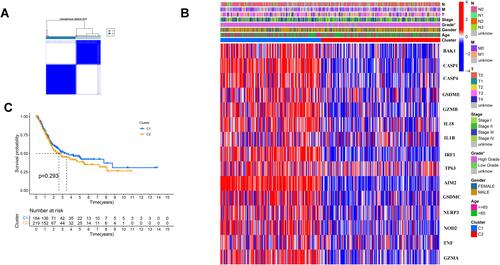
Figure 3 Construction of risk signature in the TCGA cohort. (A) Univariate cox regression analysis of OS for selected pyroptosis-related gene with P < 0.2. (B) LASSO regression of the 9 OS-related genes. (C) Cross-validation for tuning the parameter selection in the LASSO regression. (D) Kaplan–Meier OS curves of patients in the high- and low-risk groups. (E) ROC curves demonstrated the predictive efficiency of the risk score. (F) Distribution of patients based on the risk score. (G) The survival status for each patient. (H) PCA plot for BCs based on the risk score. (I) t-SNE plot for BCs based on the risk score.
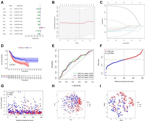
Figure 4 Validation of the risk model in the GEO cohort. (A) Kaplan–Meier curves for comparison of the OS between low- and high-risk groups. (B) Time-dependent ROC curves for BCs. (C) Distribution of patients in the GEO cohort based on the median risk score in the TCGA cohort. (D) The survival status for each patient (low-risk population: on the left side of the dotted line; high-risk population: on the right side of the dotted line). (E) PCA plot for BCs. (F) t-SNE plot for BCs based on the risk score.
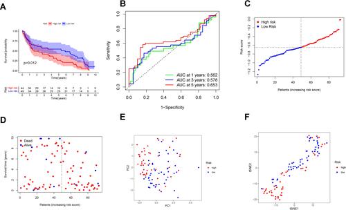
Figure 5 Univariate and multivariate Cox regression analyses for the risk score. (A) Univariate analysis for the TCGA cohort. (B) Multivariate analysis for the TCGA cohort. (C) Heatmap for the connections between clinicopathologic features and the risk groups. P values were showed as: **P < 0.01.
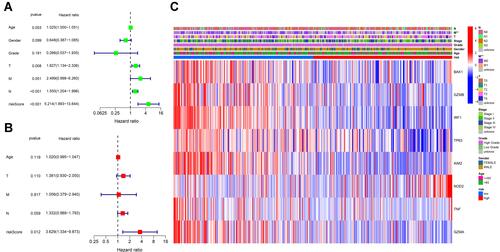
Figure 6 Functional analysis based on the DEGs between the two-risk groups in the TCGA cohort. (A) Bubble graph for GO enrichment (the bigger bubble means the more genes enriched, and the increasing depth of red means the differences were more obvious; q-value: the adjusted p-value). (B) Barplot graph for KEGG pathways (the longer bar means the more genes enriched, and the increasing depth of red means the differences were more obvious).
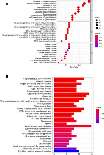
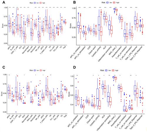
Figure 7 Comparison of the ssGSEA scores for immune cells and immune pathways. (A–D) Comparison of the tumor immunity between low- and high-risk group in the TCGA and GEO cohort. *P < 0.05; **P< 0.01; ***P < 0.001.