Figures & data
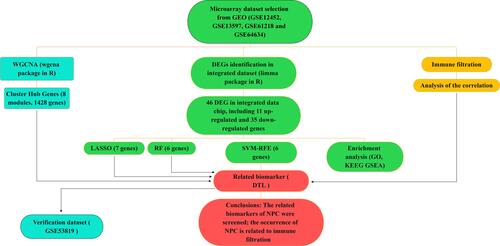
Table 1 Characteristics of mRNA Expression Profiles of Nasopharyngeal Carcinoma (NPC)
Figure 1 DEGs in the integrated dataset of NPC. (A) The volcano plots of DEGs, the red and green dots represent up-regulated and down-regulated genes, respectively. (B) The heatmap of DEGs.
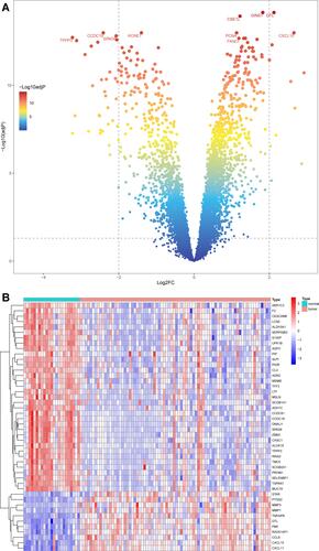
Figure 2 Continued.
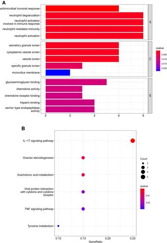
Figure 2 Functional enrichment analysis of DEGs. (A) Results of GO functional enrichment analysis of the DEGs, including BP, MF and CC. (B) KEEG enrichment analysis revealed signaling pathways highly associated with NPC. (C) The top five signaling pathways in normal nasopharyngeal tissue based on GSEA are shown. (D) GSEA showed that the top five signaling pathways were most related to NPC.
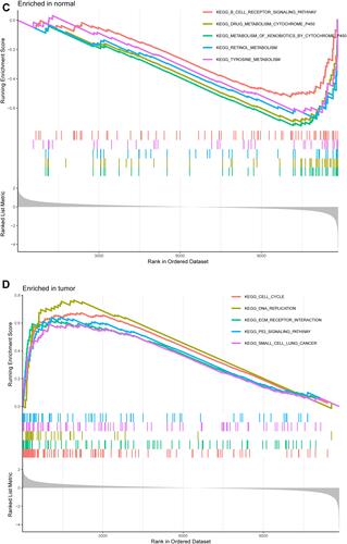
Figure 3 Continued.
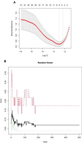
Figure 3 Screening characteristic related biomarkers via comprehensive strategy. (A) The LASSO logistic regression algorithm was performed to retain the most predictive features. (B) Screening biomarkers based on random forest (RF) machine learning algorithm. (C) Results of screening biomarkers based on RF. (D) Results of screening biomarkers based on sSVM-RFE algorithm.
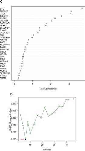
Figure 4 (A) The cluster dendrogram of genes in independent data sets. Branches of the cluster dendrogram of the most connected genes gave rise to eight gene coexpression modules. (B) Relationships of consensus modules with samples. Different color represents a specific module, containing a cluster of highly correlated genes. (C) Soft-threshold power determination for WGCNA by analysis of the scale-free fit index and mean connectivity for various soft-threshold powers.
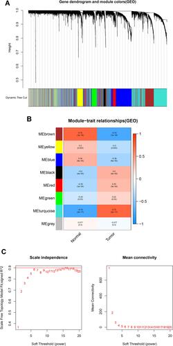
Figure 5 (A) The venn diagram showed the intersection of diagnostic markers obtained by four algorithms. (B) ROC curves of DTL in the training dataset.
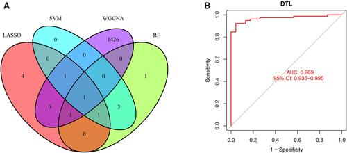
Figure 6 Validation of the diagnosis-related gene signature. (A) The expression of DTL in GSE53819. (B) ROC curves of DTL in GSE53819.
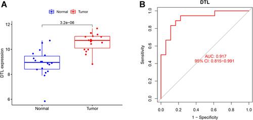
Figure 7 Continued.
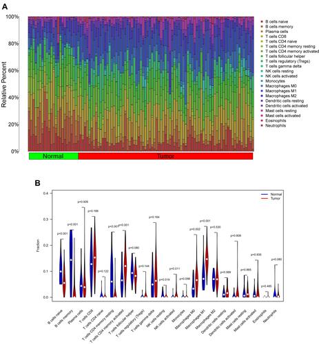
Figure 7 Immune cells infiltration analysis. (A) Pattern of infiltration of 22 kinds of immune cells in normal and tumor groups. (B) The violin plot showed the difference in 22 infiltrating immune cells between NPC and normal nasopharyngeal tissue. (C) The correlation heatmap was drawn to display the correlations of 22 types of infiltrated immune cells. The size of color square represents correlation intensity, red represents the positive correlation, and blue represents the negative correlation.
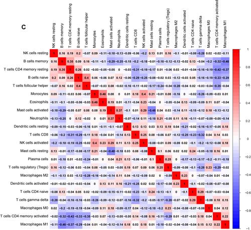
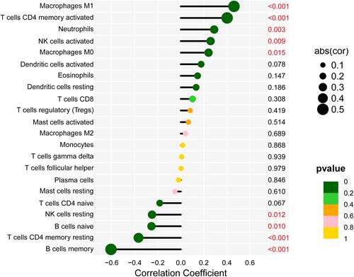
Figure 8 Correlation between DTL and infiltrating immune cells. The lower the p-value, the more green the color, and the higher the p-value, the yellow the color.