Figures & data
Figure 1 Identification of COVID-19-related target genes. (A) Volcano plot of upregulated (blue) and downregulated (red) genes in the TCGA-LUAD dataset. Vertical dashed lines indicate |log2(fold change)| = 1. Horizontal dashed line indicates FDR < 0.05. (B) Venn plot among downregulated genes (purple), upregulated genes (red) and COVID-19-related genes (green). (C and D) Enriched KEGG pathways on upregulated (C) and downregulated (D) COVID-19-related genes. Different colors indicate different pathways, and each radiation lines indicate one gene in one pathway.
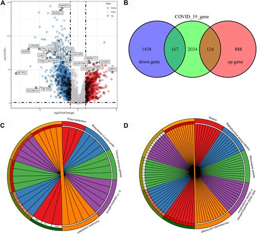
Table 1 The Top 10 Effective Molecules of FPQXZ Associated with COVID-19-Related Target Genes
Table 2 The Top 10 COVID-19-Related Target Genes Associated with FPQXZ
Figure 2 A network among YDBFZ, molecules of YDBFZ, and COVID-19-related target genes. Purple indicates TCMs of YDBFZ. Green indicates effective molecules in TCMs. Blue indicates target genes of molecules. Light Orange indicates COVID-19-related target genes.
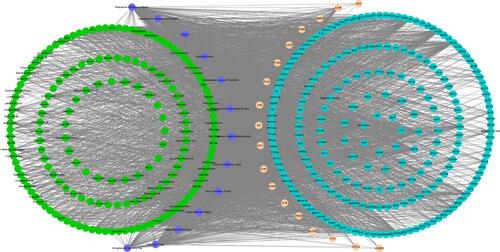
Figure 3 Mutation features of 26 COVID-19 target genes in the TCGA-LUAD dataset. (A) Mutation numbers of different types of mutations including splice site, nonsense, missense, frame-shift insertions and deletions. (B) Mutation counts of 26 COVID-19 target genes.
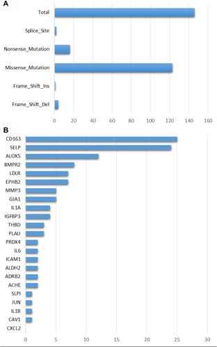
Figure 4 Functional analysis of 26 COVID-19 target genes in the TCGA-LUAD dataset. (A–C) The top 10 enriched terms of biological process, cellular component and molecular function. (D) The top 10 enriched KEGG pathways. Size indicates gene counts. FDR, false discovery rate.
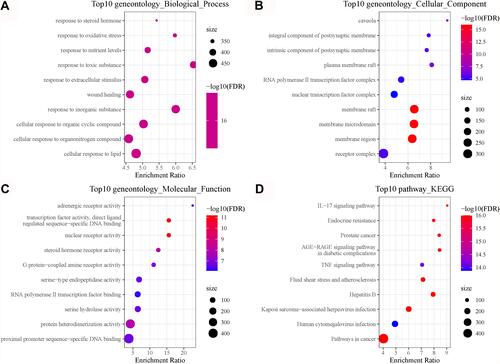
Figure 5 Correlation analysis between immune score and COVID-19 target genes in the TCGA-LUAD dataset. (A) Spearman correlation analysis between immune score and the expression of 26 COVID-19 target genes. Vertical axis represents immune score and horizontal axis represents gene expression. (B) Pearson correlation analysis between the enrichment of 21 immune cells and the expression of 26 COVID-19 target genes. Colors from red to blue indicate negative to positive correlations. Colors from green to purple indicate P values from high to low. *P < 0.05, **P < 0.01, ***P < 0.001.
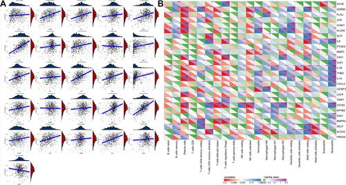
Figure 6 Analysis of interactions among 26 COVID-19 target genes. (A) A PPI network among the 26 genes. Higher dot size indicates more interactions with other genes. (B) Three groups (clust1, clust2 and genes outside clusters) identified by MOCODE. (C) Enrichment analysis of genes in clust1 and clust2. Red indicates genes in clust1 and clust2. Blue dots indicate enriched KEGG pathways.
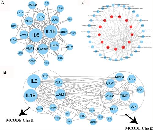
Figure 7 Pearson correlation analysis between 26 COVID-19 target genes and cell death including ferroptosis, necroptosis and pyroptosis. Blue indicates negative correlation and red indicates positive correlation. *P < 0.05, **P < 0.01, ***P < 0.001.
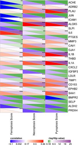
Figure 8 Unsupervised consensus clustering based on 26 COVID-19 target genes. (A and B) Consensus CDF curve and relative change in area under CDF curve when cluster number k = 2–10. (C) Consensus matrix when k = 2. (D and E) Kaplan–Meier survival analysis of Clust1 and Clust2 in the TCGA-LUAD (D) and the GSE31210 (E) datasets. Log-rank test was conducted.
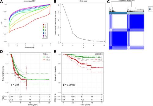
Figure 9 TME features of two molecular subtypes in the TCGA-LUAD dataset. (A) A heatmap of the proportion of 22 immune cells in two subtypes. (B) The enrichment score of the 22 immune cells in two subtypes. (C) The enrichment score of 10 oncogenic pathways. (D) Expression of 47 immune checkpoints in two subtypes. (E and F) Expression of chemokines (E) and chemokine receptors (F) in the two subtypes. Student t-test was conducted between the two groups. ns, no significance. *P < 0.05, **P < 0.01, ***P < 0.001, ****P < 0.0001.
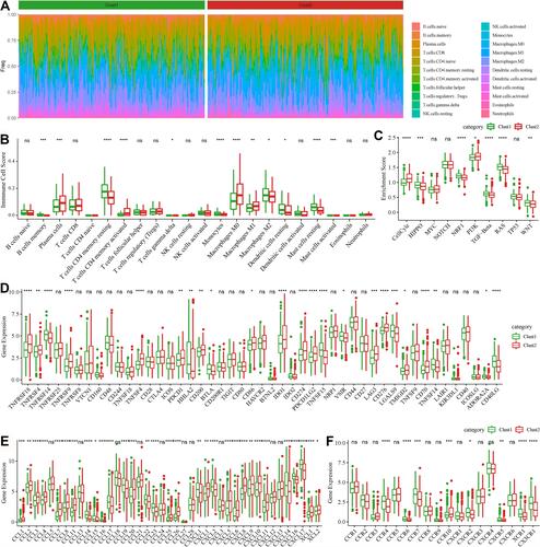
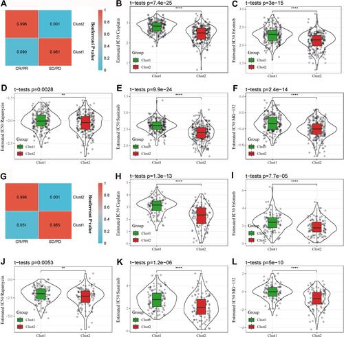
Figure 10 Differential sensitivity of the two subtypes to immunotherapy and chemotherapy. (A) SubMap analysis for comparing expression patterns between the TCGA-LUAD and IMvigor210 datasets grouped by CR/PR and SD/PD. (B–F) Comparison of estimated IC50 of five chemotherapeutic drugs between Clust1 and Clust2 in the TCGA-LUAD dataset. (G) SubMap analysis for comparing expression patterns between the GSE31210 and IMvigor210 datasets grouped by CR/PR and SD/PD. (H–L) Comparison of estimated IC50 of five chemotherapeutic drugs between Clust1 and Clust2 in the GSE31210 dataset. The gray dots in the figure represent tumor samples. Student t-test was conducted between the two groups. **P < 0.01, ****P < 0.0001.