Figures & data
Figure 1 Flow diagram of the patient selection procedure.
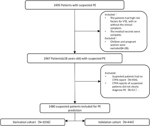
Table 1 Demographic and Baseline Patient Characteristics
Table 2 Comparison Between Derivation Cohort and Validation Cohort
Table 3 Multivariate Logistic Regression Analyses for Developing the Nomogram to Predict PE
Figure 2 Feature selection by Lasso. The above features are considered to be more important for the prediction of PE according to Lasso selection. If the coefficient is positive, it means that the feature is a risk factor for PE; If the coefficient is negative, it means that the feature is a protection factor for PE. The greater the absolute value, the greater the association between the feature and PE.
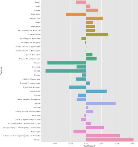
Figure 3 Nomogram for predicting the risk of PE.The nomogram was created by converting each regression coefficient from the multivariate logistic regression into a scale of 0 points (low) to 100 points (high). Finally, the total scores for all of the variables were summed.
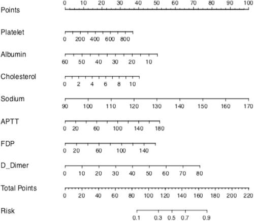
Figure 4 Receiver operating characteristic (ROC)curve for predicting PE. The performance of the nomogram was assessed by the ROC curve. The green curve represents derivation cohort, and the blue curve represents validation cohort.
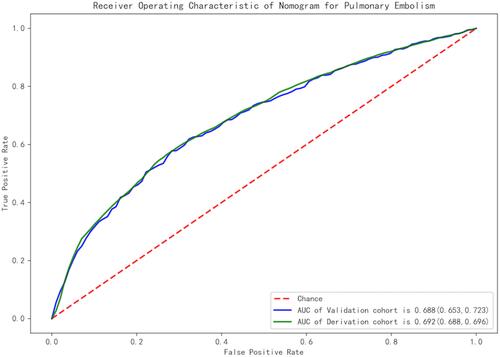
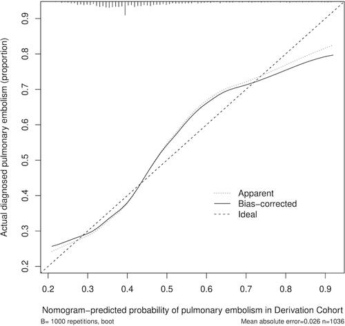
Figure 5 Calibration curve for the nomogram predicting PE. The horizontal axis represents the nomogram-predicted probability of PE, and the vertical axis represents the actual observed PE.