Figures & data
Figure 1 The landscape of genetic variations of RNA methylation regulatory genes in colorectal cancer. (A) Mutation analysis of 53 RNA methylation regulatory genes. (B) The frequency of mutations in genes showed by waterfall plot, the five genes with the highest mutation frequency were ZC3H13, TET1, TET3, KIAA1429 and YTHDC2. (C) Bar chart shows amplification and deletion frequency of RNA methylation regulating genes.
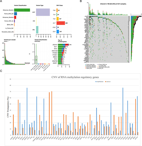
Figure 2 Correlation analysis of RNA methylation regulatory genes and prognosis. (A) Kaplan-Meier survival curve analysis showed the correlation between T, N, M stage and prognosis. (B) Heat map showing the correlation between RNA methylation genes and T, N, M staging. (C) Forest map of RNA methylation regulation genes by univariate Cox analysis. Red dots represent risk factors and blue dots represent protective factors. (D) The cross-verification results of tuning parameter (lambda) selection in the LASSO model. (E) LASSO coefficient profiles of two model genes. Each curve represents the changing trajectory of each independent variable coefficient. The ordinate is the value of the coefficient, the lower abscissa is log (lambda), and the upper abscissa is the number of non-zero coefficients in the LASSO model.
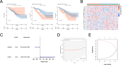
Table 1 The Risk Coefficients of Each Gene by LASSO Regression Analysis
Figure 3 Evaluation and validation of prognostic models. (A) Risk curve, scatter plot and model gene expression heat map of high and low risk groups in training cohort. (B) Kaplan-Meier survival curves for high and low risk groups in training cohort. Red represents the high risk group and blue represents the low risk group. (C) ROC curves for high and low risk groups at 1 year, 3 years, 5 years in training cohort. (D) Risk curve, scatter plot and model gene expression heat map of high and low risk groups in internal validation cohort. (E) Kaplan-Meier survival curves for high and low risk groups in internal validation cohort. Red represents the high risk group and blue represents the low risk group. (F) ROC curves for high and low risk groups at 1 year, 3 years, 5 years in internal validation cohort. (G) Risk curve, scatter plot and model gene expression heat map of high and low risk groups in external validation cohort. (H) Kaplan-Meier survival curves for high and low risk groups in external validation cohort. Red represents the high risk group and blue represents the low risk group. (I) ROC curves for high and low risk groups at 1 year, 3 years, 5 years in external validation cohort.
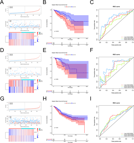
Figure 4 Comparison of risk scores among different clinical subgroups.
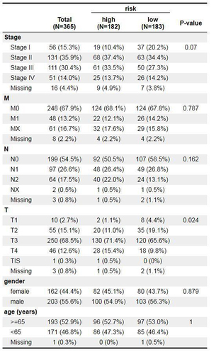
Figure 5 The nomogram model construction and validation. (A) Uni-Cox independent prognostic analysis. (B) Multi-Cox independent prognostic analysis. (C) A nomogram as shown, the C index of the nomogram was 0.761719. (D) The correction curve of the line graph. Blue, red, and green circles represent calibration curves for 1, 3 and 5 years, respectively; blue crosses represent points where the observed and predicted incidence deviated from the calibration curve.
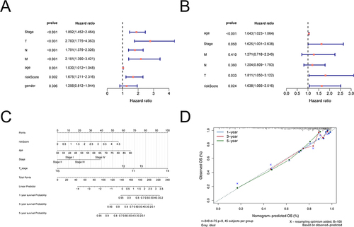
Figure 6 Results of functional enrichment analysis. (A) The GO function enrichment bar chart of differentially expressed genes. The ordinate represents the enriched GO Term, the bar length represents the number of differentially expressed genes enriched in the GO Term. (B) Bars of KEGG pathway enrichment of differentially expressed genes. The ordinate indicates the enrichment of KEGG Pathway, the bar length indicates the number of Pathway genes. (C) Heat map of enrichment of TOP20 differential pathways in high and low risk groups. Each small square represents the ssGSEA score of each sample, and the color represents the size of ssGSEA score. The larger the square, the darker the color. Red indicates a high ssGSEA score and blue indicates a low ssGSEA score.
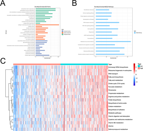
Figure 7 Results of immune infiltration analysis in high and low risk groups. (A) Violins of Immune Score in the high and low risk groups. (B) Violins of Stromal Score in the high and low risk groups. (C) Violins of ESTIMATE Score in the high and low risk groups. The abscissa represents groups, the ordinate represents scores, the blue represents low risk group, and the pink represents high risk group. (D) Analyze the differences of immune cells in high and low risk groups by ssGSEA. (E) The bar chart of proportion of immune cells in high and low risk groups by CIBERSORT. (F) Violin diagram of immune cells in the high and low risk groups by CIBERSORT. *p < 0.05, **p < 0.01, ***p < 0.001, ****p < 0.0001.
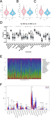
Figure 8 Results of immunotherapy differences between high and low risk groups. (A) Boxplot of immune checkpoint gene expression differences in high and low risk groups. Red is the high risk group, blue is the low risk group. (B) Heat maps of immunotherapy differences between high and low risk groups. *p < 0.05, **p < 0.01, ****p < 0.0001.
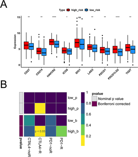
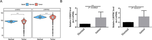
Figure 9 Results of Gene expression levels in normal and cancerous tissue. (A) Expression of LRPPRC and UHRF2 in normal and tumor samples in the TCGA dataset. (B) The expression of LRPPRC and UHRF2 using qRT-PCR. *p < 0.05, **p < 0.01, ***p < 0.001, ****p < 0.0001.