Figures & data
Figure 1 Differentially expressed gene (DEG) analysis. (A) The volcano plot of DEGs between MI and control group. (B) The heatmap of top 25 up- and down-regulated DEGs between MI and control group. (C) GO enrichment analysis of DEGs between MI and control group. (D) The KEGG analysis of DEGs between MI and control group.
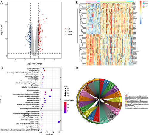
Figure 2 Consensus clusters by HRGs in training sets (A–C) and validation sets (D–F). (A and D) Consensus clustering cumulative distribution function (CDF) for k = 2 to 5. (B and E) Relative change in area under the CDF curve for k = 2 to 5. (C and F) Consensus clustering matrix for k = 2.
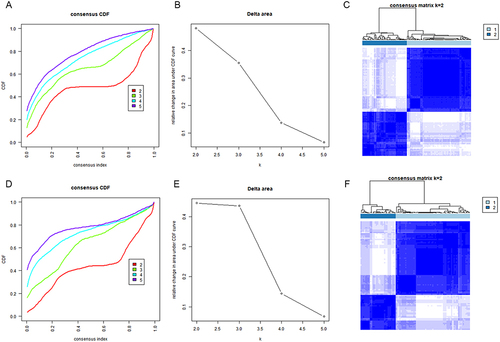
Figure 3 Differentially expression analysis between two different subtypes in training sets. (A) The volcano plot of DEGs between cluster A and cluster B. (B) The heatmap of top 25 up- and down-regulated DEGs between cluster A and cluster B. (C) GSVA enrichment analysis showing the activation states of biological pathways between cluster A and cluster B.
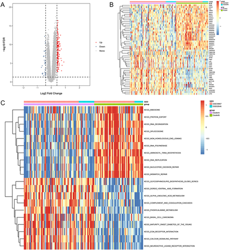
Figure 4 Characteristics of IME cell infiltration between cluster A and cluster B group in training sets. (A) The abundance of each IME infiltrating cell in cluster A and cluster B group. (B) Difference activity of specific immune responses between cluster A and cluster B group. (C) Difference in immune score between cluster A and cluster B group. (D) Difference in the HLA-related gene expression between cluster A and cluster B group. (E) Differences in EMT pathways and hypoxia condition between cluster A and cluster B group. *Indicates p < 0.05; **Indicates p < 0.01; ***Indicates p < 0.001; ****Indicates p < 0.0001; ns indicates p > 0.05.
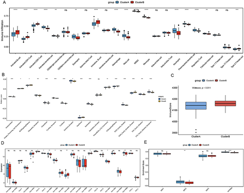
Figure 5 Hub module selection. (A) Determination of soft thresholding power in the WGCNA. (B) The cluster dendrogram of module eigengenes. (C) The module trait relationships. (D) A scatter plot of gene significance for MI versus the module membership in the turquoise module. (E) A scatter plot of gene significance for MI versus the module membership in the brown module.
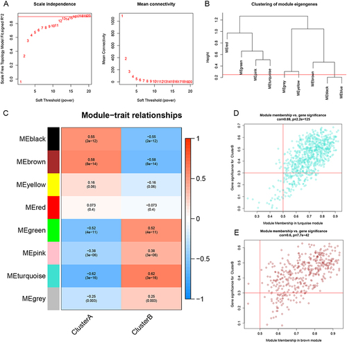
Figure 6 Construction of diagnostic model. (A) LASSO coefficient profiles of 9 hub genes. (B) Selection of the optimal parameter (lambda) in the LASSO model. (C) ROC curves showing the predictive efficiency of diagnostic model in training sets. (D) ROC curves showing the predictive efficiency of diagnostic model in validation sets.
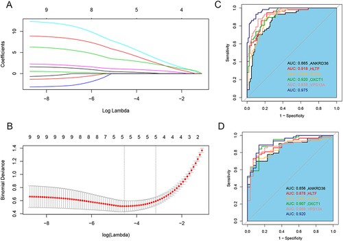
Figure 7 Correlation of candidate genes and immune cells and immune score. *Indicates p < 0.05; **Indicates p < 0.01; ***Indicates p < 0.001.
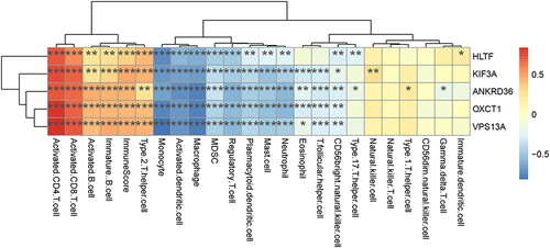
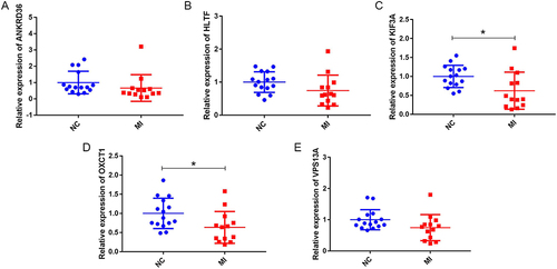
Figure 8 Expression validations of ANKRD36, HLTF, KIF3A, OXCT1 and VPS13A by RT-qPCR. (A) ANKRD36, (B) HLTF, (C) KIF3A, (D) OXCT1, (E) VPS13A. *p < 0.05.