
Figures & data
Table 1 Characteristic Distribution of Data in the Establishment Set and External Validation Set
Figure 1 Flow diagram of patients included in the study.
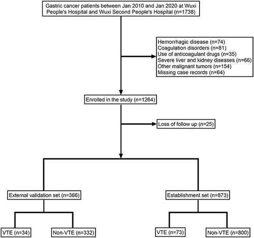
Table 2 Univariate and Multivariate Analyses of Variables Related to Postoperative VTE
Figure 2 The variable influence factor ranking plots of the four models. (A) Variable importance ranking diagram of the XGBoost model. (B) Variable importance ranking diagram of the RF model. (C) Variable importance ranking diagram of the SVM model. (D) Variable importance ranking diagram of the KNN model.
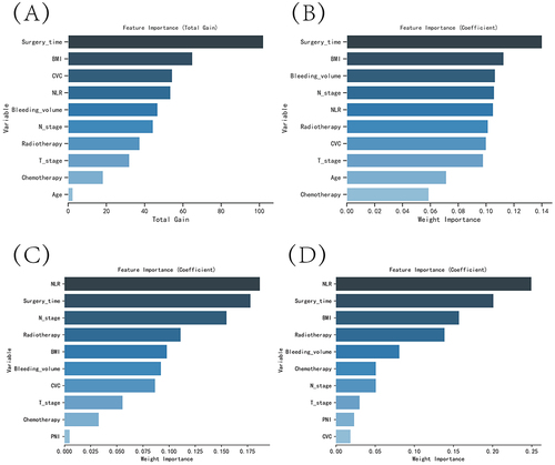
Table 3 Evaluation of the Four Models
Figure 3 Evaluation of the four models for predicting VTE. (A) ROC curves for the training set of the four models. (B) ROC curves for the validation set of the four models. (C) Calibration plots of the four models. The 45-degree dashed line in each plot represents the ideal correspondence between the predicted (x-axis) and observed (y-axis) probabilities of complications. The closer the distance between the two curves, the higher the predictive accuracy. (D) DCA curves of the four models. The point of intersection between the red curve and the “All” curve represents the baseline or starting point, while the point of intersection between the red curve and the “None” curve indicates the decision node where the corresponding patients may derive benefit.
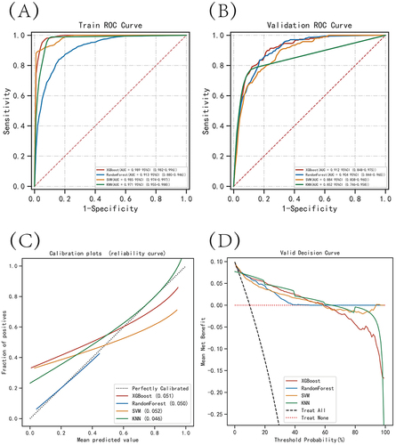
Figure 4 Internal validation of the XGBoost model. (A) ROC curve of the XGBoost model for the training set. (B) ROC curve of the XGBoost model for the validation set. (C) ROC curve of the XGBoost model for the test set. (D) External validation of the XGBoost model.
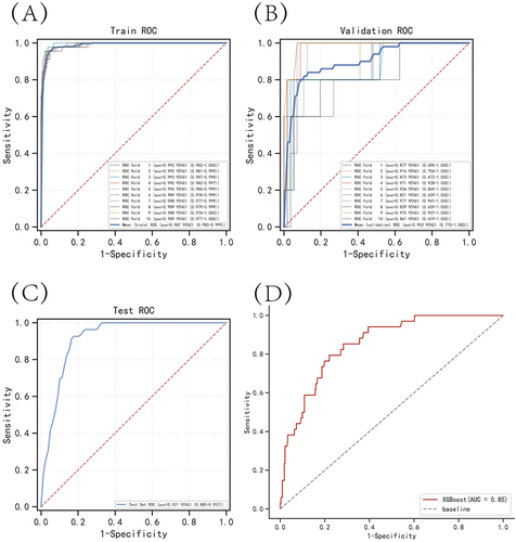
Figure 5 SHAP summary plot. The risk factors are ranked on the y-axis according to their significance, which is determined by the mean of their absolute Shapley values. The higher the risk factor appears on the plot, the more crucial it is for the model.
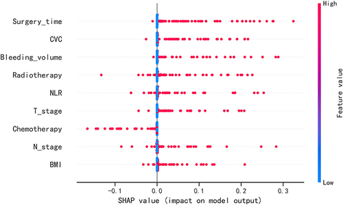
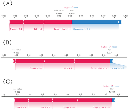
Figure 6 SHAP force plot. The explanatory variables are ordered along the horizontal axis based on the absolute value of their impact, with blue representing features that negatively affect disease prediction, as indicated by a decrease in SHAP values, and red representing features that positively affect disease prediction, as indicated by an increase in SHAP values. (A) Predictive Analysis of Patient I. (B) Predictive Analysis of Patient II. (C) Predictive Analysis of Patient III.
Data Sharing Statement
The original data presented in the study are included in the Raw Data/Table S1, and further inquiries can be directed to the corresponding author ([email protected]).