Figures & data
Figure 1 The study design flowchart illustrates the analytical pipeline for the investigation of gene expression data. The analysis includes several bioinformatics methods, such as GSEA and GSVA, to identify significant gene sets. DEGs are also detected using statistical methods, including LASSO and SVM-RFE. Furthermore, PPI networks are constructed to explore functional relationships among the identified genes. GO, KEGG, and DO databases are used to annotate the enriched gene sets and reveal their biological functions. WGCNA is employed to identify coexpressed gene modules and their associations with clinical traits. Using the CIBERSORT method, immune cell infiltration is analyzed. The accuracy of the analysis is evaluated using the ROC curve.
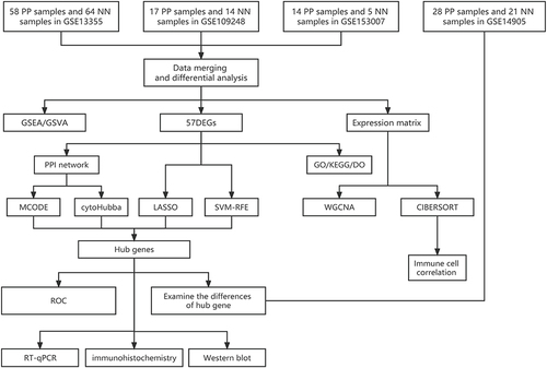
Figure 2 Analysis of genes with variable expression. (A) In the training group difference analysis volcano plot, the genes are represented by dots. Black dots indicate genes that exhibit no significant difference, while genes with red and green dots show up- and down-regulated expression, respectively. The respective names of the genes are used to identify those that exhibit statistically significant changes between the groups; (B) To see how differently expressed genes were expressed in the training group, a heat map was created. Up-regulated genes were represented in red, while down-regulated genes were shown in blue. The data were filtered using the criteria |logFC| > 2 and adjusted P-value < 0.05.
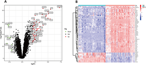
Figure 3 GO, KEGG, and DO were used to detect the biological functions, enrichment pathways, and main disease types of 57 differential genes. (A) Improved version: Bubble plots based on differential genes were created to display the top 10 significant GO analysis results in BP, CC, and MF. The vertical axis displays the GO term names, while the horizontal axis represents the proportion of genes. The size of the circle reflects the number of enriched genes in each GO term, whereas the color denotes the significance of enrichment. A redder circle implies greater enrichment of differential genes in the GO term. The filtering condition for selecting GO terms was an adjusted p-value of less than 0.05; (B) Improved version: A bubble plot was constructed to illustrate the enrichment analysis of differential genes using the DO. The vertical axis denotes illness type, and the horizontal axis represents gene proportion. The size of the circle indicates the number of enriched genes associated with each disease type, while the color denotes the significance of enrichment. A redder circle signifies a higher degree of differential gene enrichment; (C) Improved version: A bubble plot was used to visualize the results of the KEGG enrichment study on differential genes. The names of the pathways are shown on the vertical axis, and the number of enriched genes in each pathway is shown on the horizontal axis. The color indicates the degree of enrichment, with a darker shade suggesting a greater degree of enrichment of differential genes in the pathway.
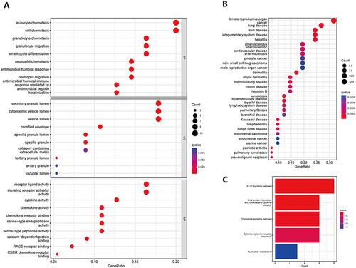
Figure 4 PPI network construction, MCODE cluster module analysis, and the identification of the key gene using cytoHubba. (A) This image displays a PPI network graph based on differential genes, consisting of 34 nodes and 117 edges. Each node corresponds to a protein, and each edge corresponds to an interaction. The color of the node reflects the Log2FC value, with red indicating gene up-regulation, blue indicating gene down-regulation, and the deeper the color indicating a larger Log2FC fold. The degree value is reflected in the size of the node; the larger the node, the greater the degree value. The thickness of the border line symbolizes the size of the interaction score, with a thicker border line representing a higher score. Additionally, this graph identifies two gene cluster modules using the (B and C). MCODE plugin; (B) This image displays gene cluster 1, which has a score of 5.667, 7 nodes, and 17 edges; (C) This image displays gene cluster 2, which has a score of 5.000, 5 nodes, and 10 edges; (D) This image displays the key genes identified by the MCC algorithm in the cytoHubba plugin.
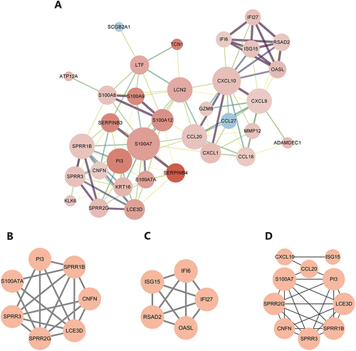
Figure 5 Screening for psoriasis signature genes and validation. (A) The image represents the results obtained from the LASSO logistic regression algorithm used for screening psoriasis signature genes. The horizontal axis reflects the log(λ) value, while the vertical axis represents the cross-validation error. The gene corresponding to the point with the smallest vertical coordinate is the characteristic gene that has diagnostic effect; (B) The image shows the results obtained from the SVM-RFE algorithm used for screening characteristic genes. The horizontal axis indicates the number of genes, and the vertical axis is the cross-validation error. The number of feature genes is the value corresponding to the smallest point in the vertical coordinate; (C) The VENN plot depicts the intersection of important genes identified by MCODE, cytoHubba, LASSO, and SVM-RFE. The plot was generated using the venn package; (D) The image represents the validation of the intersected genes in the validation group. The horizontal axis shows the sample type, with blue representing the control group and red representing the psoriasis group. The vertical axis depicts the expression of the distinctive gene SPRR1B. A P value of less than 0.05 indicates that the diagnostic gene is different in the validation group; (E and F) The ROC curves depict the diagnostic test’s false positive and true positive rates. The horizontal axis shows the false positive rate expressed as 1 minus specificity, while the vertical axis represents the true positive rate expressed as sensitivity; (G) The graphic depicts the results of real-time PCR investigations of the expression levels of SPRR1B in psoriasis sufferers’ and healthy controls’ skin lesions. The ***p<0.0001 indicates a highly significant difference between the two groups.
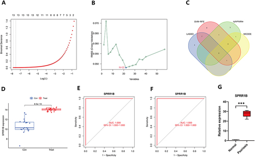
Figure 6 scWGCNA constructs co-expression modules. (A) The cluster dendrogram of samples is accompanied by a trait heatmap; (B) The connection between scale-free fit metrics and each soft threshold is shown; (C) The relationship between mean connectivity and each soft threshold is shown; (D) The clustering dendrogram displays the branches of highly connected genes, resulting in eight gene co-expression modules; (E) The relationships between module feature genes and clinical phenotypes (normal and psoriasis) are depicted in a heatmap; (F) A scatter plot showcases the relationship between MM and GS in blue-green modules, where MM represents the correlation of module signature genes with individual genes, and GS refers to the correlation of gene expression levels with psoriasis.
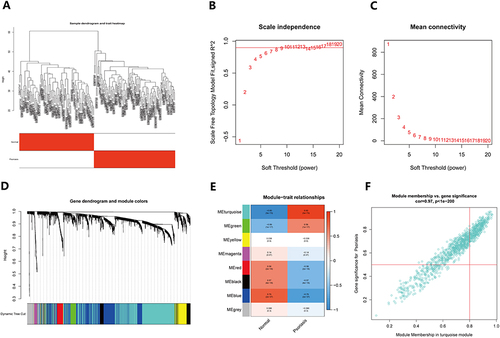
Figure 7 Immune cell infiltration in psoriasis. (A) The histogram of immune cells in the training group shows the distribution of immune cells across different sample types. The horizontal axis shows the sample type, whereas the vertical axis reflects the immune cell content. On the right side of the picture, the color of each immune cell is shown, providing a visual representation of the different cell types and their relative abundance in each sample; (B) The heat map displays the relationship between immune cells. The names of immune cells are represented by the horizontal and vertical axes, and the values inside each square show the correlation coefficients between immune cells. Positive correlations are shown as red squares, whereas negative correlations are shown as blue squares. The heat map provides a useful visual representation of the relationships between different immune cell types; (C) The violin plot depicts the difference in immune cell composition between the psoriasis and control groups. The horizontal axis indicates immune cell names, whereas the vertical axis reflects immune cell concentration. The blue violin represents the control group, while the red violin represents the psoriasis group. The violin plot depicts the variations in immune cell content between the two groups in a straightforward and succinct manner.
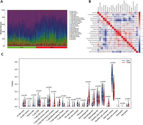
Figure 8 The figure presents a scatter plot depicting the relationship between a characteristic gene and immune cells. The horizontal axis reflects the level of expression of the distinctive gene, while the vertical axis represents the content of immune cells. The correlation coefficient (R), which measures the degree and direction of the association between the two variables, is shown. When R > 0, it indicates a positive association between the expression of the characteristic gene and the content of immune cells. Conversely, when R < 0, it denotes a negative correlation. Furthermore, the p value is also presented, which indicates the statistical significance of the correlation between immune cells and the characteristic gene. A p value < 0.05 implies that the observed correlation is unlikely to have occurred by chance alone and is, therefore, significant.
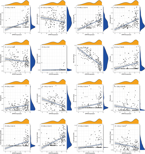
Figure 9 GSEA and GSVA reveal enriched hallmark pathways in psoriasis. (A) GSEA pinpoints the top five pathways that are considerably enriched in psoriasis skin lesion samples; (B and C) The lollipop plot displays the enriched hallmark pathways and curated pathways in the psoriasis group, as determined by GSVA. GSEA is an abbreviation for gene set enrichment analysis, whereas GSVA is an abbreviation for gene set variation analysis.
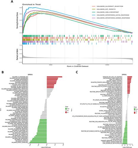
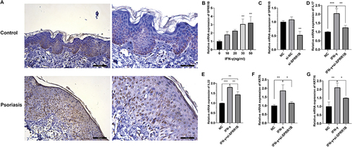
Figure 10 Biological experiments verify the relationship between SPRR1B and psoriasis. (A) Immunohistochemical analysis of SPRR1B expression in psoriasis patients and healthy controls. (B) Expression of SPRR1B in Hacat cells treated with IFN-γ (C) Expression of SPRR1B after HaCat cells were transfected with si-SPRR1B (D–G) Expression of IL17, IL22, KRT6, KRT16 in HaCat cells. Data are expressed as mean ± SD. *P < 0.05; **P < 0.01; ***P < 0.001.