Figures & data
Figure 1 Structure and characterization of composite RSL3@O2-ICG NBs. (A) General morphology of General morphology of microbubbles; (B) Scanning Electron Microscopy image showing a quasi-spherical morphology; (C–F) Enrichment degree of different elements on RSL3@O2-ICG NBs; (G) The DLS results showed a mean particle size of to be with a polydispersity value; (H) The absorption spectrum of RSL3, ICG, O2-NBs and RSL3@O2-ICG NBs.
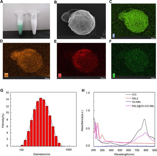
Figure 2 Analysis of ROS. (A) Fluorescence microscope images of intracellular ROS generation as indicated by DCFH-DA detection after receiving different treatments as indicated. (B) Flow cytometry analyses of intracellular ROS generation in the same experiment as above.
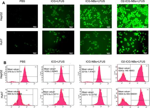
Figure 3 Analysis of Mitochondrial membrane potential (MMP) and the function of RSL3@O2-ICG NBs in ferroptosis. (A) Fluorescence microscope images of the JC-1 monomer (green channel), and aggregate (red channel) in the mitochondria of HCC cells after differential treatments as indicated; (B–E) DTNB assay of GSH Level, MDA examination in HCC cells under different treatment. ***P<0.001.
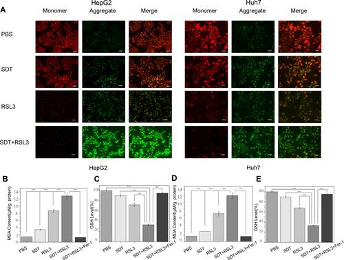
Figure 4 Analyses of Cell Cycle. (A) Cell cycle of HCC cells was analyzed by flow cytometry after differential treatments as indicated. (B and C) The column charts of different cell period of Hep G2 and Huh7 cells.
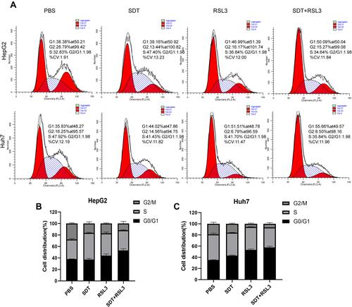
Figure 5 Screening of differentially expressed genes and KEGG enrichment analysis. (A) group A vs group B differentially expressed mRNA; (B) group C vs group D differentially expressed mRNA; (C) group A vs group B differentially expressed lncRNA; (D) lncRNA differentially expressed in group C vs group D; Up-regulated genes are represented by red dots, down-regulated genes are represented by green dots, and blue dots are genes that have not changed significantly.
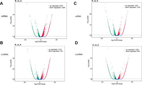
Table 1 The Representative Results of GO Enrichment Analysis with Differential mRNA
Table 2 The Representative Results of GO Enrichment Analysis with Differential LncRNA Targets
Figure 6 KEGG enrichment analysis of differentially expressed genes. (A) The first 20 KEGG pathways enriched with mRNA differentially expressed between A vs B groups; bubble chart; (B) Differences between C vs D groups Enriched bubble chart of the first 20 KEGG pathways expressing mRNA; (C) Enriched bubble chart of the first 20 KEGG pathways that differentially express lncRNA target genes between A vs B groups; (D) The first 20 KEGG pathways that differentially express lncRNA target genes between C vs D groups Enrichment bubble chart; the y-axis is the enriched pathway, and the x-axis is the ratio of the total genes in the gene of a pathway. The bubble color represents the p value. The larger the p value, the darker the color, and the bubble size represents the enrichment. The number of genes collected.
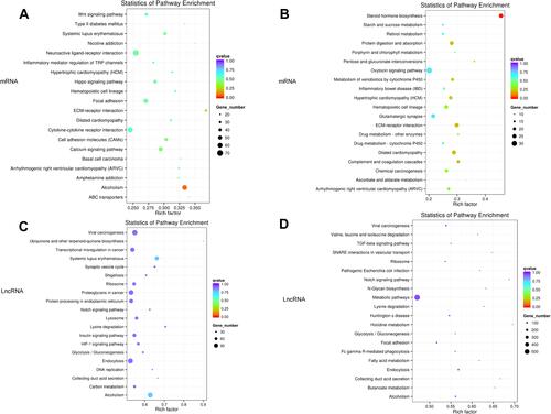
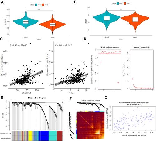
Figure 7 DEG function enrichment and DEG expression in TCGA hepatocellular carcinoma data and immune infiltration status. (A) Hierarchical clustering heat map of the expression of the intersection of differentially expressed genes between A vs B and C vs D in TCGA hepatocellular carcinoma RNA-seq; (B) overlapping DEG in TCGA hepatocellular carcinoma patients based on the hierarchical clustering of expression, red and Blue is the two types of aggregation, defined as class 1 and class 2; (C) box plot of the difference in immune cell abundance between class 1 and class 2 in TCGA hepatocellular carcinoma (t-test, p<0.05), green represents class 1 and red represents class 2; (D) the prognosis of the two types in the training set (Log rank test, p<0.05); (E) the prognosis of the two types in the test set (Log rank test, p<0.05); ****P<0.0001.
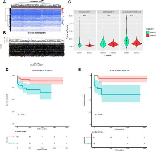
Figure 8 Prognosis analysis of the TCGA cohort and weighted co-expression network analysis in the TCGA queue. (A and B) box plot of differences in expression of two prognostic risk genes between class 1 and class 2 groups (t-test, p<0.05), blue represents class 1, red represents class 2; (C) Scatter plot of the correlation between two prognostic risk genes and tumor microenvironment scores (Pearson, R>0.4, p<0.05); (D) Soft Threshold (power) represents the weight, and the ordinate represents the correlation between the connection degree k and p(k); (E) the gene tree for clustering genes by Euclidean distance, different colors represent different gene modules; (F) the heat map of gene co-expression similarity matrix, and the characterization module Cluster trees are displayed in combination. The higher the expression similarity between genes, the darker the color; (G) the scatter plot of the correlation between the blue module and the characteristic gene. **P<0.01, ****P<0.0001.