
Figures & data
Figure 1 Expression variation of proteasome molecules. (A) The pattern diagram shows the potential regulation mechanism of the proteasome in tumors. (B) The waterfall diagram shows the somatic mutations of the 10 proteasome molecules with the highest mutation frequency using pan-cancer analysis. 53.15% is the proportion of 591 samples with at least one mutation of the top 10 genes among 1112 samples with at least one mutation of 45 proteasome (PSM) molecules. The percentage figure of each line on the right of the picture is the number of samples with the corresponding gene mutation divided by 1112 samples with at least one mutation among the 45 PSM molecules. (C) The color of the dots represents the degree of variance. Redder dots represent higher expression in cancer tissue. Blue dots represent higher expression in normal tissue. The fold change equals mean (Tumor) / mean (Normal), P-value was used, t-test and P-value was adjusted by false discovery rate (FDR). The size of the bubbles indicates the FDR. Larger bubbles represent a lower FDR. The genes with fold change (Fold change >2) and significance (FDR > 0.05) were retained to produce the figures. If there is no significant gene in one cancer type, the cancer type is omitted in the final figure. (D) The risk scores distribution and gene expression patterns of patients in high and low-risk groups. Hazard ratio (HR) above 1.0 indicates greater risk (red dot); hazard ratio below 1.0 indicates less risk (blue dot). (E) The bubble chart shows the correlation between Copy number variant (CNV) and mRNA expression level. Red indicates positive correlation; blue indicates negative correlation. The deeper color indicates a larger correlation index (Pearson correlation). The bubble size indicates the FDR. (F) The bubble chart shows the correlation between methylation of the 45 PSM and mRNA expression. Red shows a positive correlation and blue shows a negative correlation. The darker color indicates a larger correlation index (Pearson correlation). Bubble size indicates the FDR. (G) Correlation between expression levels of 45 PSM molecules, red represents positive correlation, blue represents negative correlation. The size of the circle represents the absolute value of the correlation coefficient (Spearman method, TCGA-LIHC, n = 373).
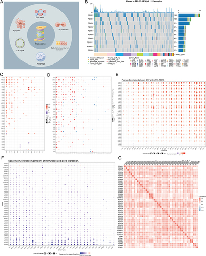
Figure 2 The significance of PSM molecules in hepatocellular carcinoma (HCC). (A) Overall expression levels (Gene set variation analysis, GSVA scores) of proteasome molecules in 14 cancers containing paired normal samples. (B) The heatmap shows the correlation between the expression level of the 45 PSM molecules in important cancer signaling pathways. The global percentage of cancers in which a gene has an effect on the pathway among the 32 cancer types, is shown as the percentage: (number of activated or inhibited cancer types/32 *100%). Heatmap shows collagen molecules that have a function (inhibit or activate) in at least 5 cancer types. “Pathway activate” (red) represents the percentage of cancers in which a pathway may be activated by given genes, inhibition in a similar way shown as “pathway inhibit” (blue). (C) The correlation between the 45 PSM molecules in TCGA-LIHC and important cancer signaling pathways. The solid line represents activation and the dashed line represents inhibition. (D) The “clusterProfiler” R package was used for the Gene Ontology (GO) and Kyoto Encyclopedia of Genes and Genomes (KEGG) enrichment analysis. Different colors represented different background gene sets. (E) The Gene Set Variation Analysis (GSVA) heatmap showing PSM molecules that activate and inhibit pathways in TCGA-LIHC. The pathway activity was assessed with the GSCALite web server. (F) Least absolute shrinkage and selection operator (LASSO) Cox model fitting. Each curve represents a gene. The profiles of coefficients were plotted versus log(λ). Vertical lines indicate the positions of seven genes with coefficients greater than 0 determined by 10-fold cross-validation. λ was determined from 10-fold cross-validation. The x-axis represents log(λ); the y-axis represents binomial deviance. Optimal values calculated from minimum criteria and one standard error of the criteria are indicated by the dotted vertical lines. (G–I) Univariate Forest plot showing association between 7 candidate PSM molecules expression and Overall survival (OS) (G), Disease Specific Survival (DSS) (H) and Progression Free Interval (PFI) (I) in TCGA-LIHC.
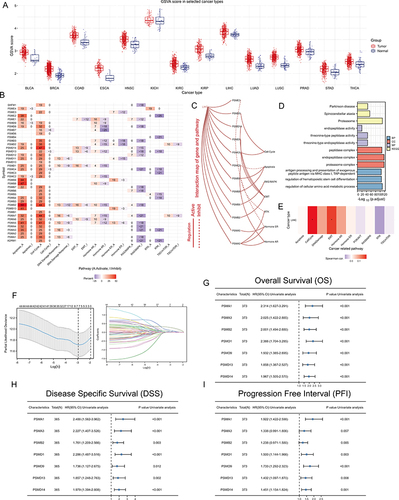
Figure 3 Unsupervised Machine Learning algorithms was used to identify 2 molecular subtypes in TCGA. (A) Left: The cumulative distribution function (CDF) curves in consensus cluster analysis. CDF curves of consensus scores by different subtype numbers (k = 2, 3, 4, 5, and 6) were displayed. Right: Relative change in area under the CDF curve for k = 2–6. (B) The consensus score matrix of all samples when k = 2. The higher the consensus score is, the more likely they were assigned to the same group (TCGA-LIHC). (C) The Principal Component Analysis (PCA) distribution of TCGA-LIHC samples by expression profile of PSM. Each point represents a single sample; different colors/shapes represent C1 and C2 respectively. (D) Survival analysis including Overall Survival (OS), Disease Specific Survival (DSS), Disease Free Interval (DFI), and Progression Free Interval (PFI) based on two clusters (Log rank test, TCGA-LIHC, n = 373). (E) Expression distribution of 45 PSM molecules between two subtypes in TCGA-LIHC. (F) Distribution of clinical characteristics of two subtypes, including Gender, T/N/M stages, Clinical stage, and Tumor grade. (G) Oncoplot shows mutations in the top 20 genes with the highest mutation frequency in both subtypes (TCGA-LIHC). Each column represents an individual patient. (H and I) Graphs show the mutually exclusive and co-occurrence of mutational events in both subtypes (TCGA-LIHC; (H) C1, (I) C2). Green indicates co-mutation, red indicates mutex-mutation, the asterisk indicates P-value (Wilcoxon test,·P <0.05, *P <0.01).
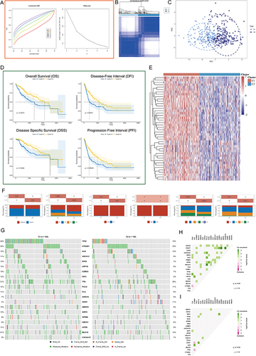
Figure 4 Analysis of PSM-related signaling pathways. (A) Volcano map of differentially expressed genes (DEGs) between C1 and C2 based on TCGA-LIHC dataset. Data on the abscissa are differences in gene expression (log2 fold change); data on the ordinate represent the significance of these differences (−log10 padj). Red indicates upregulation, and blue indicates downregulation. (B) Significant Gene Ontology (GO) enrichment terms and Kyoto Encyclopedia of Genes and Genomes (KEGG) pathway enrichment analyses of the DEGs. (C) The co-expression network of DEGs is based on Multiscale Embedded Gene Co-Expression Network Analysis (MEGENA). Each node represents a module, with the larger nodes indicating a higher number of genes. Right MEGENA network showing the largest gene module C1_2. The degree value of the node was calculated by Cytoscape. The higher the degree value, the darker the color and the larger the size. (D) Enrichment analysis of the largest gene module (node indicates gene expression level; color indicates P value). (E) Graphs for comparison of ten hub genes expression in paired normal and tumor tissues using TCGA-LIHC (Paired t test, *** P < 0.001, n = 50).
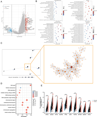
Figure 5 Single-cell analysis. (A) Uniform Manifold Approximation and Projection (UMAP) plot dimensionality reduction algorithm, each color represents a unique cell type. (B) Cells were clustered into 21 types via UMAP plot dimensionality reduction algorithm, each color represents a unique cluster. (C) Dot plots demonstrate the expression distribution of the top 10 degree value genes. (D and E) Violin plots of the top 10 degree value genes across different cell types (D) and cell cluster (E).
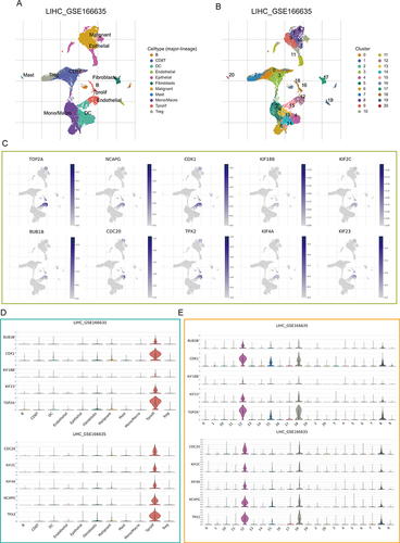
Figure 6 PSM correlated with cancer DNA repair and stemness. (A–C) Dot plots demonstrate the expression distribution of homologous recombination repair (HRR) signature (A), mismatch repair (MMR) (B) signature and PSM molecules (C) in GSE166635. (D–F) Violin plots demonstrate the expression distribution of HRR signature (D), MMR (E) signature and PSM molecules (F) in GSE166635. (G) The correlation scatter plots in TCGA-LIHC present the correlations between the HRR signature and PSM molecules expression. (H) The correlation scatter plots in TCGA-LIHC present the correlations between the MMR signature and PSM molecules expression. (I) Analysis of the mRNAsi score difference between the two subtypes (Wilcoxon test, TCGA-LIHC, n = 373). (J) Correlation analysis of the 7 candidate genes mRNA expression and mRNAsi score based in TCGA-LIHC (Spearman method, n = 373). (K and L) PSMD13 expression in different Human hepatocarcinoma cell lines based on (K) the Cancer Cell Line Encyclopedia (CCLE) and (L) Western blot. One-way ANOVA was conducted. (***P < 0.001, ****P < 0.0001). (M and N) Hep 3B2.1–7 and HepG2 cells transfected with the NC, sh-PSMD13 constructs. The representative images from the sphere-forming assay (M). The scale bar represents 50 μm. The number of tumor spheres was counted and plotted, and percentage of tumor spheres with diameters of 50–100 μm, 100–150 μm, or >150 μm was calculated and plotted (N). (ANOVA, **P < 0.01, ***P < 0.001, ****P < 0.0001). (O) Clone formation capacity of the Hep 3B2.1–7 and HepG2 transfected with the NC, sh-PSMD13 constructs assessed using the clone formation assay. Data are means ± SEM. All experiments were repeated at least three times, independently.
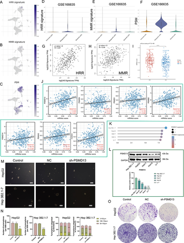
Figure 7 PSMD13 overexpression promotes a malignant phenotype in HCC. (A) A volcano plot of differentially expressed mRNAs in PSMD13 knockdown cells. (B) Enrichment analysis of DEGs upon PSMD13 knockdown. The larger the circle area is, the higher the number of genes; the smaller the p-values and the more significant the enrichment (the darker the color). (C) Gene set enrichment analysis (GSEA) plots of HALLMARK terms were analyzed in GSE57871. (D and E) Correlation of the PSMD13 expression levels with EMT-related makers based on TCGA-LIHC (D) and ICGC (E). Spearman method is applied. (F) Association of PSMD13 expression with MMP2 and MMP9 in TCGA pan-cancer. Red: positively correlated; Blue: negatively correlated, Grey: not statistically significant. Spearman method is applied. (G and H) The Expression of the MMP2 and MMP9 proteins was examined using Western blots after the transfection of the Hep 3B2.1–7 and HepG2 cells with NC, sh-PSMD13 constructs. (ANOVA, **P < 0.01, ***P < 0.001, ****P < 0.0001). (I and J) The migratory ability of the different groups of Hep 3B2.1–7 and HepG2 was examined using the wound-healing assays (Scale bars = 50 μm). (**P < 0.01, ***P < 0.001). (K and L) Cell invasion (Transwell assay) (Scale bars = 20 μm). (ANOVA, ***P < 0.001). (M) Schematic diagram of subcutaneous tumor models. Green triangles represent the time point when the tumor volume was measured. (N) Xenograft mouse tumors (n= 6 mice per group). (O) Weights of xenograft tumors at completion of the study. (ANOVA, ***P < 0.001). (P) Volumes of xenograft tumors measured twice a week. Data are means ± SEM. All experiments were repeated at least three times, independently.
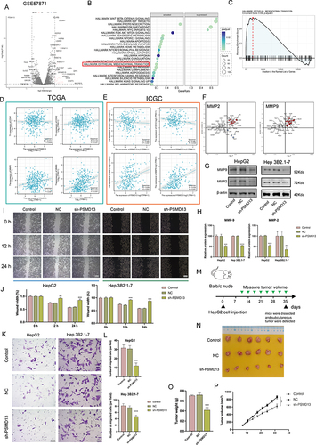
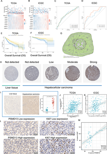
Figure 8 Clinical significance of PSM. (A and B) The composite plots of the distribution of risk scores, vital status and expression patterns of the seven PSM prognostic molecules in HCC patients from TCGA (A) and ICGC (B). Risk scores are listed in ascending order from left to right. (C and D) The predictive value of the PSM score was evaluated using time-dependent Receiver operating characteristic (ROC) curve analysis within 1, 3 and 5 years (C: TCGA-LIHC; (D) ICGC). (E and F) Kaplan-Meier curves of association between the PSM prognostic molecule expression levels (ssGSEA algorithm) and overall survival of HCC patients in TCGA (E) and ICGC (F) datasets (Log rank test, n = 373). (G) Main subcellular localization of PSMD13 based on Human Protein Atlas (HPA) database. (H) Representative Immunohistochemistry (IHC) images of PSMD13 expression in normal liver tissue and HCC tissue according to HPA databases. (I) IHC analysis of PSMD13 of our own samples. The statistical comparison of PSMD13 expression levels (H-SCORE) in paracancerous and HCC tissue (Wilcoxon test, ***p< 0.001, n = 40, Scale bars = 50 μm). All the IHC scores were repeated three times using a double-blind method. Statistical analysis All experiments were repeated at least three times, independently. (J and K) Scatter plot showing the correlation of PSMD13 and MKI67 mRNA levels based on TCGA (J) and ICGC (K) datasets. (L and M) Matched HCC tissue sections of adjacent slides were displayed to prove the correlation of PSMD13 and Ki-67 expression (L). The correlation analysis was based on immunohistochemical H-score (M). (Wilcoxon test, ***P < 0.001, n = 40, Scale bars = 50 μm).
Data Sharing Statement
We declare that all the data in this article are authentic, valid, and available for use on reasonable request. Dr. Yu Zhang can be contacted ([email protected]) regarding the availability of data and materials.